The Starbucks logo stands as a globally recognized symbol of coffee culture, blending historical maritime heritage with modern brand storytelling. Since its 1971 debut in Seattle, the logo has undergone transformative redesigns that mirror the company’s evolution from a local coffeehouse to a global lifestyle empire. Each iteration—from the twin-tailed siren to the minimalist green-and-white emblem—carries layered meanings, reflecting shifts in consumer perception, sustainability priorities, and the brand’s strategic expansion into food, digital services, and retail. Beyond its visual appeal, the logo’s typography, color palette, and iconography serve as a silent ambassador, fostering instant brand recognition while adapting to diverse cultural contexts worldwide.
The design choices behind the Starbucks logo reveal a deliberate balance between tradition and innovation, where every curve, hue, and font stroke contributes to a narrative of quality, tradition, and accessibility. This exploration dissects the logo’s chronological progression, symbolic depth, and typographic refinements, offering insights into how a simple emblem transcends its origins to shape contemporary consumer behavior and corporate identity.
Historical Evolution of the Starbucks Logo
The Starbucks logo has undergone significant transformations since its inception in 1971, evolving alongside the company’s growth from a modest Seattle coffee shop to a globally dominant lifestyle brand. Each iteration of the logo reflects shifts in branding strategy, corporate identity, and market positioning. Below is a chronological exploration of its visual and symbolic development, structured to highlight key design choices, typographic shifts, and their alignment with Starbucks’ business milestones.
Origins and Early Iterations: 1971–1987
The first Starbucks logo, introduced in 1971 by the original founders—Jerry Baldwin, Zev Siegl, and Gordon Bowker—was designed by local artist Terry Heckler. It featured a two-tailed mermaid (siren) encircled by the word "Starbucks" in a maroon serif font, with the company’s name stylized to resemble a nautical star. The mermaid motif, inspired by the mythical "Starbucks" (a character from Moby Dick), symbolized the brand’s maritime heritage and Seattle’s connection to the sea.
By 1976, the logo underwent minor refinements, including a shift to a bold, all-caps serif typeface and the removal of the star from "Starbucks." The twin-tailed mermaid remained central, now depicted with a more detailed, flowing design and set against a dark brown background. This iteration emphasized craftsmanship and exclusivity, aligning with Starbucks’ positioning as a high-end coffee retailer in Pike Place Market.
In 1987, following Howard Schultz’s acquisition of the company and its merger with PepsiCo, the logo was modernized to reflect a broader corporate identity. The 1987 redesign introduced:
A simplified, single-tailed mermaid with a more abstract, stylized appearance, reducing the intricate detailing of earlier versions.
A green-and-white color scheme, replacing the original maroon, to evoke freshness and natural ingredients.
A cleaner, sans-serif font for the wordmark, enhancing readability and contemporary appeal.
The addition of the PepsiCo logo subtly integrated into the design, signaling the merger’s influence.
This transition marked Starbucks’ shift from a local brand to a corporate entity, though the mermaid’s presence retained its mythical allure while adapting to a more commercial aesthetic.
Corporate Expansion and Symbolic Reinvention: 1992–2011
As Starbucks expanded globally in the 1990s, the logo continued to evolve to accommodate international markets. The 1992 iteration introduced a more streamlined mermaid, with smoother curves and a simplified tail, while the wordmark adopted a bold, sans-serif typeface in green. The color palette expanded to include deep green and white, reinforcing the brand’s association with nature and quality.
By 2008, the logo had become a universal symbol, recognizable worldwide. However, internal critiques emerged regarding its complexity and lack of scalability for digital and merchandise applications. The twin-tailed mermaid, though iconic, was deemed visually cluttered and inconsistent across platforms.
The 2011 Redesign: Simplification and Global Branding
In 2011, Starbucks launched a radical redesign aimed at simplification, versatility, and global appeal. Key changes included:
Removal of the twin-tailed mermaid: Replaced with a single-tailed siren, now depicted in a minimalist, abstract form with a sleek, modern silhouette. The design retained the original’s elegance but eliminated perceived complexity.
Shift to a green-and-white palette: The deep green (#006241) became the dominant hue, symbolizing sustainability and premium quality, while white ensured contrast and adaptability.
Introduction of the "Siren" logo: A standalone, scalable icon of the mermaid’s head and tail, designed to function independently of the wordmark for use on merchandise, digital interfaces, and storefronts.
Typography update: The wordmark adopted a custom, rounded sans-serif font (later named "Starbucks Custom") to improve legibility and modernize the brand’s identity.
The redesign was driven by strategic imperatives:
1. Global consistency: A unified logo system to support expansion into emerging markets.
2. Digital readiness: Scalability for mobile apps, social media, and in-store signage.
3. Brand clarity: Distilling the logo to its essential elements—the mermaid as a timeless symbol of allure and quality—while removing historical baggage.
The 2011 logo redesign epitomizes Starbucks’ transition from a regional coffeehouse to a global lifestyle brand. By stripping away ornate details and embracing minimalism, the logo now communicates accessibility, modernity, and premium experience—core pillars of Starbucks’ contemporary identity. The mermaid, though simplified, retains its mythical essence, serving as a visual anchor for a brand that has redefined daily rituals worldwide.
Timeline: Logo Evolution and Corporate Milestones
The following table correlates Starbucks’ logo iterations with pivotal company developments, illustrating how design choices aligned with business strategy:
Year
Logo Iteration
Key Visual Elements
Corporate Milestone
1971
Original Seattle Logo
Twin-tailed mermaid with intricate detailing.
Maroon serif font with "Starbucks" stylized as a nautical star.
Dark brown background.
Founding of Starbucks in Pike Place Market, Seattle.
1976
Refined Market Logo
Mermaid with flowing, detailed tail.
Bold all-caps serif typeface (no star in "Starbucks").
Dark brown and white color scheme.
Expansion to multiple Seattle locations; emphasis on craft coffee.
1987
Corporate Merger Logo
Single-tailed mermaid with abstract styling.
Green-and-white palette.
Sans-serif wordmark; subtle PepsiCo integration.
Acquisition by Howard Schultz; merger with PepsiCo; first international stores (Japan).
1992
Global Expansion Logo
Streamlined mermaid with smoother curves.
Deep green and white dominant colors.
Bold sans-serif typeface.
Rapid global expansion; introduction of the Frappuccino (1995).
2008
Pre-Redesign Iteration
Mermaid with slight digital optimization.
Green-and-white with minor color variations.
Consistent wordmark but criticized for complexity.
Financial crisis; temporary store closures; focus on cost-cutting.
Global reach of 17,000+ stores; launch of mobile ordering; emphasis on digital integration.
2017–Present
Current Logo System
Refined "Siren" icon with micro-adjust
Symbolism and Cultural Interpretation of the Starbucks Logo
The Starbucks logo transcends its role as a corporate emblem, embedding layers of historical, cultural, and psychological meaning into its design. At its core, the logo’s evolution reflects a deliberate fusion of maritime heritage, sensory allure, and global adaptability—each element carefully curated to resonate with diverse audiences while maintaining brand consistency. The siren’s dual symbolism, the strategic use of color, and regional interpretations collectively illustrate how visual identity can bridge myth and modernity, tradition and innovation, while also sparking debates over cultural sensitivity.
Dual Meanings of the Siren in the Original Logo
The original 1971 Starbucks logo featured a twin-tailed siren (mermaid) derived from the ship’s figurehead of the Waban, a 19th-century schooner owned by the company’s founders. This choice was not arbitrary but rooted in Seattle’s deep maritime history, where the port city thrived on trade and seafaring culture. The siren’s presence served as a nod to the city’s legacy, evoking the romance and danger of the open sea—a theme that aligned with the bold, adventurous spirit of coffee exploration.
Beyond maritime symbolism, the siren’s depiction also embodied the irresistible allure of coffee itself. Coffee, like the mythical song of sirens, has long been described as a "siren song" for its ability to captivate and energize. Starbucks leveraged this metaphor to position its product as an essential, almost magical experience—one that customers could not resist. The siren’s gaze, often directed toward the viewer, reinforces this idea of invitation and temptation, subtly suggesting that coffee is both a necessity and a luxury.
Historically, sirens in Greek mythology represented duality: beauty and peril, allure and destruction. Starbucks’ adoption of this figure subtly mirrored the duality of coffee—its ability to invigorate yet, in excess, disrupt routines. This layered meaning was reinforced in later iterations, where the siren’s modernized form retained her mythical essence while adopting a more approachable, humanized aesthetic.
Color Symbolism: Green, White, and the Psychology of Brand Perception
The Starbucks logo’s color palette is a masterclass in strategic branding, where each hue carries specific connotations tied to the company’s identity and values.
- Green: The dominant color of the logo represents the coffee bean’s natural origin, evoking the lush plantations of Latin America and Africa where Starbucks sources its beans. Green also symbolizes freshness, aligning with the company’s emphasis on high-quality, ethically sourced coffee. Additionally, it subtly communicates sustainability, a growing concern for modern consumers. Starbucks has reinforced this association through initiatives like its C.A.F.E. Practices program, which promotes environmentally responsible farming.
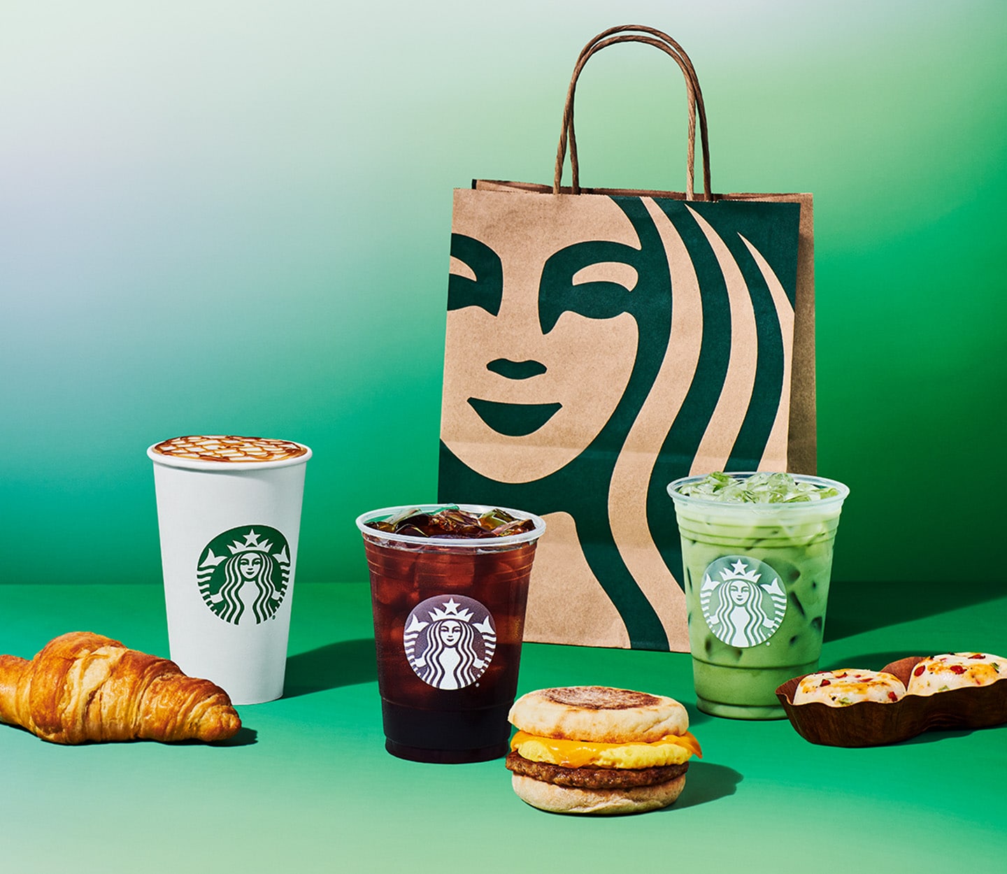
- White: The background and accents in white convey purity and premium quality, positioning Starbucks as a refined, upscale brand. In color psychology, white is often linked to cleanliness and simplicity, reinforcing the idea that Starbucks offers a crisp, unadulterated coffee experience. The contrast between green and white also enhances the logo’s visual impact, making it instantly recognizable.
The combination of these colors creates a harmonious yet dynamic effect, balancing earthiness with elegance. This duality mirrors Starbucks’ broader brand strategy—appealing to both the casual coffee drinker and the discerning consumer seeking specialty beverages.
Cultural Perceptions of the Starbucks Logo Across Regions
The Starbucks logo’s global reach has led to varied cultural interpretations, often shaped by local history, religion, and visual literacy. While the siren remains the central figure, her reception differs significantly across regions:
- United States and Europe: The siren is largely perceived as a modernized mythical figure, stripped of her original Greek connotations of danger. Instead, she is seen as a friendly, approachable symbol of coffee culture. In Europe, the logo’s minimalist 2011 redesign—featuring a simplified siren without tail or hair—was interpreted as a universal, gender-neutral icon, aligning with contemporary design trends that favor inclusivity.
- Japan: The siren’s transformation into a sleek, minimalist emblem resonated with Japan’s appreciation for subtle, high-design aesthetics. However, the original logo’s mermaid imagery occasionally sparked curiosity about its origins, with some consumers associating it with Western fantasy rather than local folklore. Starbucks’ adaptation to Japanese tastes—such as seasonal collaborations and matcha offerings—has helped soften any cultural friction, positioning the brand as a harmonious blend of global and local identity.
- Middle East: The siren’s depiction has occasionally faced scrutiny due to religious and cultural sensitivities surrounding mythical female figures. In regions where depictions of women, especially in non-traditional roles, are restricted, the logo’s modernized form (without visible hair or tail) is more readily accepted. However, the original siren’s dual-tailed design has been misinterpreted in some contexts as a symbol of duality or even rebellion, leading to localized modifications in store signage to avoid controversy.
- Latin America: The logo’s green color palette aligns seamlessly with the region’s coffee-growing heritage, reinforcing Starbucks’ commitment to ethical sourcing. The siren, while less culturally embedded than local folklore, is often viewed as a neutral, aspirational figure—one that represents the global appeal of Latin American coffee.
These regional nuances highlight the importance of cultural adaptability in global branding. Starbucks’ ability to refine its visual identity—while retaining core elements—demonstrates how a single logo can evolve to resonate across diverse markets without losing its essence.
Conceptual Illustration: The Siren’s Transformation Over Time
A conceptual illustration of the Starbucks siren’s evolution would visually map her journey from a detailed, mythical figurehead to a minimalist, modern icon. Below is a descriptive breakdown of key stages in this transformation, suitable for a semantic `
` and `` structure:
1971 (Original Logo):
A classical siren with flowing hair, dual tails, and intricate linework, directly inspired by the Waban schooner’s figurehead. Her pose was dynamic, with one tail wrapped around a coffee cup, symbolizing the fusion of maritime and coffee culture. The design was elaborate, reflecting the craftsmanship of the era.This version emphasized authenticity and heritage, grounding the brand in Seattle’s port history.
1987 (First Modernization):
The siren was simplified, losing her tails and some hair details. The coffee cup was removed, and her form became more abstract and symmetrical. The green color was standardized, and the logo adopted a bold, sans-serif font for the wordmark. This iteration aimed to broaden appeal while retaining recognizable elements.The shift reflected Starbucks’ expansion beyond local coffee shops, adopting a more corporate-friendly aesthetic.
2011 (Minimalist Redesign):
The siren was reduced to her most essential form: a stylized, gender-neutral head with a single, curved tail (reminiscent of a mermaid’s but abstracted). The hair was replaced with two horizontal lines, and the logo was rendered in pure green and white without shading. The wordmark was further simplified, using a clean, geometric typeface.This version prioritized global recognition and digital adaptability, ensuring the logo remained legible on small screens and in diverse cultural contexts.
2023 (Subtle Refinements):
Minor adjustments were made to the siren’s proportions, such as softening the jawline and refining the tail’s curve. The green shade was slightly darker and more saturated, aligning with Starbucks’ emphasis on premium quality and sustainability. The logo’s negative space was optimized for better versatility in merchandise and digital applications.These tweaks reflected ongoing brand maturation, ensuring the logo felt timeless yet contemporary without losing its heritage.
The illustration would visually contrast these stages, using color gradients, line weight, and composition to highlight the progression from complexity to simplicity. Arrows or connecting lines could emphasize the continuity of the siren’s core identity despite her evolving form.
Common Misconceptions About the Starbucks Logo
The Starbucks logo’s iconic status has given rise to several persistent myths, often stemming from misinterpretations of its design intent or historical context. Below is a list of prevalent misconceptions
Typography and Brand Identity in the Starbucks Logo
The Starbucks logo’s typography serves as a visual cornerstone of its brand identity, evolving from a handcrafted script to a sleek, modern wordmark. These typographic choices reflect the company’s dual heritage—rooted in the artisanal tradition of coffee while embracing contemporary design principles. The transition from the original "Starbucks Coffee" script to the minimalist "Starbucks" wordmark exemplifies how typography adapts to market expansion, digital accessibility, and global recognition. Below, the analysis explores the design evolution, functional adaptations, and symbolic significance of Starbucks’ typography across its product lines and international presence.
Design Evolution of Starbucks’ Typographic Elements
The original Starbucks logo (1971–1987) featured a custom script font hand-drawn by graphic designer Gordon Bowker, who sought to evoke the maritime heritage of the original Starbucks Coffee Tea & Spice shop in Seattle. This font combined flowing cursive strokes with a nautical influence, reinforcing the brand’s connection to exploration and craftsmanship. In contrast, the modern sans-serif "Starbucks" wordmark (introduced in 2011) prioritizes clarity, scalability, and digital compatibility, aligning with the company’s global expansion and tech-integrated retail experience.
The shift from script to sans-serif reflects broader design trends in branding, where legibility and adaptability across platforms (e.g., mobile apps, social media, and store signage) became critical. Below is a comparative analysis of the two typographic eras:
Custom sans-serif with geometric precision, optimized for digital and print scalability.
Readability
High in physical retail contexts but challenging at small sizes or on digital screens.
Designed for high legibility across all mediums, including mobile interfaces and storefronts.
Brand Association
Emphasized artisanal, handcrafted, and maritime traditions.
Balances tradition with modernity, signaling a broader lifestyle brand.
Adaptability
Limited to static applications (e.g., store signs, packaging).
Dynamic usage in digital menus, loyalty programs (e.g., Starbucks App), and global signage.
Cultural Context
Reflected Seattle’s bohemian coffee culture and the original shop’s nautical roots.
Universal appeal, designed to transcend regional identity while maintaining brand recognition.
The transition to sans-serif was not merely aesthetic but strategic, addressing the needs of a brand that had expanded beyond coffee into food, merchandise, and digital services. The modern font’s clean lines and open apertures (e.g., in letters like "a" and "e") improve visibility in high-traffic environments, such as drive-thru lanes or airport lounges.
Typography as a Tool for Brand Cohesion Across Product Lines
Starbucks’ typography is dynamically adapted to convey hierarchy and exclusivity while maintaining visual consistency. For example:
The full "Starbucks Coffee" script appears on premium packaging (e.g., whole-bean bags) to reinforce the brand’s heritage and quality.
The simplified "Starbucks" wordmark dominates storefronts and digital interfaces, ensuring instant recognition.
Variations like "Starbucks Reserve" or "Starbucks VIA" use bold, condensed, or italicized versions of the sans-serif font to signal premium tiers or product-specific identities without deviating from the core logo system.
In global markets, typographic adaptations include:
Local language integration: The sans-serif font is reimagined for scripts like Arabic or Chinese, with character spacing and stroke adjustments to preserve legibility and cultural resonance.
Regional product lines: In Japan, the "Starbucks Teahouse" logo incorporates kanji characters within the wordmark’s negative space, blending Eastern and Western design sensibilities.
Limited-edition collaborations: Temporary typographic treatments (e.g., holographic or metallic inks) appear on holiday-themed packaging, aligning with seasonal branding while retaining core font DNA.
These adaptations demonstrate how Starbucks’ typography functions as a modular system, allowing for creativity within strict brand guidelines. The consistency of the sans-serif’s weight, spacing, and alignment ensures that customers worldwide associate the text with the brand, regardless of the specific product or market.
Symbolic Implications of Typographic Simplification
The removal of "Coffee" from the logo in 2011 marked a deliberate rebranding strategy, signaling Starbucks’ evolution into a lifestyle and experience-driven enterprise. This shift was not merely semantic but reflected broader business objectives:
The elimination of "Coffee" from the logo was a visual manifestation of Starbucks’ ambition to transcend its origins as a single-product retailer. By stripping away the product-specific descriptor, the brand positioned itself as a provider of third-places—spaces for social interaction, work, and community—rather than merely a purveyor of beverages. This typographic simplification mirrored the company’s expansion into food, technology (e.g., mobile ordering), and retail partnerships (e.g., grocery stores), where coffee was no longer the sole focus.
The change also addressed global scalability: the shorter "Starbucks" wordmark reduced cognitive load for non-native English speakers and simplified translation challenges. Additionally, the sans-serif’s neutrality allowed the logo to integrate seamlessly into diverse cultural contexts, from the minimalist interiors of Scandinavian stores to the vibrant murals of Latin American locations.
The typographic evolution underscores a key principle of modern branding: flexibility without dilution. Starbucks’ font choices demonstrate how a logo can remain recognizable while adapting to new markets, technologies, and consumer behaviors—proving that effective typography is both a static symbol and a dynamic tool for brand growth.
The Starbucks logo is more than an icon—it is a dynamic canvas that encapsulates the brand’s journey from a single Seattle storefront to a cultural phenomenon. Through its historical reinventions, the logo has consistently communicated Starbucks’ core values: heritage, craftsmanship, and global connectivity. The removal of the siren in 2011 marked not just a visual shift but a strategic pivot toward inclusivity and modernity, while the enduring green-and-white palette remains a testament to the brand’s commitment to freshness and premium quality. As Starbucks continues to expand into new markets and product categories, its logo will remain a pivotal element in reinforcing its identity as a lifestyle brand, proving that effective branding lies in the harmony between tradition and evolution.
FAQ
what is the starbucks logo supposed to be?
Q: What is the Starbucks logo supposed to represent?
:max_bytes(150000):strip_icc()/Myproject-1-94a90a81eb8740c88b766770eac32a23.jpg)

Leave a Comment
Comments are moderated before appearing. The data you submit is processed according to the Privacy Policy of Voltefac.