What Is The Color Of Violet Explained Scientifically And Culturally
Table of Contents
- Scientific Classification of Violet in the Visible Light Spectrum
- Wavelength and Frequency Characteristics of Violet and Adjacent Colors
- Retinal Detection of Violet: Role of Cone and Rod Cells
- Violet’s Position in the Electromagnetic Spectrum: Visual Representation
- Cultural and Historical Perceptions of Violet
- Violet in Ancient Civilizations and Religious Symbolism
- Timeline of Violet’s Cultural Significance
- Comparative Symbolic Interpretations Across Cultures
- Violet in Heraldry vs. Religious Iconography: Visual and Symbolic Contrasts
- Biological and Botanical Sources of Violet Pigments
- Natural Organic Sources of Violet Pigments
- Comparative Analysis: Organic vs. Synthetic Violet Pigments
- Violet in Art and Design: Techniques and Symbolism
- Historical Pigment Mixtures and Evolution of Violet in Famous Paintings
- Digital Design Guide: Creating Vibrant and Muted Violets with RGB/CMYK/Hex Codes
- Color Palette Examples for UI/UX Design
- Violet in Modern Branding: Color Psychology and Industry Applications
- Textile Techniques for Achieving "True Violet": Natural vs. Modern Methods
- Optical Illusions and Perceptual Variations of Violet
- Spectral Power Distribution and Light Source Effects on Violet Perception
- Optical Illusions Involving Violet Perception
- Physiological Factors: Aging and Color Vision Deficiencies
- FAQ
- What color is a violet flower?
- What colors are violet and indigo in the traditional color spectrum?
- What is the color of violet in Hindi?
- What is the opposite color of violet on the color wheel?
- What is the contrast color of violet?
- What is the complementary color of violet?
The color violet occupies a unique position in the visible spectrum, bridging the gap between blue and ultraviolet while carrying profound scientific, cultural, and symbolic significance. From its precise wavelength of 380–450 nanometers—a range that triggers the human eye’s short-wavelength cones—to its historical associations with royalty, spirituality, and mourning across civilizations, violet defies simple classification. This exploration examines its electromagnetic properties, biological origins, artistic applications, and perceptual variations, revealing how a single hue has shaped human perception, technology, and tradition for millennia.
Scientifically, violet’s placement near the ultraviolet spectrum influences its detection by rod cells in low light, while culturally, its meanings have evolved from Tyrian purple’s imperial exclusivity to modern branding’s psychological appeal. Whether in the anthocyanin-rich petals of lavender or the synthetic dyes of digital design, violet’s adaptability underscores its enduring relevance. By dissecting its optical illusions, historical symbolism, and biological synthesis, this analysis uncovers why violet remains a color of both mystery and mastery.

Scientific Classification of Violet in the Visible Light Spectrum
The color violet occupies the shortest wavelength range of the visible light spectrum, marking the transition between human-perceivable light and non-visible ultraviolet (UV) radiation. Its precise classification within the electromagnetic spectrum is determined by wavelength measurements (typically 380–450 nanometers), frequency ranges (640–790 terahertz), and its interaction with photoreceptor cells in the human retina. Understanding violet’s position requires examining its spectral boundaries, adjacent colors (indigo and blue), and the physiological mechanisms enabling its detection, including the role of short-wavelength cones and rod cells in varying light conditions.
Violet’s placement in the spectrum is critical for fields such as optics, astronomy, and color science, where distinctions between visible and non-visible light influence applications like UV imaging, fluorescence studies, and human vision research. Below, the spectral properties of violet are analyzed alongside adjacent colors, followed by an exploration of retinal photoreception and the electromagnetic spectrum’s broader context.
Wavelength and Frequency Characteristics of Violet and Adjacent Colors
Violet light spans wavelengths from approximately 380 nm to 450 nm, bridging the gap between the visible spectrum and ultraviolet (UV) radiation (below 380 nm). Its frequency range (640–790 THz) corresponds inversely to its wavelength, with shorter wavelengths (e.g., 380 nm) exhibiting higher frequencies than longer wavelengths (e.g., 450 nm). The table below compares violet with indigo, blue, and ultraviolet, highlighting their wavelength ranges, frequency bands, and perceived brightness as measured in candela per square meter (cd/m²) under standard illuminants.Key Relationships:
Wavelength (λ) and Frequency (f): \( c = λ \times f \), where \( c \) is the speed of light (~3 × 10⁸ m/s). Brightness Perception: Short-wavelength light (violet/indigo) appears dimmer to the human eye than mid-spectrum colors (e.g., green) due to lower luminous efficiency.
| Color | Wavelength Range (nm) | Frequency Range (THz) | Perceived Brightness (cd/m² at 1 W/m²) | Photoreceptor Sensitivity (Peak) |
|---|---|---|---|---|
| Ultraviolet (Non-visible) | 10–380 | 790–3,000+ | 0 (invisible to humans) | Rod cells (scotopic vision); some S-cones (300–400 nm) |
| Violet | 380–450 | 640–790 | 0.03–0.1 (low luminous efficiency) | Short-wavelength (S) cones (peak ~420 nm) |
| Indigo | 420–490 | 610–710 | 0.05–0.2 | S-cones and M-cones (overlap) |
| Blue | 450–495 | 605–670 | 0.2–0.4 | S-cones and M-cones (peak ~440 nm) |
Retinal Detection of Violet: Role of Cone and Rod Cells
The human eye detects violet primarily through short-wavelength (S) cones, a subset of photoreceptor cells specialized for sensing light in the 400–490 nm range. These cones are most sensitive at ~420 nm, aligning with violet’s peak wavelength. However, their sensitivity declines rapidly at shorter wavelengths (approaching UV), contributing to violet’s perception as dimmer than longer-wavelength colors like blue or green.In low-light conditions, rod cells—responsible for scotopic vision—supplement cone activity. While rods lack color discrimination, they are highly sensitive to violet and blue light due to their spectral response curve (peak ~498 nm). This explains why violet hues may appear faint or washed out in dim lighting, as rod-mediated vision dominates and reduces chromatic fidelity.
Photoreceptor Contributions to Violet Perception:Contextual Factors Affecting Violet Detection:
S-cones (3–5% of cones): Dominate violet detection; sensitive but sparse (~6–7 million per retina). M/L-cones (medium/long-wavelength): Contribute minimally to violet perception but enable color contrast (e.g., violet vs. yellow). Rods (120 million per retina): Enhance violet visibility in scotopic conditions but suppress hue accuracy.
Violet’s Position in the Electromagnetic Spectrum: Visual Representation
To illustrate violet’s placement, a diagrammatic representation of the electromagnetic spectrum would segment the following regions with labeled transitions:1. Non-Visible Ultraviolet (UV):
2. Visible Spectrum (380–750 nm):
3. Non-Visible Infrared (IR):
Diagram Annotations:
Example of Spectral Overlap:
Cultural and Historical Perceptions of Violet
The color violet has transcended its position in the visible light spectrum to become a potent symbol in human history, intertwined with spirituality, power, and societal norms. Ancient civilizations attributed mystical and divine qualities to violet, embedding it in religious iconography, royal heraldry, and cultural rituals. Its perceptual significance evolved across civilizations, reflecting shifts in technological, artistic, and philosophical paradigms. Below, the cultural and symbolic interpretations of violet are examined through historical artifacts, textual references, and comparative analyses across civilizations.Violet in Ancient Civilizations and Religious Symbolism
In ancient Egypt, violet was associated with the goddess Hathor, patron of love, music, and joy, whose cult often incorporated lapis lazuli—a deep blue-violet mineral—into jewelry and temple decorations. The Book of the Dead (c. 1550 BCE) describes the "violet lotus" (Nymphaea caerulea), a flower linked to rebirth and the afterlife, suggesting its use in funerary rites. Archaeological evidence, such as the Tutankhamun’s burial mask (1323 BCE), features lapis lazuli inlays, reinforcing violet’s connection to divine authority and immortality.The Romans adopted violet from Greek traditions, where it symbolized Bacchus, the god of wine and ecstasy, and Dionysus in Greek mythology. Pliny the Elder (Naturalis Historia, 1st century CE) documented the use of orchil dye, derived from lichens, to produce purple-violet hues for elite garments, reserving it for senators and emperors. The Purple Robe of Imperial Authority (e.g., the Toga Praetexta) incorporated this color to signify power, a practice later mirrored in Byzantine imperial regalia.
In Hinduism, violet (nīlām) is linked to Lord Shiva, representing transcendence and the third eye (Ajna chakra). The Rigveda (c. 1500 BCE) describes Indra’s violet-hued chariot, symbolizing cosmic energy. Meanwhile, Buddhist iconography in Tibet and Nepal often depicts Avalokiteshvara (the Bodhisattva of Compassion) adorned in violet robes, signifying spiritual enlightenment and divine mercy.
Timeline of Violet’s Cultural Significance
Ancient Mesopotamia (3000–500 BCE)
Violet pigments from manganese-rich minerals were used in Sumerian cylinder seals and Assyrian palace murals, often depicting gods like Inanna (Ishtar) in regal violet attire. The color denoted royalty and divine favor.
Classical Greece and Rome (500 BCE–500 CE)
The Tyrian purple (derived from Murex sea snails) dominated elite fashion, with violet hues reserved for the upper class. Roman poets like Ovid (Metamorphoses) associated violet with Venus, goddess of love, while Christian hymns later adopted it for depictions of the Virgin Mary’s mantle.
Medieval Europe (500–1500 CE)
Violet declined in secular use due to the Church’s association with penance (e.g., violet vestments during Lent). However, heraldic violet (a dark purple) emerged in coats of arms, symbolizing nobility and justice. The Violet Cross of the Knights Templar reflected their mystical and protective roles.
Renaissance and Baroque (1500–1800 CE)
Artists like Titian and Rubens used violet in sfumato techniques to convey depth and divinity, as seen in The Assumption of the Virgin (1516–1518). The Violet Order of the Garter (founded 1348) cemented its link to British monarchy, while alchemists (e.g., Paracelsus) linked violet to spiritual purification.
Victorian Era (1837–1901 CE)
Violet became a mourning color in China, influenced by Confucian funeral customs, while in Europe, it symbolized creativity and intuition in the Theosophical Movement. Queen Victoria’s violet mourning dress (post-Prince Albert’s death) popularized its association with grief, contrasting with earlier royal connotations.
Modern Era (20th–21st Century)
Psychological studies (e.g., Max Lüscher’s color tests) classify violet as representing intuition and spirituality, while corporate branding (e.g., Cadbury’s purple) leverages its perceived luxury. Meanwhile, LGBTQ+ pride flags incorporate violet to honor sexual revolution symbols from the 1970s.
Comparative Symbolic Interpretations Across Cultures
Psychological and Spiritual Associations
China: Violet (zǐ sè) in funerary textiles symbolized mourning and ancestral connection, as documented in The Book of Rites (4th century BCE). Hinduism: The third eye chakra (Ajna) is visualized as violet, linking it to intuition and psychic awareness (e.g., Yoga Sutras of Patanjali, 2nd century CE). Western Esotericism: The Hermetic Order of the Golden Dawn (19th century) associated violet with the crown chakra, representing divine union.
Contrasting Royal and Religious UsesViolet’s duality—simultaneously sacred and secular—demonstrates its adaptability. While heraldic violet embodied terrestrial authority, religious depictions elevated it to cosmic significance, a tension resolved only by its contextual interpretation.
Context Violet Attribute Description Cultural Example Heraldry Deep, matte purple with metallic sheen (e.g., Royal Purple). French Royal Arms: Fleurs-de-lis on violet field (symbolizing justice). Christian Iconography Soft, iridescent violet (e.g., Mary’s robe in Byzantine mosaics). Hagia Sophia: Violet tiles in the Deësis mosaic (13th century). Islamic Art Muted violet in Arabesque patterns, avoiding anthropomorphism. Alhambra’s Court of the Lions: Violet stucco in geometric designs. Japanese Aesthetics Pale violet (murasaki) in ukiyo-e prints, evoking melancholy. Hokusai’s The Dream of the Fisherman’s Wife (1814): Violet waves symbolizing illusion.
Violet in Heraldry vs. Religious Iconography: Visual and Symbolic Contrasts
Heraldic violet, standardized in the 12th century, prioritizes durability and visibility, often rendered as a dark, opaque purple with metallic undertones (e.g., the Purple Heart medal). In contrast, religious iconography favors luminous, semi-transparent hues to evoke divine radiance, as seen in Byzantine mosaics where violet gold leaf creates an ethereal glow.Key Differences in RepresentationThe intensity gradient—from royal purple (heraldry) to pastel lilac (folk art)—reflects cultural priorities: earthly power versus spiritual transcendence. This dichotomy persists in modern design, where violet’s shade spectrum continues to encode hierarchical and symbolic meanings.
Heraldry: Geometric precision, flat tinctures (e.g., violet on silver in the Arms of the House of Savoy). Iconography: Chiaroscuro techniques (e.g., Rembrandt’s The Night Watch’s violet shadows) to convey emotion. Textile Arts: Persian carpets (e.g., Ardabil Rug, 16th century) use violet indigo for spiritual protection, while European tapestries (e.g., Bayeux Tapestry) employ it for noble lineage.
Biological and Botanical Sources of Violet Pigments
Violet pigments in nature arise from diverse biochemical pathways, ranging from plant-based anthocyanins to specialized animal-derived compounds like Tyrian purple. These pigments exhibit structural and functional variations, influencing their color intensity, stability, and ecological roles. While organic sources rely on natural biosynthesis, synthetic violet dyes—often derived from manganese or organic heterocycles—mimic or enhance these hues through engineered chemical structures. The interplay between pigment chemistry, environmental factors (e.g., pH, light exposure), and biological masking (e.g., chlorophyll interference) determines whether a plant appears violet, purple, or another shade in the spectrum.The extraction and application of these pigments reflect both historical trade practices and modern industrial processes, with stability and scalability differing markedly between natural and synthetic sources. Below, the chemical foundations of violet pigments are examined, followed by a comparative analysis of organic versus synthetic production methods. The role of metabolic pathways in non-plant organisms—such as mollusks and bacteria—is also explored, highlighting evolutionary adaptations for pigment synthesis.
Natural Organic Sources of Violet Pigments
Violet hues in plants primarily originate from anthocyanins, a subclass of flavonoids that absorb light in the green-yellow spectrum while reflecting violet-blue wavelengths. However, the perceived color often results from a combination of anthocyanins and other pigments (e.g., carotenoids, chlorophyll), where masking effects dominate. For instance, lavender (Lavandula spp.) derives its violet-blue tones from 6-hydroxyluteolin and apigenin glycosides, while orchids (e.g., Phalaenopsis spp.) produce pelargonidin-3-glucoside derivatives, which shift color based on pH gradients in vacuoles.Beyond anthocyanins, indigo—a historically significant blue-violet dye—is synthesized via microbial fermentation of Indigofera tinctoria leaves, yielding indoxyl precursors that oxidize to form insoluble indigo particles. Similarly, murex snails (Bolinus brandaris) biosynthesize 6,6′-dibromoindigotin (Tyrian purple) through a multi-step enzymatic pathway involving tyrosine metabolism and bromination, a process requiring high energy investment and rare in nature.
Key organic violet pigment sources and their chemical basis:
-
Anthocyanin-rich plants:
- Lavender (Lavandula angustifolia): 6-Hydroxyluteolin-7-O-glucoside (absorbs ~530 nm, reflects violet-blue).
- African violet (Saintpaulia ionantha): Delphinidin-based anthocyanins (pH-sensitive, shifts from red to violet at alkaline pH).
- Grape skins (Vitis vinifera): Malvidin-3-O-glucoside (responsible for wine’s violet hues; absorbs ~520–540 nm).
-
Microbial and animal-derived pigments:
- Indigo (Indigofera spp.): Indoxyl oxidized to indigo (λmax ~600 nm; historically used in textiles).
- Tyrian purple (murex snails): 6,6′-Dibromoindigotin (λmax ~560 nm; requires ~10,000 snails to produce 1.4 g).
- Purple bacteria (e.g., Chromatium spp.): Bacteriochlorophyll c (absorbs infrared but reflects violet in thin layers).
This explains why hydrangea flowers appear violet in alkaline soils but pink in acidic conditions.At acidic pH (pH < 3): Anthocyanins exist as flavylium cations (red-orange).
At neutral pH (pH ~7): Convert to quinoidal bases (violet-blue).
At alkaline pH (pH > 9): Form carbinol bases (colorless or yellow).
Comparative Analysis: Organic vs. Synthetic Violet Pigments
While organic violet pigments are biologically derived and often pH/labile, synthetic dyes are engineered for stability, consistency, and cost-efficiency. Below is a comparative table highlighting key differences:| Category | Source | Extraction/Production Method | Key Pigment(s) | Stability | Ecological/Safety Notes |
|---|---|---|---|---|---|
| Organic | Lavender | Solvent extraction (ethanol/hexane) of flowers; steam distillation for essential oils. | 6-Hydroxyluteolin, apigenin glycosides. | Moderate; degrades under UV/oxidation. | Non-toxic; used in cosmetics/food (E161b). |
| Indigo plants | Fermentation of Indigofera leaves; reduction to leuco-indigo for dyeing. | Indoxyl → indigo (C16H10N2O2). | High when oxidized; soluble leuco-form unstable. | Biodegradable but historically linked to labor-intensive harvest. | |
| Murex snails | Manual collection; enzymatic oxidation of tyrosine precursors. | 6,6′-Dibromoindigotin (C16H8Br2N2O2). | Extremely stable in solid form; rare in nature. | Non-renewable; modern synthesis replicates structure. | |
| Synthetic | Manganese violet | Precipitation of manganese(II) salts with phosphates/silicates. | Manganese pyrophosphate (MnP2O7). | High; resistant to light/heat. | Toxic if inhaled; restricted in food applications. |
| Dioxazine violet | Condensation of 3-amino-9-ethylcarbazole with formaldehyde. | C18H12N2O2 (e.g., Pigment Violet 23). | Excellent lightfastness; used in plastics/inks. | Potential carcinogenic impurities; regulated under REACH. | |
| Alizarin-based violets | Sulfonic acid modification of anthraquinone. | C14H8O3 derivatives (e.g., Pigment Violet 19). | Good stability; pH-sensitive in solution. | Historically derived from madder root; synthetic versions avoid ecological harm. |
-
<
- Lapis lazuli (ultramarine) + red ochre → Muted earthy violets (pre-15th century).
- Cobalt blue + cadmium red → Vibrant, stable violets (18th–19th century).
- Alizarin crimson + ultramarine → Deep, translucent violets (19th century).
- Manganese violet → Highly saturated, synthetic (late 19th century).
- Dioxazine purple → Ultra-modern, lightfast (20th century onward).
- Vibrant violet (#9D00FF, RGB: 157,0,255) → Creativity, innovation (tech startups).
- Muted violet (#6A5ACD, RGB: 106,90,205) → Trust, reliability (financial services).
- Pastel violet (#D8BFD8, RGB: 216,191,216) → Nostalgia, softness (wellness apps).
- Increase saturation (vibrancy): Boost RGB red/green values (e.g., #9D00FF → #B500FF).
- Desaturate (mute): Add gray (e.g., #6A5ACD → #7B6888 by averaging RGB components).
- Shift toward blue/purple: Reduce red channel (e.g., #8B00FF → #6A00FF).
- Shift toward magenta: Increase red channel (e.g., #8B00FF → #FF00FF).
- Contrast Checkers: WebAIM Contrast Checker (WCAG compliance).
- Color Blindness Simulators: Color Oracle (test for protanopia, deuteranopia, tritanopia).
- Design Software: Adobe Color’s "Accessibility" panel (Photoshop/Illustrator).
- Luxury: Opulence, rarity (e.g., Chanel’s "No. 5" packaging).
- Tech: Innovation, digital connectivity (e.g., Slack’s purple accents).
- Wellness: Calm, spiritual alignment (e.g., Calm app’s color scheme).
- Creative Fields: Originality, artistic expression (e.g., Pinterest’s logo).
- Cadbury (Purple Wrapper): Evokes nostalgia and indulgence (UK market).
- Hallmark (Purple Logo): Associated with sentimentality and gifts.
- Yahoo! (Original Purple Logo): Symbolized playfulness and energy (1990s).
- Incandescent lighting (2700–3000K): Emits a broad spectrum with peak energy in the red-orange region, suppressing violet’s visibility due to lower blue-violet output. Violet objects may appear desaturated or tinged with purple-brown.
- LED lighting (3000–5000K): Often lacks full-spectrum output, with some LEDs emitting narrowband peaks that can exaggerate or distort violet hues. High-CRI (Color Rendering Index) LEDs mitigate this but may still introduce metamerism.
- Natural sunlight (5000–6500K): Provides a near-continuous spectrum, preserving violet’s true hue but potentially increasing its perceived brightness due to higher blue-violet energy.
- Fluorescent lighting (4000–4200K): May emit spikes in specific wavelengths (e.g., mercury lines at 404.7 nm and 435.8 nm), causing violet to appear more cyan or neon-like under certain conditions.
- Peak wavelength dominance: Light sources with strong emissions in the 400–450 nm range (e.g., some UV LEDs) amplify violet saturation, while those deficient in this band (e.g., low-CRI LEDs) mute it.
- Spectral gaps: Missing or attenuated regions in the SPD (e.g., around 420 nm) can induce metameric mismatches, where violet appears differently under two light sources despite identical x,y coordinates.
- Purkinje shift: Under low-light conditions (scotopic vision), the eye’s sensitivity peaks at ~505 nm, reducing violet’s visibility relative to green-yellow hues.
- Complementary contrast (violet + yellow): A violet patch adjacent to yellow will appear more saturated and slightly shifted toward blue due to the opponent-process mechanism’s suppression of yellow-cone signals.
- Assimilation (violet + gray): When violet is embedded in a gray background, it may appear less saturated as the surrounding neutral tones "pull" its hue toward the background’s perceived chroma.
- Chevreul’s illusion: Violet edges adjacent to higher-contrast colors (e.g., red or green) will appear to "bleed" or shift in hue due to lateral inhibition in retinal ganglion cells.
- Negative afterimage: Staring at a bright violet object and then fixating on a white surface will produce a greenish-yellow afterimage, reflecting the opponent-process nature of cone fatigue.
- McCollough effect: Viewing violet gratings under polarized light followed by neutral gratings can create persistent color aftereffects, where violet is perceived as tinged with its complement (yellow-green).
-
Simultaneous contrast with complementary colors:
- Place a violet square on a yellow background. The violet will appear bluer and more saturated due to the suppression of yellow-cone signals.
- Surround violet with red; it may appear slightly greenish due to the red-green opponent channel’s interaction.
- Adjacent to white, violet may desaturate as the brain "averages" the contrast ratio.
-
Assimilation effects:
- Embed violet in a textured gray field. The texture’s micro-contrasts can make the violet appear less uniform or slightly shifted toward the gray’s undertone.
- Violet patterns on a dark background may appear lighter at edges due to edge enhancement by retinal neurons.
-
Afterimage and adaptation effects:
- Fixate on a violet LED for 30 seconds, then view a white screen. The afterimage will be greenish-yellow, demonstrating cone fatigue in the blue-yellow channel.
- Alternate gaze between violet and a neutral gray. The gray will temporarily appear tinged with violet’s complement (yellow-green).
-
Metameric mismatches in mixed lighting:
- Photograph a violet object under daylight (5500K) and incandescent (2700K). The LED display may render the daylight image as overly saturated violet, while the incandescent image appears muted.
- Print a violet swatch under D50 simulator lighting; it may shift toward magenta under a warm-toned LED monitor.
- Lens yellowing: The human lens gradually yellows with age (a process called "lenticular sclerosis"), absorbing short wavelengths (including violet/blue) more efficiently. This reduces violet contrast and can cause it to appear more brownish or desaturated.
- Reduced rod/cone sensitivity: Scotopic (rod-mediated) vision declines with age, impairing violet detection in low-light conditions. Photopic (cone-mediated) sensitivity also shifts, with L-cones (red) becoming relatively more dominant.
- Pupil size reduction: Smaller pupils in older adults limit the amount of light entering the eye, further attenuating violet perception.
- Protanopia (red-cone absence): Violet appears greenish-yellow due to the absence of L-cone input, collapsing the red-green axis. Saturation is reduced as the remaining S-cones (blue) and M-cones (green) cannot fully distinguish violet from blue-green.
- Deuteranopia (green-cone absence): Violet retains some blue hue but may appear darker or muddier, as the missing M-cone signals reduce the contrast between violet and blue.
- Tritanopia (blue-cone absence): Violet is perceived as a shade of gray or pale yellow, as the S-cones (responsible for blue-violet detection) are nonfunctional. This condition is rare (~0.0001% of males) but
Violet emerges from this examination as more than a color—it is a convergence of physics, biology, and human ingenuity. Its scientific precision as the shortest visible wavelength contrasts with its fluid cultural interpretations, from ancient Egyptian deities to contemporary UI/UX palettes. Whether perceived as a luminous hue under sunlight or a muted tone in artificial lighting, violet’s adaptability reflects its dual nature: a measurable phenomenon and a deeply symbolic force. As technology and art continue to redefine its applications, violet’s legacy persists as a testament to how a single spectral band can transcend disciplines, bridging the tangible and the intangible in ways no other color achieves.
Violet in Art and Design: Techniques and Symbolism
The color violet has long been a pivotal yet elusive hue in art and design, occupying a unique position between the warmth of red and the coolness of blue. Historically, its rarity and the complexity of its creation influenced its symbolic weight—from divine associations in medieval iconography to psychological depth in modern branding. Artists and designers have employed diverse techniques to capture violet’s spectrum, balancing tradition with technological innovation. This section explores the evolution of violet pigments in classical and contemporary art, practical methods for achieving its variations in digital and textile applications, and its strategic deployment in branding to evoke specific emotional and cultural responses.Historical Pigment Mixtures and Evolution of Violet in Famous Paintings
The synthesis of violet relied heavily on the availability of primary pigments, with early artists achieving the hue through careful blending rather than pre-mixed commercial paints. Ultramarine blue, derived from lapis lazuli, was a foundational component, often combined with red ochre or vermilion to produce muted violets. Cobalt blue, introduced in the 18th century, offered a more stable alternative, while alizarin crimson (a synthetic dye) later enabled brighter, more saturated violets in the 19th century. These mixtures were refined over centuries, as seen in the works of Jan van Eyck, who used lake pigments (organic dyes bound to a base) to create subtle violet shadows in The Arnolfini Portrait (1434).The Impressionist movement marked a turning point, with artists like Claude Monet employing optical mixing—applying adjacent strokes of blue and red to create violet in the viewer’s eye. Monet’s Water Lilies series (1897–1926) exemplifies this technique, where cobalt violet and manganese violet (a synthetic pigment introduced in the 1860s) were layered to evoke twilight and floral hues. The Post-Impressionists, including Vincent van Gogh, further experimented with chromatic intensity, using dioxazine purple (a modern synthetic) in Starry Night (1889) to convey emotional turbulence.
Key Historical Violet Pigments:
Digital Design Guide: Creating Vibrant and Muted Violets with RGB/CMYK/Hex Codes
In digital design, violet’s versatility is amplified by precise color models, allowing for customization across UI/UX, branding, and multimedia. The RGB (red-green-blue) and CMYK (cyan-magenta-yellow-key) systems, along with Hex codes, provide frameworks for achieving both vibrant (high saturation) and muted (low saturation) violets. Accessibility considerations—such as contrast ratios for text readability and color blindness simulation—are critical in modern design.Vibrant violets (e.g., electric or neon hues) are ideal for call-to-action buttons or accent elements, while muted violets (e.g., pastel or desaturated) enhance calm, professional aesthetics in corporate interfaces. Below are structured palettes with technical specifications:
Color Psychology in Digital Violet:
Color Palette Examples for UI/UX Design
Table 1: Violet-Based Palettes with Accessibility Metrics| Use Case | Primary Violet (Hex/RGB) | Secondary Violet (Hex/RGB) | Contrast Ratio (WCAG AA) | Color Blindness Simulation |
|---|---|---|---|---|
| Tech Dashboard | #6E48AA (RGB: 110,72,170) | #9370DB (RGB: 147,112,219) | 7.1:1 (text) | Passes deuteranopia/tritanopia tests |
| Wellness App | #B19CD9 (RGB: 177,156,217) | #DDA0DD (RGB: 221,160,221) | 4.5:1 (text) | Reduced confusion for protanopia |
| Luxury Branding | #4B0082 (RGB: 75,0,130) | #8A2BE2 (RGB: 138,43,226) | 8.3:1 (text) | High contrast for readability |
Accessibility Tools for Violet Palettes:
Violet in Modern Branding: Color Psychology and Industry Applications
Violet’s symbolic flexibility makes it a strategic choice in branding, where it is deployed to evoke luxury, spirituality, or innovation depending on the target audience. In the luxury sector, deep violets (e.g., #4B0082) signal exclusivity and sophistication, as seen in Dior’s "J’adore" perfume branding. Conversely, tech companies (e.g., Microsoft’s "Violet" branding) use lighter violets (#B19CD9) to convey creativity and futurism. The wellness industry leverages muted violets (#8A2BE2) to promote relaxation and intuition, aligning with color psychology studies linking violet to meditation and healing.Industry-Specific Violet Associations:
Case Study: Violet in Corporate Branding
Textile Techniques for Achieving "True Violet": Natural vs. Modern Methods
The pursuit of "true violet"—a hue perceived as pure on the visible spectrum—has driven advancements in textile dyeing, from ancient natural processes to contemporary synthetic innovations. Natural indigo (Indigofera tinctoria), when overdyed with madder root (a red dye), produces a muted violet, as practiced in Japanese Aizome techniques. However, these methods are labor-intensive and prone to fading due to light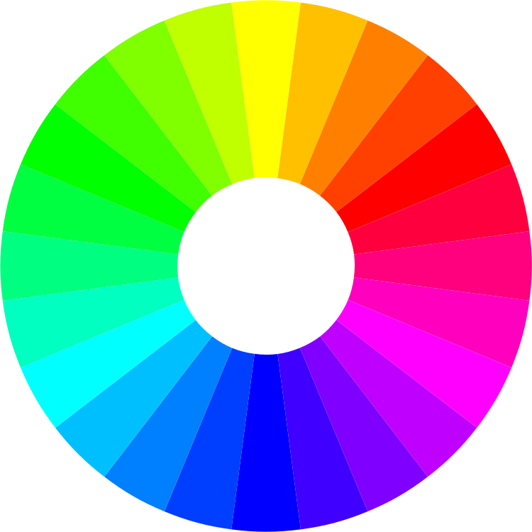
Optical Illusions and Perceptual Variations of Violet
Violet occupies a unique position in the visible light spectrum, bridging the gap between blue and ultraviolet wavelengths (approximately 380–450 nm). Its perception, however, is highly dynamic and susceptible to environmental, physiological, and contextual factors. Variations in light sources, color interactions, and individual visual impairments can drastically alter how violet appears, leading to discrepancies between objective measurement and subjective experience. Understanding these phenomena is critical for fields ranging from photography and design to neurology and color science, where precision in color rendering is essential.The perception of violet is influenced by the spectral power distribution (SPD) of light sources, which dictates the relative intensity of wavelengths emitted or reflected. Under different illumination conditions—such as incandescent, LED, or natural sunlight—the same violet object may exhibit shifts in hue, saturation, or brightness due to metamerism and color temperature effects. Additionally, optical illusions exploit the human visual system’s limitations, creating perceptual distortions when violet is paired with complementary or adjacent colors. Physiological factors, including aging and color vision deficiencies, further complicate violet perception by altering cone sensitivity and neural processing.
Spectral Power Distribution and Light Source Effects on Violet Perception
The appearance of violet is highly dependent on the spectral composition of the illuminating light source, as the human eye’s trichromatic system (S, M, L cones) integrates signals across a broad range of wavelengths. Color temperature (measured in Kelvin) and correlated color temperature (CCT) influence how violet is rendered, with cooler light sources (e.g., daylight at ~6500K) enhancing its saturation, while warmer sources (e.g., incandescent at ~2700K) may mute it toward magenta or brownish tones.Spectral power distribution (SPD) variations across light sources create metameric effects, where two objects with identical tristimulus values (e.g., CIE 1931 x,y coordinates) appear different under distinct SPDs. For example:
Key SPD characteristics affecting violet:
Optical Illusions Involving Violet Perception
The human visual system relies on contextual cues and lateral inhibition to interpret color, making violet susceptible to illusions that exploit contrast, afterimages, and assimilation effects. These phenomena arise from interactions between the retina’s opponent-process cells (red-green and blue-yellow channels) and the cortex’s perceptual grouping mechanisms.Simultaneous contrast illusions occur when a violet stimulus is surrounded by complementary or adjacent colors, altering its perceived hue or brightness. For example:
Afterimages and negative color effects demonstrate how prolonged exposure to violet can induce temporary perceptual distortions:
Structured breakdown of violet-related illusions:
Physiological Factors: Aging and Color Vision Deficiencies
Violet perception deteriorates with age and is significantly altered in individuals with color vision deficiencies (CVDs), primarily due to changes in lens transmission, photoreceptor sensitivity, and neural processing.Aging effects on violet perception:
Color vision deficiencies and violet perception:
Individuals with dichromatic or anomalous trichromacy experience systematic shifts in violet hue and saturation. The most relevant CVDs affecting violet are:
FAQ
What color is a violet flower?
Violet flowers typically range from light lavender (a pale, soft purple) to deep, rich purple with hints of blue or red. The exact shade depends on the species—some, like sweet violets, lean toward pale blue-purple, while others, like African violets, are darker.
What colors are violet and indigo in the traditional color spectrum?
In the ROYGBIV (rainbow) spectrum, violet is the deepest purple-blue hue at the end of the visible light range, while indigo is a dark blue-purple, often described as a slightly less intense violet with more blue dominance. Modern color models often merge indigo and violet, but traditionally, indigo is darker and closer to blue.
What is the color of violet in Hindi?
The color violet in Hindi is called "बैगनी" (baigani) for lighter shades and "जामुनी" (jaamuni) for deeper, bluish-purple tones (like grape or plum). "लाइलाक" (lailaak) can also refer to pale violet/lilac.
What is the opposite color of violet on the color wheel?
The direct opposite (complementary) color of violet is yellow-green (a mix of yellow and a touch of blue to balance violet’s warmth). However, if referring to "opposite" in terms of emotional contrast, some associate violet with mystery/spirituality and its "opposite" as bold, bright colors like orange or red.
What is the contrast color of violet?
The high-contrast color for violet is typically yellow (especially bright lemon yellow), as they sit opposite each other on the color wheel. For visual accessibility (e.g., text), a yellow-green or chartreuse works best to ensure readability against violet backgrounds.
What is the complementary color of violet?
The complementary color of violet is yellow-green (a shade between yellow and green, often described as lime or spring green). This pairing creates maximum contrast and visual balance, as complementary colors sit directly opposite each other on the 12-step color wheel.
Leave a Comment
Comments are moderated before appearing. The data you submit is processed according to the Privacy Policy of Voltefac.