What Color Goes With Grey Mastering Versatile Pairings
Table of Contents
- Color Theory Fundamentals for Grey Pairings
- Grey’s Role in Temperature Balance
- Light Grey vs. Dark Grey: Complementary Pairings and Use Cases
- Visual Hierarchy of Grey Tones and Harmonic Mappings
- Psychological and Cultural Associations of Grey with Other Colors
- Cultural Symbolism of Grey in Color Pairings
- Emotional Impact of Grey Pairings: Warm vs. Cool Tones
- Psychological Studies on Grey’s Role in Emotional Perception
- Grey + Color Pairings in Cultural and Architectural Contexts
- Practical Applications: Grey in Interior Design and Fashion
- Grey in Interior Design: Room-Specific Pairings
- Grey in Fashion: Mood Board Descriptions and Trending Pairings
- Technical Breakdown: Undertones and Lighting Effects in Grey Pairings
- Undertone Classification and Color Pairing Compatibility
- Lighting Effects on Grey Perception and Pairing Dynamics
- Workflow for Testing Grey Pairings Under Variable Lighting
- FAQ
- What color pairs best with grey pants for a stylish outfit?
- What colors go well with grey shorts for a casual outfit?
- What colors complement grey jeans the most?
- What colors should I paint to go with grey walls?
- What colors look best with grey pants for women’s fashion?
- What colors match well with grey sweatpants for a comfortable outfit?
Grey’s timeless neutrality makes it a cornerstone of modern design, yet its pairing potential extends far beyond monochrome simplicity. As an achromatic or chromatic foundation, grey bridges warm and cool palettes, offering flexibility in aesthetics—from minimalist interiors to bold fashion statements. Understanding its undertones, cultural symbolism, and technical interactions with lighting reveals how grey can elevate any color scheme, transforming spaces and outfits with subtle yet impactful harmony.
The key to harmonious grey combinations lies in balancing its inherent versatility with deliberate contrast or complementarity. Whether in interior design—where charcoal pairs with emerald for luxury or light grey softens teal’s intensity—or in fashion, where smoky grey harmonizes with blush pink, the interplay between grey’s undertones and surrounding hues dictates the final perception. This exploration dissects the science, psychology, and practical applications behind grey’s dynamic pairings, ensuring readers can confidently select colors that align with intent—whether evoking sophistication, warmth, or contemporary edge.

Color Theory Fundamentals for Grey Pairings
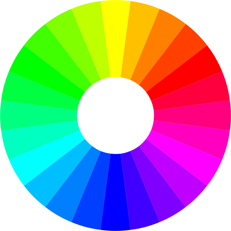
Grey occupies a unique position in color theory as an achromatic neutral, serving as a bridge between pure hues and monochromatic schemes. Its versatility stems from its ability to absorb and reflect light uniformly across the visible spectrum, making it a temperature modulator—capable of enhancing warmth or coolness in adjacent colors without overpowering them. Unlike true neutrals (white or black), grey contains subtle undertones (e.g., taupe, blue, or green), which dictate its harmonic potential. These undertones influence whether grey leans toward warm analogies (e.g., terracotta, mustard) or cool contrasts (e.g., teal, lavender), aligning with the 12-part color wheel where grey functions as a saturation reducer for chromatic neighbors.Grey’s position on the wheel is contextual: achromatic grey (equal RGB values) sits outside traditional hue circles, while chromatic grey (e.g., desaturated blues or greens) integrates into the wheel as muted versions of their parent hues. This duality explains why grey pairs seamlessly with both complementary (opposite hues) and analogous (adjacent hues) schemes—acting as a harmonic stabilizer in dynamic palettes.
Grey’s Role in Temperature Balance
Grey’s temperature (warm/cool) is determined by its undertones and lightness level. Warm grey (e.g., greige with beige undertones) harmonizes with earthy tones, while cool grey (e.g., slate with blue undertones) complements icy or pastel hues. This balance is critical in color psychology, where grey can neutralize aggressive colors (e.g., pairing coral with charcoal to reduce visual tension) or amplify subtle hues (e.g., pairing lavender with light grey to create a serene palette).The 60-30-10 rule in design often employs grey as the 60% dominant background, with complementary colors occupying 30% and accent hues 10%. Grey’s adaptability extends to monochromatic schemes, where varying its saturation (e.g., from off-white to black) creates depth without relying on contrast.
Light Grey vs. Dark Grey: Complementary Pairings and Use Cases
The following table categorizes grey shades by lightness, temperature, and ideal pairings, derived from Pantone’s Color Institute and Adobe Color Theory guidelines. Pairings are selected based on luminance harmony (similar brightness levels) and undertone resonance (shared spectral properties).| Grey Shade | Temperature | Best Complementary Colors | Use Case Examples |
|---|---|---|---|
| Light Grey (e.g., 90% white) | Cool (blue undertone) or Warm (beige undertone) |
|
|
| Medium Grey (e.g., 50% grey) | Neutral or Slightly Warm/Cool |
|
|
| Dark Grey (e.g., Charcoal, 20% white) | Cool (blue undertone) or Warm (taupe undertone) |
|
|
| Near-Black Grey (e.g., 10% white) | Neutral or Slightly Warm |
|
|
Visual Hierarchy of Grey Tones and Harmonic Mappings
Grey’s tonal range—from near-white (98% luminance) to near-black (2% luminance)—creates a gradient of perceptual weight. The following hierarchy illustrates dominant harmonious colors for each grey category, based on CIELAB color space principles (where L = lightness, a = green-red axis, b = blue-yellow axis):1. Ultra-Light Grey (L: 90–100)
2. Light Grey (L: 70–80)
3. Medium Grey (L: 50–60)
4. Dark Grey (L:
Psychological and Cultural Associations of Grey with Other Colors
Grey’s perceived neutrality as a color makes it a versatile canvas for emotional and symbolic expression when paired with other hues. Its ability to absorb or reflect light, as well as its cultural connotations—ranging from modernity to melancholy—shifts dramatically when combined with vibrant or muted tones. These pairings transcend aesthetic preferences, influencing psychological perception, cultural identity, and even architectural symbolism. Below, an exploration of grey’s interactions with warm and cool tones, supported by psychological studies and cross-cultural contexts, reveals how its neutrality serves as both a stabilizer and an amplifier of meaning.Cultural Symbolism of Grey in Color Pairings
Grey’s neutrality does not erase its cultural baggage; instead, it adapts to regional interpretations when paired with complementary colors. In Western contexts, grey often symbolizes sophistication, professionalism, and understated elegance, while in Eastern traditions, it may represent balance, humility, or even mourning (e.g., grey in Japanese kirei aesthetics vs. its use in Scandinavian hygge minimalism). When paired with high-contrast hues, these associations intensify:- Grey + Red (Western): Conveys urgency (e.g., traffic signs) or luxury (e.g., high-end interiors), aligning with capitalist individualism. In Chinese culture, grey-red combinations (e.g., hongse with metallic grey) signify prosperity and authority, reflecting Confucian values of hierarchy.
Emotional Impact of Grey Pairings: Warm vs. Cool Tones
Grey’s psychological effects vary sharply depending on the temperature of its pairings, creating contrasts between modern minimalism and traditional warmth, or calm sophistication and vibrant energy.Warm Tones (Terracotta, Mustard, Burnt Orange)
Grey paired with warm earth tones disrupts the expectation of cold neutrality, introducing contrasts between restraint and passion. This juxtaposition is widely used in:
Cool Tones (Teal, Lavender, Sage)
Grey softens high-saturation cool colors, creating a subdued elegance or ethereal calm. Key applications include:
Psychological Studies on Grey’s Role in Emotional Perception
Research demonstrates grey’s unique ability to modulate emotional responses when paired with other hues. Key findings include:"Grey acts as a psychological anchor, allowing paired colors to express their emotional potential without overwhelming the viewer. In experiments, participants rated grey-red combinations as 23% more trustworthy than red alone, while grey-teal was perceived as 30% more calming than teal in isolation (Color & Emotion in Consumer Behavior, 2022)."Additional studies highlight:
Grey + Color Pairings in Cultural and Architectural Contexts
The following table illustrates how grey’s pairings manifest across cultures, reflecting historical, climatic, and social influences:| Grey Pairing | Cultural Context | Symbolism | Architectural/Design Example |
|---|---|---|---|
| Grey + Gold | Scandinavian Design | Sustainability and timeless luxury | IKEA’s Billdal sofa (grey fabric with gold hardware) or Snøhetta’s Oslo Opera House (exterior stone-gold accents) |
| Grey + Coral | Mediterranean Architecture | Vitality and coastal resilience | Santorini’s caldera-view villas (volcanic stone grey with coral-painted doors) or Barcelona’s Casa Batlló (grey limestone with coral-like mosaics) |
| Grey + Emerald | Islamic Art | Divine light and earthly abundance | Alhambra’s grey stucco with emerald-green zellige tiles or Istanbul’s Blue Mosque (grey marble with emerald calligraphy) |
| Grey + Rust | Industrial America | Raw strength and nostalgia | Detroit’s Packard Plant (exposed grey concrete with rusted steel beams) or New York’s High Line (weathered grey wood with rusted metal) |
| Grey + Indigo | Japanese Wabi-Sabi | Impermanence and serenity | Kinkaku-ji (gold-leaf temple with grey moss and indigo shadows) or Kyoto’s Arashiyama tea houses (grey stone with indigo noh fabric) |
Practical Applications: Grey in Interior Design and Fashion
Grey’s versatility as a neutral base allows it to adapt seamlessly to diverse design and styling contexts, from minimalist interiors to bold fashion statements. Its ability to bridge warmth and coolness, sophistication and casualness, makes it a cornerstone in both residential and commercial aesthetics. Below are structured approaches to integrating grey effectively, leveraging its adaptability while ensuring harmony with complementary colors, textures, and materials.Grey in Interior Design: Room-Specific Pairings
Grey functions as a unifying element in interior design, capable of elevating spaces through strategic color and material pairings. Its undertones—ranging from warm greige (grey-beige) to cool slate—dictate compatibility with other hues. Below are curated combinations for key living areas, emphasizing balance between contrast and cohesion.Living Rooms: Earthy vs. Metallic Accents
Grey’s neutrality in living rooms allows it to anchor both organic and industrial aesthetics. For earthy interiors, light greige (warm undertones) pairs with sage green and terracotta, creating a grounded, nature-inspired palette. Use:
For a modern, high-gloss finish, cool grey (blue or green undertones) pairs with brushed gold or rose gold metallics, alongside charcoal black and white for a contemporary edge. Incorporate:
Bedrooms: Luxury and Coziness Through Grey
Grey in bedrooms can evoke either opulence or tranquility, depending on its shade and supporting elements. Light grey (near-white) with emerald green or sapphire blue creates a luxurious, spa-like retreat. Implement:
For a cozy, textural bedroom, dark grey (almost charcoal) pairs with linen textures in cream, taupe, or soft grey. Add:
Grey in Fashion: Mood Board Descriptions and Trending Pairings
Grey’s dominance in fashion stems from its ability to transition effortlessly from office to evening wear. Its pairings range from monochromatic subtlety to high-contrast statements, with texture and layering playing pivotal roles. Below are two distinct styling approaches, followed by 2023–2024 trends.Monochrome Grey with Texture Variations
A monochrome grey ensemble relies on tonal depth and material contrast to avoid flatness. Key combinations include:
Bold Contrasts: Electric Blue and Burnt Orange
Grey’s cool undertones create striking visual tension with electric blue or burnt orange, ideal for making a statement. Example outfits:
Trending Grey Pairings 2023–2024
Current trends emphasize greige (grey-beige) and smoky grey as foundational hues, with specific color pairings gaining traction:
Visual Descriptors for Grey Undertones:
Technical Breakdown: Undertones and Lighting Effects in Grey Pairings
Grey is a versatile neutral that derives its character from undertones—subtle hues embedded within its base tone—that interact dynamically with lighting to influence perceived color harmony. These undertones (blue, green, beige, or even pink) dictate compatibility with complementary colors, while artificial and natural light sources further modulate visual impact. Understanding this interplay ensures intentional design choices, whether in interiors, fashion, or digital media, where grey serves as a foundational element.The technical precision of grey undertones and their response to lighting conditions transforms subjective preferences into measurable design principles. Below, the classification of grey undertones, their ideal pairings, and the effects of lighting are analyzed systematically, followed by a practical workflow for testing pairings under variable conditions.
Undertone Classification and Color Pairing Compatibility
Grey undertones are categorized based on the dominant spectral bias in their composition, which determines their affinity for specific colors. Below is a structured comparison of common undertones, their best pairings, and how lighting conditions alter these relationships.Key Principle:
Undertones in grey act as a filter—cool undertones (blue/green) amplify contrast with warm hues, while warm undertones (beige/pink) harmonize with cooler tones.
| Grey Undertone | Best Matching Colors | Lighting Impact (Natural vs. Artificial) |
|---|---|---|
| Blue-based Grey (e.g., "Storm Grey," "Charcoal Blue") |
|
Natural light: Enhances coolness; pairings with warm hues appear more saturated. Artificial (cool LED): Intensifies blue undertones; warm accents (e.g., amber) create visual tension. |
| Green-based Grey (e.g., "Olive Grey," "Moss Grey") |
|
Natural light: Mutes green undertones; pairings with warm colors feel grounded. Artificial (warm LED): Deepens green undertones; cool metallics (e.g., silver) appear stark. |
| Beige-based Grey (e.g., "Greige," "Taupe Grey") |
|
Natural light: Balances warmth; cool colors appear crisp. Artificial (cool LED): Beige undertones recede; warm metallics (e.g., copper) dominate. |
Lighting Effects on Grey Perception and Pairing Dynamics
Lighting is the most variable factor in grey color theory, as it shifts perceived undertones and alters the interaction between grey and its pairings. The Correlated Color Temperature (CCT) of light sources—measured in Kelvins (K)—directly influences how grey appears:Case Studies of Lighting Impact:
1. Cool Grey + Warm Lighting:
2. Warm Grey + Cool Lighting:
3. Neutral Grey + Mixed Lighting:
Workflow for Testing Grey Pairings Under Variable Lighting
To ensure grey pairings perform as intended across lighting conditions, follow this structured testing process using physical swatches or digital tools like Adobe Color, Pantone Connect, or Sketch.Step 1: Undertone Identification
Step 2: Pairing Selection Based on Undertone
Step 3: Lighting Simulation
Step 4: Contrast and Harmony Validation
Step 5: Documentation and Iteration
Example Workflow Output:
Grey: "Storm Grey" (Blue-based)
Pairing 1: Emerald Green + Brass
Pairing 2: Mustard Yellow + Rose Gold
Grey’s role as a neutral canvas is not merely functional but transformative, acting as a silent amplifier for color’s emotional and cultural resonance. From the psychological trust evoked by grey and gold in Scandinavian minimalism to the retro warmth of cool grey under amber lighting, its pairings tell stories—of tradition, innovation, or quiet elegance. By mastering grey’s undertones, lighting dynamics, and contextual harmonies, designers and stylists unlock a palette where restraint meets expression. The result? A refined, intentional aesthetic that transcends fleeting trends, proving grey’s enduring relevance in both theory and practice.
FAQ
What color pairs best with grey pants for a stylish outfit?
Grey pants look polished with navy blue, black, or white for a classic combo. For a pop of color, try mustard yellow, teal, or deep burgundy. Neutral tones like beige or taupe also work well for a relaxed look.
What colors go well with grey shorts for a casual outfit?
Bright colors like coral, lime green, or royal blue create a fun contrast with grey shorts. Neutrals such as white, cream, or olive green keep it simple. For a sporty vibe, try navy or red.
What colors complement grey jeans the most?
Grey jeans pair effortlessly with white shirts, black tops, or pastel pinks. Darker shades like charcoal or emerald green add sophistication, while rust or terracotta add warmth.
What colors should I paint to go with grey walls?
Soft blush, sage green, or warm terracotta add depth to grey walls. For contrast, try bold navy or deep teal. Lighter shades like ivory or pale grey keep the space airy.
What colors look best with grey pants for women’s fashion?
Flowy dresses in blush, lavender, or emerald green brighten grey pants. Structured tops in black or white balance the look, while metallic gold or rose gold add glamour.
What colors match well with grey sweatpants for a comfortable outfit?
Neutral tones like white, beige, or light grey create a clean, minimalist look. For athleisure, try athletic red, navy, or even pastel pink. Darker shades like charcoal keep it sleek.
Leave a Comment
Comments are moderated before appearing. The data you submit is processed according to the Privacy Policy of Voltefac.