What Is Signage And Its Critical Role In Communication Design
Table of Contents
- Definition and Core Concepts of Signage
- Fundamental Purpose of Signage in Communication, Navigation, and Branding
- Primary Types of Signage and Their Functions
- Comparison of Signage Types: Function, Audience, Placement, and Design Elements
- Applications of Signage in Public Spaces, Retail, and Corporate Environments
- Design Principles for Effective Signage
- Visual Hierarchy in Signage Design
- Creating a Signage Design Brief
- Traditional vs. Modern Signage Design Trends
- Technical and Material Aspects of Signage
- Material Selection for Durability and Application
- Checklist for Selecting Signage Hardware
- Illuminating Signage: Types, Efficiency, and Implementation
- Signage in Specific Industries and Use Cases
- Hospitality Signage: Function, Trends, and Design Strategies
- Retail Signage Strategies: Promotional, Branding, and Navigation Systems
- Healthcare Facility Signage: Wayfinding, Patient Education, and Emergency Protocols
- FAQ
- what is signage mean?
- what is signage board?
- what is signage in construction?
- what is signage design?
- what is signage in business?
- what is signage display?
Signage serves as a silent yet powerful ambassador for organizations, shaping user experiences through visual clarity and strategic messaging. From guiding pedestrians through urban landscapes to reinforcing brand identity in retail spaces, effective signage bridges the gap between information and perception, ensuring accessibility, safety, and engagement. Its impact extends beyond mere functionality, influencing behavioral responses through psychological design principles that govern color psychology, typography, and spatial organization.
The evolution of signage reflects broader technological and cultural shifts, transitioning from static, utilitarian markers to dynamic, interactive systems that adapt to digital integration and sustainability demands. Whether deployed in public infrastructure, corporate headquarters, or specialized industries like healthcare and hospitality, well-designed signage optimizes navigation while fostering inclusivity through universal design principles. This exploration examines the foundational elements, technical considerations, and industry-specific applications that define signage as both an art and a science.

Definition and Core Concepts of Signage
Signage serves as a critical visual communication tool that bridges the gap between information and user experience. Its primary functions include guiding navigation, reinforcing branding, conveying regulatory or safety instructions, and enhancing aesthetic appeal in diverse environments. As a structured form of visual language, signage integrates typography, color psychology, and spatial design to influence perception, behavior, and decision-making. Effective signage balances functionality with clarity, ensuring messages are accessible to diverse audiences while aligning with contextual and cultural expectations.The foundational purpose of signage lies in its ability to transmit information rapidly and intuitively, reducing cognitive load and improving usability. Whether in public transit systems, corporate campuses, or retail stores, well-designed signage minimizes confusion, enhances safety, and strengthens brand identity. Its role extends beyond mere directionality—it shapes environmental storytelling, reinforces institutional authority, and creates memorable user interactions.
Fundamental Purpose of Signage in Communication, Navigation, and Branding
Signage acts as a silent ambassador for organizations, fulfilling three interdependent roles:1. Communication: Transmits messages with precision, leveraging visual cues to convey information without reliance on language. For example, an international airport uses pictograms (e.g., a wheelchair symbol or restroom icon) to ensure accessibility for non-native speakers.
2. Navigation: Structures physical spaces by providing wayfinding solutions, such as directional signs that guide users through complex environments like hospitals or shopping malls. Studies indicate that intuitive wayfinding reduces stress and improves user satisfaction by up to 40% (Wayfinding Research Institute, 2021).
3. Branding: Reinforces corporate or product identity through consistent design elements, such as logos, color schemes, and typography. A retail brand like Apple uses minimalist signage to evoke sophistication and coherence across all touchpoints.
The psychological impact of signage is rooted in gestalt principles, where proximity, contrast, and figure-ground relationships dictate readability. For instance, high-contrast colors (e.g., red and white) are used for emergency signs to trigger immediate attention, while pastel tones in retail environments promote a calming, exploratory atmosphere.
Primary Types of Signage and Their Functions
Signage is categorized based on its primary objective, audience, and environmental context. Below are the four core types, each serving distinct communication needs:Signage classification is not rigid; many signs blend functions (e.g., a directional sign in a museum may also serve as an informational marker for exhibits).
-
Directional Signage
Guides users through physical spaces by indicating paths, exits, or points of interest. Examples include:
- Wayfinding signs (e.g., "Exit," "Restrooms") in public buildings.
- Floor markers (e.g., numbered directories in office towers). Design principles emphasize clarity, with arrows, landmarks, and distance indicators (e.g., "300m to Gate B") to reduce cognitive effort.
-
Regulatory Signage
Enforces rules or safety protocols through authoritative design. Common examples:
- Prohibition signs (e.g., "No Smoking" with a red circle and diagonal slash).
- Mandatory signs (e.g., "Wear a Mask" in healthcare settings). Regulatory signs often use international symbols (ISO 7010) to ensure universal comprehension, with high-visibility colors like red or yellow for warnings.
-
Informational Signage
Provides context or details about services, events, or products. Subtypes include:
- Educational signs (e.g., historical plaques in museums).
- Promotional signs (e.g., retail sale banners). Informational signage prioritizes scannability, using bullet points, QR codes, or layered information (e.g., a museum exhibit sign with a brief overview and detailed panel).
-
Decorative/Ambient Signage
Enhances aesthetic appeal while subtly reinforcing branding. Examples:
- Artistic murals in urban spaces (e.g., street art in Berlin’s Mitte district).
- Luxury brand accents (e.g., gold-lettered signs in high-end boutiques). Decorative signage leverages materiality and lighting to create immersive environments, though it must avoid overshadowing functional messages.
Comparison of Signage Types: Function, Audience, Placement, and Design Elements
The following table contrasts three primary signage types—directional, regulatory, and informational—across key criteria to highlight their distinct applications and design considerations.| Criteria | Directional Signage | Regulatory Signage | Informational Signage |
|---|---|---|---|
| Function | Facilitates movement and orientation within a space. | Enforces compliance with laws, policies, or safety protocols. | Educates, informs, or promotes products/services. |
| Audience | General public, visitors, or employees in transit. | Specific user groups (e.g., pedestrians, drivers, employees) with legal or safety obligations. | Targeted audiences (e.g., museum-goers, shoppers, conference attendees). |
| Placement |
|
|
|
| Design Elements |
|
|
|
Applications of Signage in Public Spaces, Retail, and Corporate Environments
Signage adapts to contextual demands, shaping user experiences through tailored design and placement strategies. Below are three high-impact environments and their respective signage implementations:-
Public Spaces
In cities, transit hubs, and parks, signage prioritizes universal accessibility and wayfinding efficiency. Key examples include:
- Urban Wayfinding Systems: Cities like Singapore employ color-coded districts (e.g., red for Central Business District) with tactile paving for visually impaired users. The system reduces navigation errors by 60% in tourist-heavy areas (Singapore Land Transport Authority, 2022).
- Transit Signage: Airport terminals use hierarchical signage—primary signs (e.g., "Terminals") in large fonts at
- Primary level: Station name in bold, high-contrast white-on-blue (size: 120pt).
- Secondary level: Line color (e.g., red for Bakerloo) and destination icons (e.g., arrows) in 60pt.
- Tertiary level: Additional details (e.g., "Next Stop: Oxford Circus") in 24pt, gray. This structure ensures riders identify their stop within 2 seconds, even during rush hours.
- Objective: Reduce customer confusion in a retail store.
- Success metric: 90% of shoppers locate the checkout within 30 seconds (measured via heatmaps).
- Scope: Interior wayfinding signs (10 locations) + promotional displays (5).
- Primary audience: Elderly visitors (font size ≥16pt, high-contrast colors).
- Secondary audience: Visually impaired (tactile Braille signs, audio cues via QR codes).
- Cultural considerations: Arabic script for Middle Eastern markets, pictograms for global audiences.
- Indoor/outdoor: UV-resistant vinyl for exteriors, fire-rated acrylic for interiors.
- Lighting conditions: Backlit signs for low-light areas (e.g., stairwells), reflective materials for sunny environments.
- Space limitations: Compact modular signs for tight corridors (e.g., hospitals).
- Primary message: "Exit" (universal symbol, no text needed).
- Secondary message: "Emergency Exit – Do Not Block" (smaller text, 12pt).
- Multilingual support: English + Spanish + Chinese (with Pinyin for Mandarin).
- Materials: Recycled aluminum for sustainability, LED for energy efficiency.
- Interactivity: NFC tags for dynamic content updates (e.g., menu changes in restaurants).
- Budget: $1,500–$3,000 per sign (including installation).
- ADA compliance: Tactile signs at 48–60 inches above the floor.
- OSHA: High-visibility tape for hazardous areas (ANSI Z53.5).
- Local laws: No political/religious symbols in public spaces (e.g., Germany’s neutrality laws).
- Materials: Aluminum, PVC, anodized metal, or laminated paper.
- Production: Screen printing, vinyl cutting, or die-cutting.
- Applications: Permanent wayfinding (e.g., highway signs), static directories (e.g., office buildings).
- Limitations: Inflexible content, high maintenance, limited scalability.
- Example: The Milan Metro’s 1960s-style signs use bold typography and geometric shapes, remaining functional despite their age.
- Materials:
- LED/electroluminescent (EL) panels: Energy-efficient, customizable colors (e.g., Samsung’s Neo QLED signs for dynamic content).
- 3D-printed signs: Custom shapes for branding (e.g., IKEA’s modular 3D wayfinding in stores).
- Photoluminescent materials: Glow-in-the-dark for emergency exits (e.g., eGlow’s safety signs).
- Interactivity:
- Touchscreens: Apple Stores’ Genius Bar signs with interactive maps.
- Augmented Reality (AR): IKEA Place app overlays furniture signs in real-world spaces.
- RFID/NFC: Smart hospital signs that update routes via patient wristbands.
- Sustainability:
- Recycled ocean plastic: Adidas’ signage for pop-up stores.
- Solar-powered: Off-grid signs in remote areas (e.g., National Park trail markers).
- Data Integration:
- Real-time updates: Airport signs displaying gate changes via cloud sync.
- User feedback: Amazon Go stores use sensors to adjust sign visibility based on foot traffic.
- Aluminum Composite Panels (ACP)
- Pros: Lightweight, corrosion-resistant, customizable finishes, and excellent UV resistance. Ideal for large-format signs.
- Cons: Higher cost than vinyl; requires professional installation for optimal adhesion.
- Powder-Coated Aluminum
- Pros: Extremely durable, resistant to rust and fading, and suitable for high-impact areas. Common in directional or regulatory signs.
- Cons: Heavy; fabrication requires precision to avoid warping.
- Vinyl (PVC)
- Pros: Affordable, flexible for curved designs, and resistant to water and mild chemicals. Best for temporary or low-cost permanent signs.
- Cons: Limited lifespan (5–10 years outdoors); prone to fading and tearing from prolonged sun exposure.
- Acrylic (Lexan/Plexiglas)
- Pros: High clarity, lightweight, and resistant to shattering (when tempered). Used in illuminated or three-dimensional signs.
- Cons: Scratches easily; UV stabilizers are necessary to prevent yellowing.
- Stainless Steel
- Pros: Corrosion-proof, high durability, and professional appearance. Suitable for long-term installations like monument signs.
- Cons: Expensive; requires specialized cutting and finishing.
- Wood (Pressure-Treated or Composite)
- Pros: Natural aesthetic appeal; composite wood resists rot and insects. Used in rustic or thematic signage.
- Cons: Susceptible to warping, mold, and pest damage without treatment. Not ideal for high-moisture areas. Indoor Signage Materials
- Acrylic or Polycarbonate
- Pros: Lightweight, shatter-resistant, and available in translucent/transparent options for backlit signs.
- Cons: Scratches under abrasive cleaning; UV protection may degrade over time.
- Foam Board (e.g., Gatorboard)
- Pros: Lightweight, easy to cut and mount, and cost-effective for temporary or promotional signs.
- Cons: Not waterproof; limited durability for high-traffic areas.
- Fabric (for Banner or Vinyl-Wrapped Signs)
- Pros: Flexible for dimensional designs; fabric options like mesh reduce glare in retail displays.
- Cons: Vulnerable to wear, fading, and moisture without protective coatings.
- Metal (Brass, Copper, or Anodized Aluminum)
- Pros: Premium finish, durable, and resistant to wear. Used in corporate or luxury branding.
- Cons: High cost; requires professional fabrication and maintenance. Material Longevity Comparison
-
Mounting Systems
- Wall-Mounted Brackets: Suitable for indoor or low-wind outdoor signs (e.g., acrylic or foam board). Requires studs or heavy-duty adhesive for security.
- Pole-Mounted Signs: Necessary for freestanding or high-visibility signs (e.g., directional or wayfinding). Use galvanized steel poles for corrosion resistance and concrete footings for stability in high-wind zones.
- Ceiling-Mounted Signs: Ideal for indoor wayfinding (e.g., hospitals or airports). Requires adjustable arms and load-rated fixtures to support weight.
- Magnetic or Adhesive Mounts: Temporary solutions for indoor signs; avoid in high-traffic or vibration-prone areas.
-
Weatherproofing and Sealing
- Use silicone sealants for gaps in aluminum or acrylic signs to prevent water ingress.
- Apply UV-resistant coatings to vinyl or acrylic to extend outdoor lifespan.
- Install drainage holes in enclosed sign boxes to avoid moisture buildup.
-
Lighting Integration
- LED Strip Lights: Low-profile, energy-efficient, and ideal for backlit acrylic or channel letters. Requires IP65-rated strips for outdoor use.
- Neon or Fluorescent Tubes: High visibility but higher energy consumption. Use shatterproof tubes for safety.
- Spotlights or Floodlights: For large signs; choose IC-rated fixtures to prevent overheating near combustible materials.
-
Safety and Accessibility Hardware
- Non-Slip Surfaces: Textured coatings or grip tape for outdoor signs to prevent accidents.
- Braille or Tactile Signs: Mandatory for ADA compliance (e.g., elevator buttons or restroom signs). Use anodized aluminum for durability.
- Emergency Exit Signs: Require 90-minute battery backup and photoluminescent or electroluminescent illumination.
-
Environmental Load Testing
- Conduct wind tunnel tests for signs exceeding 20 sq. ft. in high-wind zones (e.g., coastal areas). Use dynamic load calculations per ASCE 7 standards.
- For high-traffic areas, reinforce mounts with anti-vibration pads to reduce wear.
- In seismic zones, opt for flexible mounting systems (e.g., base isolators) to absorb ground movement.
-
LED Lighting
- Pros:
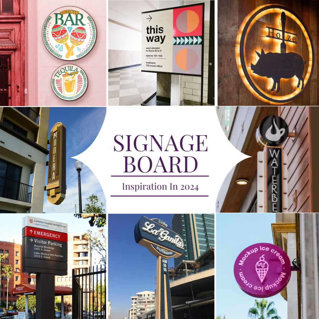
Signage in Specific Industries and Use Cases
Signage serves as a critical communication tool across industries, tailoring its function, design, and material selection to meet operational, safety, and branding objectives. Effective signage in specialized sectors enhances user experience, ensures compliance with regulations, and reinforces organizational identity. This section examines industry-specific applications, highlighting functional requirements, design trends, and strategic implementations across hospitality, retail, healthcare, urban planning, corporate environments, and events.
Hospitality Signage: Function, Trends, and Design Strategies
Hospitality signage—encompassing hotels, restaurants, and resorts—prioritizes wayfinding, brand reinforcement, and operational clarity to elevate guest experience. Design trends in this sector emphasize minimalist aesthetics, digital integration, and culturally adaptive elements to align with modern consumer expectations.Functional Categories and Design Trends
Hospitality signage is categorized by purpose, each requiring distinct design approaches:
-
Wayfinding Signage
High-traffic areas like lobbies, elevators, and corridors rely on hierarchical typography and iconography to guide guests efficiently. Trends include:- Modular systems for scalability in large properties (e.g., Marriott’s global wayfinding standards).
- Multilingual labels with Unicode support for international audiences (e.g., Mandarin, Arabic, and Cyrillic scripts).
- Dynamic LED displays for real-time updates (e.g., event schedules in convention centers).
-
Menu Boards and Promotional Signage
Restaurants leverage high-contrast layouts and food photography to drive sales, with trends favoring:- Interactive digital menus (e.g., touchscreens with customizable language options).
- Sustainable materials like reclaimed wood or recycled acrylic for eco-conscious branding.
- Neon or backlit signage in nightlife districts to enhance visibility and ambiance.
-
Emergency and Safety Signage
Compliance with ADA (Americans with Disabilities Act) and OSHA (Occupational Safety and Health Administration) mandates tactile signage, photoluminescent exits, and braille labels. Trends include:- Smart signage with integrated sensors to alert staff during emergencies (e.g., fire alarms triggering illuminated exit paths).
- Unified color schemes (e.g., green for exits, red for hazards) across chains to reduce cognitive load.
-
Brand Identity Signage
Luxury hotels and boutique restaurants use custom typography, metallic finishes, and textured materials (e.g., brass, marble) to convey prestige. Examples:- The Four Seasons employs serif fonts and watercolor-inspired backgrounds in lobby signage.
- Fast-casual chains like Chipotle use bold, sans-serif logos with vibrant color blocks for instant recognition.
The Aman Resorts chain integrated augmented reality (AR) signage in its properties, allowing guests to scan QR codes on room keys to navigate amenities via a mobile app. This reduced reliance on physical directories by 40% while enhancing personalization.
Retail Signage Strategies: Promotional, Branding, and Navigation Systems
Retail signage functions as a silent salesperson, influencing purchasing decisions through strategic placement, messaging, and visual hierarchy. Effective strategies combine psychological triggers, technological innovation, and store layout optimization.Core Strategies by Function
Retail environments deploy signage to achieve three primary objectives: promotion, brand identity, and navigation.
-
Promotional Signage
Designed to create urgency and highlight discounts, promotional signage often uses:- Contrast and size dominance (e.g., oversized "SALE" banners in red and yellow).
- Countdown timers (e.g., "Only 3 Days Left!" for limited-edition products).
- Interactive elements like touchscreen kiosks for personalized deals (e.g., Sephora’s digital mirrors).
-
Brand Identity Signage
Stores invest in consistent visual language to reinforce recognition, including:- Logo integration on storefronts, receipts, and employee uniforms (e.g., Nike’s "Swoosh" in monochrome or neon).
- Signature color schemes (e.g., Coca-Cola’s red, Apple’s minimalist white).
- Custom typography (e.g., Walmart’s bold, sans-serif "W" for accessibility).
-
In-Store Navigation Systems
Complex retail environments (e.g., malls, electronics stores) require scalable wayfinding solutions:- Modular signage grids (e.g., Best Buy’s departmental overhead signs with LED backlighting).
- RFID-enabled signs that adjust in real-time based on inventory (e.g., Amazon Go stores).
- Tactile paths for visually impaired shoppers (e.g., raised floor markers in blind alleys).
A 2022 Nielsen study found that 70% of purchase decisions are influenced by in-store signage. Retailers like Target use heat-mapping technology to optimize sign placement, increasing foot traffic to high-margin sections by 25%.
Healthcare Facility Signage: Wayfinding, Patient Education, and Emergency Protocols
Healthcare signage must balance clarity, accessibility, and emergency preparedness, adhering to Joint Commission standards and HIPAA compliance. Visual hierarchy and universal design principles ensure usability across diverse patient populations.Key Applications and Design Considerations
Healthcare environments prioritize reducing cognitive load and minimizing errors through structured signage systems.
-
Wayfinding for Patients and Staff
Hospitals employ color-coded zones (e.g., blue for patient areas, green for administrative) with:- Floor-level signage for wheelchair users and braille labels for the visually impaired.
- Directional arrows with pictograms (e.g., a wheelchair icon for accessible routes).
- Digital directories with voice-guided navigation (e.g., Cleveland Clinic’s app-integrated signs).
-
Patient Education Signage
Clear, ADA-compliant signage educates patients on procedures, medication, and safety:- Illustrated instructions (e.g., steps for using a blood pressure cuff).
- Multilingual labels (e.g., Spanish and Chinese translations in diverse communities).
- Interactive screens for pre-procedure videos (e.g., surgical consent explanations).
-
Emergency and Safety Protocols
Photoluminescent signage, unified symbols, and tactile warnings are critical:- Exit signs with green backlighting (visible in power outages).
- Fire hazard maps with braille and raised text
Signage emerges as a multifaceted discipline where aesthetics and functionality converge to create meaningful user interactions. By adhering to design principles that prioritize readability, cultural relevance, and psychological impact, organizations can transform ordinary wayfinding tools into strategic assets that enhance safety, efficiency, and brand cohesion. The future of signage lies in its adaptability—embracing digital innovation, sustainable materials, and inclusive design to meet the evolving needs of diverse audiences. Ultimately, its success hinges on a balance between technical precision and creative intuition, ensuring every message is not just seen, but understood.
FAQ
what is signage mean?
Q: What does the term signage mean?
what is signage board?
Q: What is a signage board?
what is signage in construction?
Q: What is the role of signage in construction?
what is signage design?
Q: What is signage design?
what is signage in business?
Q: What is the importance of signage in business?
what is signage display?
Q: What is a signage display?
-
Wayfinding Signage
- Pros:
Design Principles for Effective Signage
Effective signage design balances functionality, aesthetics, and communication to ensure messages are conveyed clearly and efficiently. The principles governing signage—such as visual hierarchy, cultural adaptability, and technical innovation—directly influence user engagement and wayfinding success. This section explores foundational design principles, practical implementation strategies, and emerging trends that redefine signage effectiveness in diverse contexts.Visual Hierarchy in Signage Design
Visual hierarchy organizes information to guide the viewer’s attention through deliberate use of size, contrast, and spacing. In signage, this principle ensures critical messages (e.g., directions, warnings) are prioritized over secondary details. The effectiveness of hierarchy relies on three core elements:Size and Scalability
Larger text or symbols command immediate attention, while smaller elements provide supplementary context. For example, airport signs use bold, high-contrast numbers (e.g., "GATE 12") in 120pt+ fonts for primary wayfinding, with secondary details (e.g., "Boarding Zone") in 30–40pt. The Fitts’s Law principle—larger targets are easier to interact with—applies here, where touchscreen signs benefit from oversized buttons (minimum 48x48px) to reduce user error.
Contrast and Color Psychology
High contrast between text/background (e.g., black text on yellow for warnings, per ANSI Z53.1 standards) enhances legibility, especially in low-light conditions. Color also conveys meaning: red signals danger (e.g., emergency exits), green denotes safety (e.g., first-aid stations), and blue often represents information (e.g., directional signs). Studies show that 75% of people associate red with urgency, making it critical for fire-alarm signs (NFPA 701 compliance).
Spacing and Alignment
White space (or negative space) prevents visual clutter and improves readability. For instance, highway signs use modular grids (e.g., 1:3 ratio of text-to-space) to separate elements like route numbers from destinations. Misalignment disrupts flow; aligned text or icons (e.g., left-justified headings) create a cohesive structure. The Swiss Style approach—minimalist layouts with ample spacing—is widely adopted in corporate and public signage for clarity.
Case Study: Well-Executed Hierarchy
The London Underground’s roundel signs exemplify hierarchy:
Creating a Signage Design Brief
A structured design brief ensures signage meets functional and aesthetic goals while addressing constraints. Below is a step-by-step template, categorized by critical decision points:1. Project Context and Objectives
Define the signage’s purpose, scope, and success metrics. For example:
2. Target Audience Analysis
Demographics, literacy levels, and accessibility needs dictate design choices:
3. Location and Environmental Factors
Physical constraints influence material selection and durability:
4. Message and Content Strategy
Clarify the core message and supporting details:
5. Technical and Budget Constraints
Specify feasibility requirements:
6. Compliance and Standards
Adhere to regulatory and industry guidelines:
Example Brief Template
| Category | Details |
|---|---|
| Project Name | Wayfinding for City Hospital – Ward B |
| Primary Audience | Patients (50+ age group), staff, visitors with limited English proficiency |
| Key Message | Room numbers, departments (ER, Oncology), emergency exits |
| Materials | Antimicrobial acrylic, LED backlighting, Braille labels |
| Budget | $25,000 (including installation and maintenance for 5 years) |
Traditional vs. Modern Signage Design Trends
Signage evolution reflects advancements in technology, materials, and user expectations. Traditional methods prioritize durability and simplicity, while modern approaches integrate interactivity and data-driven personalization.Traditional Signage Characteristics
Modern Signage Innovations
Trend Comparison Table
| Aspect | Traditional Signage | Modern Signage |
|---|---|---|
| Durability | High (metal, vinyl) | Variable (LED may degrade; 3D printing offers longevity) |
| Flexibility | Static content | Dynamic (software updates, AR overlays) |
| Cost |
Leave a Comment
Comments are moderated before appearing. The data you submit is processed according to the Privacy Policy of Voltefac.