| Production Cost and Time |
Lower upfront cost; faster to create (e.g., a 5Design Principles and Structure in Effective Infographic Creation
Infographics thrive on a balance between visual clarity and data precision, requiring adherence to design principles that guide user engagement and comprehension. The structure of an infographic dictates how information is absorbed, while design elements—such as typography, color, and layout—enhance readability and emotional resonance. A well-architected infographic organizes data hierarchically, ensuring the audience grasps key insights before delving into supporting details. Below, the foundational principles of design and structural organization are explored, alongside the strategic use of color psychology and common pitfalls in execution.
Hierarchy in infographic design establishes a visual pathway that directs attention from the most critical information to secondary details. This principle relies on size, placement, contrast, and typographic weight to create a natural flow, ensuring the audience processes content in a logical sequence. A structured flow typically follows:
Introduction: A headline or brief context to orient the viewer.
Key Points: Core data or messages presented prominently.
Supporting Details: Supplementary statistics, visuals, or explanations.
Conclusion: A summary or call-to-action reinforcing the primary takeaway.For example, a financial infographic comparing quarterly revenue growth might begin with a bold headline ("Q3 Revenue Surge: 25% YoY Increase"), followed by a bar chart highlighting the trend, then annotations explaining external factors (e.g., market expansion), and conclude with a projection for Q4. Tools like z-pattern or F-pattern layouts (left-to-right, top-to-bottom scanning) align with natural reading habits, optimizing information retention.
Core Design Principles for Visual Clarity
Effective infographics adhere to universal design principles that prioritize usability and aesthetics. These include:Contrast and Visual Distinction
Contrast ensures elements stand out, preventing visual fatigue. Techniques include:
Color contrast: Pairing dark text on light backgrounds (e.g., black on white) or vice versa for readability.
Shape contrast: Using geometric shapes (circles, squares) to differentiate categories (e.g., circles for positive data, squares for negative).
Size contrast: Larger icons or text for primary messages, smaller for secondary details.
Example: A healthcare infographic might use red for warning signs (e.g., high-risk symptoms) and green for preventive measures, leveraging innate color associations.Alignment and Consistency
Alignment creates order and professionalism. Key practices:
Grid systems: Structuring content in columns or rows for uniformity (e.g., a 3-column layout for three key metrics).
Consistent spacing: Maintaining margins and padding between elements to avoid clutter.
Repeated design motifs: Using identical icons or borders for related data points (e.g., a dotted line connecting related statistics).Typography and Readability
Typography conveys tone and ensures legibility. Guidelines:
Font selection: Sans-serif fonts (e.g., Arial, Helvetica) for digital use; serif fonts (e.g., Times New Roman) for print.
Hierarchy through type: Headlines in bold (24pt+), subheadings in semi-bold (16pt), and body text in regular (12pt).
Line length: Limit text to 50–75 characters per line to prevent wrapping and improve scanning.
Accessibility: Ensure sufficient color contrast (minimum 4.5:1 for text) and offer alt-text for icons.
Color Psychology and Emotional Impact
Color influences perception and emotional response, making it a critical tool in infographic design. Strategic color choices can:
Evoke emotions: Warm colors (red, orange) convey urgency or passion; cool colors (blue, green) inspire trust or calm.
Highlight trends: Gradients or color scales (e.g., blue-to-red) visualize data ranges (e.g., temperature maps or stock performance).
Differentiate categories: Assign distinct colors to data series (e.g., blue for sales, green for expenses) to avoid confusion.Effective Color Schemes by Use Case:
Educational infographics: Blues and greens for clarity and learning (e.g., NASA’s data visualizations).
Marketing/sales: Reds and yellows for attention (e.g., "Limited-Time Offer" banners).
Healthcare: Greens for wellness, oranges for caution (e.g., CDC’s COVID-19 risk indicators).
Data-heavy infographics: Monochromatic scales (e.g., grayscale for neutral data, with one accent color for emphasis).Example: A sustainability infographic might use earthy tones (browns, greens) to align with eco-friendly themes, while a financial infographic could employ gold and navy to convey stability and luxury. Tools for Color Selection:
Color theory: Use the 60-30-10 rule (60% dominant, 30% secondary, 10% accent).
Accessibility: Test with tools like WebAIM Contrast Checker to ensure readability for color-blind audiences.
Cultural context: Avoid red for warnings in cultures where it symbolizes luck (e.g., China), opting for orange instead.
Common Mistakes in Infographic Design and Mitigation Strategies
Design errors undermine clarity and credibility. The following pitfalls—rooted in overcomplication or neglect of principles—are prevalent in ineffective infographics:
1. Overcrowding and Clutter
Issue: Packing excessive data, text, or visuals into a single frame, overwhelming the audience.
Solution: Adopt the "one idea per frame" rule. Break complex topics into multiple infographics or use modular layouts (e.g., accordion-style expandable sections for details).2. Poor Readability Due to Typography Choices
Issue: Using decorative fonts, small text, or low-contrast combinations (e.g., light gray text on white).
Solution: Limit font families to 2–3 types, prioritize readability over aesthetics, and ensure text scales appropriately for digital/print.3. Misaligned or Inaccurate Data Visualization
Issue: Distorting data (e.g., truncated axes in charts, incorrect proportions in icons) to mislead or confuse.
Solution: Validate data sources, use standardized scales (e.g., 0–100% for percentages), and label all axes clearly. Tools like Excel or Tableau can auto-correct distortions.4. Ignoring Audience Needs
Issue: Designing for technical experts when the audience is laypeople, or vice versa.
Solution: Conduct audience analysis to tailor complexity (e.g., use icons for beginners, detailed annotations for professionals).5. Neglecting Mobile Responsiveness
Issue: Infographics optimized for desktop appear cluttered or unreadable on mobile devices.
Solution: Test designs on multiple screens, use responsive layouts, and simplify visuals for smaller displays (e.g., replace dense text with icons).6. Lack of Visual Hierarchy
Issue: Treating all elements equally, forcing the audience to decipher importance through sheer volume.
Solution: Apply the 80/20 rule—80% of attention should focus on 20% of the content. Use size, color, and placement to guide the eye.7. Over-reliance on Trends or Gimmicks
Issue: Using flashy animations, excessive gradients, or irrelevant stock images to distract from the message.
Solution: Prioritize substance over style; if visuals don’t enhance understanding, simplify or remove them.
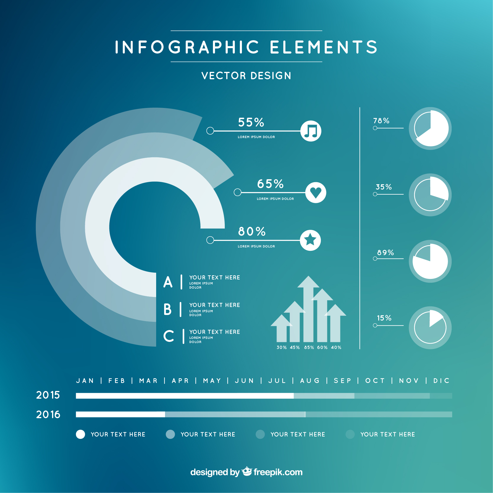
The selection of appropriate tools and software plays a critical role in the efficiency, creativity, and scalability of infographic design. Whether a designer requires beginner-friendly interfaces, advanced customization, or seamless data integration, the right platform aligns with project requirements, skill level, and budget constraints. Modern tools range from intuitive drag-and-drop editors to professional-grade applications with animation and interactivity, each catering to specific use cases such as marketing campaigns, educational materials, or data-driven presentations.The choice of software impacts not only the design process but also the final output’s quality, accessibility, and adaptability across platforms. Below, a comparative analysis of popular tools is provided, followed by step-by-step guidance for a beginner-friendly platform, advanced feature exploration, and a structured pricing and feature breakdown for free versus paid solutions.
The market offers diverse tools tailored to different user needs, from non-technical professionals to experienced designers. Key considerations include ease of use, customization depth, collaboration features, and output quality. Below is a comparative overview of leading platforms:- Canva
Strengths: Intuitive drag-and-drop interface, extensive template library (including infographic-specific designs), free tier with premium features, and mobile compatibility.
Limitations: Limited advanced customization for complex layouts; free version includes watermarks on some exports.
Best for: Beginners, marketers, educators, and teams requiring quick, visually appealing designs without technical barriers.- Adobe Illustrator
Strengths: Industry-standard vector-based design with unparalleled customization, precision tools, and scalability for print and digital use.
Limitations: Steep learning curve; requires subscription for full access.
Best for: Professional designers, agencies, and projects demanding high-resolution, scalable graphics.- Piktochart
Strengths: Specialized infographic templates with data visualization tools, integration with Google Drive and Dropbox, and collaborative editing.
Limitations: Free version restricts template access; fewer advanced design features compared to Adobe Suite.
Best for: Researchers, academics, and businesses focusing on data-heavy infographics.- Venngage
Strengths: Pre-built infographic templates optimized for social media, blog integration, and animated elements; strong data visualization capabilities.
Limitations: Limited customization for non-standard layouts; subscription model for advanced features.
Best for: Digital marketers, content creators, and teams prioritizing shareability and engagement.- Visme
Strengths: Combines infographic design with interactive elements (e.g., embedded videos, quizzes) and real-time collaboration; supports data integration from spreadsheets.
Limitations: Free plan has limited exports and branding restrictions.
Best for: Educators, trainers, and professionals needing interactive presentations.- Crello
Strengths: Animation-focused tool with motion graphics capabilities; user-friendly for dynamic infographics.
Limitations: Smaller template library compared to Canva or Venngage.
Best for: Social media managers and brands requiring animated content.- Snappa
Strengths: Fast rendering, built-in stock photo library, and simple pricing structure.
Limitations: Fewer advanced design tools; primarily text/image-based.
Best for: Quick-turnaround projects with minimal design complexity.Key Differentiators:
Ease of Use: Canva, Crello, and Snappa prioritize accessibility, while Adobe Illustrator demands technical proficiency.
Customization: Adobe Illustrator and Visme offer granular control, whereas Piktochart and Venngage streamline workflows for non-designers.
Collaboration: Venngage and Visme emphasize real-time teamwork, while standalone tools like Illustrator require external file-sharing.
Output Quality: Vector-based tools (Illustrator) ensure lossless scaling, whereas raster-based platforms (e.g., Canva’s free tier) may degrade at high resolutions.
Step-by-Step Infographic Creation in Canva
Canva’s user-friendly interface makes it ideal for beginners. Below is a structured workflow for designing a basic infographic from scratch, using a hypothetical example: "The Life Cycle of a Butterfly" for an educational blog.Prerequisites:
A Canva account (free or Pro).
Basic data or visual assets (e.g., stage names, icons, or placeholder images).Step 1: Template Selection
1. Log in to Canva and navigate to the "Templates" tab.
2. Search for "infographic" in the search bar and filter by "Education" or "Nature" categories.
3. Select a template with a 3–5 step layout (e.g., "Process Infographic" or "Timeline").
4. Click "Use this template" to duplicate it in your workspace. Step 2: Data Input and Layout Adjustment
1. Replace placeholder text with your content:
Title: "The Life Cycle of a Butterfly"
Stages: Egg → Larva (Caterpillar) → Pupa (Chrysalis) → Adult Butterfly.
Descriptions: Add 1–2 sentences per stage (e.g., "Eggs hatch in 3–7 days").
2. Adjust text boxes:
Use Canva’s "Text" tool to add or resize boxes.
Align text horizontally/vertically using the "Align" button in the toolbar.
3. Insert icons/images:
Search Canva’s "Elements" library for "butterfly life cycle" icons.
Upload custom images (e.g., stock photos of each stage) via the "Uploads" tab.
4. Modify colors and fonts:
Select a cohesive color palette (e.g., pastel greens/blues) via the "Colors" panel.
Use Google Fonts (integrated in Canva) for readability (e.g., "Open Sans" for body text, "Montserrat" for headings).Step 3: Design Enhancements
1. Add visual hierarchy:
Use bold fonts or larger sizes for stage names.
Highlight key facts with callout boxes or arrows (found in "Elements").
2. Incorporate data visualization:
For quantitative data (e.g., "Duration of each stage"), insert a bar chart from Canva’s "Charts" tool.
Customize chart colors to match your palette.
3. Optimize spacing:
Use the "Grid" tool to align elements uniformly.
Adjust margins by dragging text/icon boxes.Step 4: Export Settings
1. Preview the design in "Desktop" or "Mobile" mode to ensure responsiveness.
2. Click "Share" → "Download" and select:
Format: PNG (for web) or PDF (for print).
Resolution: 300 DPI for print; 72 DPI for digital.
Size: Adjust dimensions (e.g., 1200x630px for social media).
3. For Pro users, enable "Brand Kit" to auto-apply logos/colors.Pro Tip:
Use Canva’s "Magic Resize" feature (Pro) to repurpose the infographic for Instagram posts or presentations without redesigning.
Professional tools extend beyond static design to include interactivity, animation, and data automation, catering to dynamic content needs. Below are advanced features, their functionalities, and practical use cases:
Interactivity enables user engagement through clickable elements, hover effects, or embedded media, ideal for digital storytelling.
Adobe Illustrator (with Adobe XD/After Effects integration)
Feature: Vector animation and interactive prototyping.
Use Case: Creating animated infographics for explainer videos (e.g., a step-by-step process with motion transitions).
Example: A healthcare infographic where clicking a muscle group reveals detailed anatomy.- Visme
Feature: Embedded videos, quizzes, and real-time data updates from Google Sheets.
Use Case: Interactive timelines for educational platforms (e.g., a historical event infographic with clickable sources).
Example: A sales dashboard where users input metrics to auto-generate visual trends.- Venngage
Feature: Animated transitions between slides (e.g., fade-in effects for data points).
Use Case: Social media campaigns requiring motion graphics (e.g., a "Before & After" infographic for product comparisons).
Example: A fitness app’s infographic showing progress over time with animated icons.- Snappa (with Canva Pro integration)
Feature: Batch resizing and scheduled social media publishing.
Use Case: Automating infographic distribution across platforms (e.g., weekly blog graphics for a newsletter).
Example: A marketing team repurposing a single infographic into 5 social media formats.- Figma (for collaborative design)
Data Visualization Techniques in Infographic Creation
Data visualization transforms complex datasets into intuitive visual narratives, enabling audiences to grasp insights at a glance. Effective visualization leverages cognitive perception—humans process images 60,000 times faster than text—by structuring information hierarchically, emphasizing trends, and reducing cognitive load. Infographics employ a mix of typography, color theory, and spatial arrangement to ensure clarity while maintaining aesthetic appeal. The challenge lies in balancing simplicity with accuracy, avoiding distortions that mislead interpretation while preserving the integrity of the source data. Visual representations in infographics serve distinct purposes: statistical infographics quantify trends, process infographics map workflows, and comparison infographics highlight differences. Each technique requires alignment with the data’s nature—whether hierarchical (e.g., organizational charts), sequential (e.g., timelines), or relational (e.g., network diagrams). The following sections explore core techniques, creative applications, and methodologies to ensure data fidelity in visual storytelling.
Core Data Visualization Techniques and Their Applications
Data visualization techniques are categorized based on their functional objectives, each suited to specific data types and audience needs. The selection of a technique depends on the data’s complexity, the message’s intent, and the audience’s familiarity with the subject matter. Below are foundational techniques with their ideal use cases and structural guidelines.
-
Charts and Graphs
Charts are the most common tools for representing quantitative data, where numerical relationships are visualized through geometric shapes. Bar charts excel in comparing discrete categories (e.g., market share by product), while line graphs illustrate trends over time (e.g., GDP growth). Pie charts, though less recommended due to their limitations in comparing segments, remain useful for showing proportional parts of a whole (e.g., budget allocation).
Best Practice: Avoid 3D effects in charts, as they distort perception and reduce accuracy. Use consistent scaling (e.g., 0–100% for pie charts) and label axes clearly to prevent misinterpretation.
- Example: A bar chart comparing global internet users by region (2010–2023) with annotations for outliers (e.g., Africa’s rapid growth).
- Example: A line graph depicting CO₂ emissions by sector, with a secondary axis for renewable energy adoption.
-
Flowcharts and Diagrams
Flowcharts map processes or systems, using directional arrows and nodes to represent steps, decisions, or interactions. They are essential for infographics explaining workflows (e.g., customer journey maps), hierarchical structures (e.g., organizational charts), or technical processes (e.g., data pipeline stages).
Design Principle: Limit flowchart complexity to 5–7 decision points per visual segment. Use color-coding to distinguish phases (e.g., green for success paths, red for errors).
- Example: A layered flowchart illustrating the stages of drug development, with icons for approval milestones (e.g., clinical trials, FDA review).
- Example: A network diagram of global supply chains, where node size correlates with production volume.
-
Timelines
Timelines visualize sequential events, ideal for historical data, project milestones, or lifecycle analyses. They can be linear (chronological) or non-linear (e.g., branching timelines for alternative outcomes). Interactive timelines, though beyond static infographics, can incorporate tooltips for additional context.
Accuracy Consideration: Ensure temporal scaling is proportional (e.g., decades vs. years) and avoid truncating axes to exaggerate growth or decline.
- Example: A horizontal timeline of major AI breakthroughs (e.g., 1956 Dartmouth Conference to 2023 LLMs), with icons for key inventions.
- Example: A circular timeline for annual business cycles, highlighting quarterly revenue peaks.
-
Maps and Geospatial Visualizations
Maps contextualize data geographically, useful for demographic distributions, election results, or environmental data. Heatmaps overlay density data (e.g., population heatmaps), while choropleth maps use color gradients to represent values (e.g., unemployment rates by state).
Cartographic Integrity: Use projections that minimize distortion (e.g., Mercator for global comparisons, Gall-Peters for area accuracy). Avoid "cherry-picking" regions to skew perceptions.
- Example: A world map showing renewable energy capacity by country, with tooltips for per-capita statistics.
- Example: A dot distribution map of global pandemics, where dot size reflects case severity.
Creative Data Visualization Techniques and Their Strategic Use
Innovative visualization techniques enhance engagement by leveraging metaphor, abstraction, or interactivity (where applicable). These methods are particularly effective for audiences with limited statistical literacy or when conveying abstract concepts (e.g., emotions, intangible metrics). Below are advanced techniques with case studies and implementation guidelines.
-
Icon-Based Representations
Icons replace numerical data with symbolic imagery, making complex statistics accessible. For example, a single icon (e.g., a person) can represent 1,000 individuals, while stacked icons show comparisons (e.g., 3 coffee cups for "3x increase in sales").
Design Guideline: Standardize icon scales (e.g., 1 icon = X units) and provide a legend. Use universally recognizable symbols (e.g., 🏠 for housing, 💰 for currency) to avoid ambiguity.
- Application: A healthcare infographic showing vaccine distribution, where each syringe icon = 10,000 doses, with color-coding for vaccine types.
- Application: A financial infographic comparing CEO salaries to worker wages, using salary icons (e.g., $100K = 1 briefcase icon).
-
Metaphorical Illustrations
Metaphors transform abstract data into relatable analogies. For instance, a "data mountain" can represent cumulative debt, while a "tree of knowledge" might illustrate academic citations. This technique is powerful for storytelling but requires careful alignment between the metaphor and data.
Risk Mitigation: Test metaphors with a sample audience to ensure clarity. Avoid overused clichés (e.g., "rocketing to success") that may dilute impact.
- Example: A "leaky bucket" metaphor for water conservation, where the bucket’s fill level represents annual rainfall, and leaks denote usage.
- Example: A "city skyline" to depict GDP growth, with building heights correlating to economic output by sector.
-
Layered and Interactive Infographics
Layered infographics reveal complexity progressively, starting with a high-level overview before drilling down into details. Interactive elements (e.g., hover effects, clickable nodes) are increasingly integrated into digital infographics to allow user-driven exploration.
Technical Note: For static infographics, use transparency and sequential numbering to guide layer navigation. For digital, ensure interactivity is intuitive (e.g., consistent hover states).
- Static Example: A layered infographic on climate change, with the first layer showing global temperature rise, the second adding CO₂ sources, and the third detailing policy impacts.
- Digital Example: An interactive timeline of the moon landing, where clicking a mission phase reveals related scientific data.
-
Abstract and Minimalist Visualizations
Minimalist designs strip away non-essential elements, focusing on data-driven shapes and negative space. Techniques include:- Isotype (Picture Statistics): Uses repeated pictograms to represent data (e.g., 1 figure = 10,000 people). Originated by Otto Neurath in the 1920s.
- Geometric Abstraction: Replaces objects with shapes (e.g., circles for data points, lines for connections), as seen in network diagrams.
- Monochrome Gradients: Uses grayscale or single-color gradients to depict intensity (e.g., darker shades for higher values

Purpose and Applications Across Fields
Infographics serve as a versatile tool for conveying complex information in a visually engaging and easily digestible format. Their adaptability allows them to bridge gaps between technical expertise and audience comprehension across diverse sectors, from education and marketing to scientific research and journalism. By transforming data, processes, or narratives into structured visuals, infographics enhance retention, clarify ambiguous concepts, and foster deeper engagement. Their effectiveness lies in the strategic integration of design, data, and storytelling, making them indispensable in fields where clarity and impact are paramount.
Infographics in Education: Simplifying Learning Across Disciplines
Education leverages infographics to demystify intricate subjects, reduce cognitive load, and cater to varied learning styles—particularly visual and kinesthetic learners. Research indicates that visual aids improve information retention by up to 65% compared to text alone (Educause, 2018). Infographics excel in subjects where abstract or sequential information is challenging to grasp, such as biology, history, and mathematics.Infographics in biology often illustrate cellular processes (e.g., mitosis phases) or ecosystems (e.g., food webs), using annotated diagrams and color-coded pathways. For history, they map timelines (e.g., World War II events), compare historical figures, or visualize cause-and-effect relationships (e.g., the French Revolution’s triggers). In mathematics, they break down algorithms (e.g., step-by-step solutions to quadratic equations) or depict geometric proofs with interactive elements. Educational platforms like Khan Academy and National Geographic Education frequently employ infographics to complement textbooks and digital lessons. > Example Applications in Education
> - Biology: A layered infographic showing the human digestive system, with each organ’s function labeled and connected to dietary impacts (e.g., fiber’s role in gut health).
> - History: A comparative timeline infographic of the American and French Revolutions, highlighting key parallels (e.g., Enlightenment influences) and divergences (e.g., outcomes).
> - Mathematics: A visual breakdown of the Pythagorean theorem using a right-angled triangle with adjustable sides, demonstrating how a² + b² = c² dynamically.
Infographics in Marketing and Branding: Enhancing Storytelling and Engagement
Marketing and branding utilize infographics to distill brand messages, simplify product features, and amplify audience engagement through shareable content. Studies show that articles with infographics receive 3x more engagement than those without (HubSpot, 2021). Infographics serve multiple roles: educating consumers about product benefits, reinforcing brand identity through consistent visual styles, and driving conversions by presenting data persuasively.In product promotion, infographics highlight unique selling points (USPs) with before-and-after comparisons (e.g., skincare results), feature breakdowns (e.g., smartphone specs), or user testimonials paired with visual metaphors. Storytelling infographics narrate brand histories (e.g., a timeline of a company’s milestones) or customer journeys (e.g., how a SaaS tool solves pain points). For example, Mailchimp’s infographics explain email marketing metrics (e.g., open rates vs. click-through rates) in a digestible format, positioning the brand as an authority. > Key Marketing Applications
> - E-commerce: Side-by-side infographics comparing product variants (e.g., laptop models) with performance metrics (e.g., battery life, processing speed).
> - Social Media Campaigns: Threaded infographics on Instagram or LinkedIn that break down complex topics (e.g., "How AI is Reshaping Retail") into bite-sized visuals.
> - Brand Guidelines: Internal infographics outlining logo usage, color palettes, and typography rules to ensure consistency across campaigns.
Infographics in Scientific Research and Journalism: Accessible Data Presentation
Scientific research and journalism employ infographics to translate technical findings into public-facing narratives, ensuring transparency and fostering informed discourse. Peer-reviewed journals like Nature and Scientific American frequently use infographics to summarize studies, while investigative outlets (e.g., The New York Times, BBC) deploy them to visualize data-driven stories. This approach demystifies complex topics such as climate change, genetic research, or economic trends, making them actionable for policymakers and the general public.In scientific research, infographics illustrate:
- Study methodologies (e.g., flowchart of a clinical trial’s phases).
- Data trends (e.g., a heatmap showing global temperature anomalies over decades).
- Mechanisms (e.g., how CRISPR gene editing works, with labeled DNA strands).
Journalism leverages infographics to:
- Contextualize statistics (e.g., a bar chart comparing COVID-19 vaccination rates by country).
- Reveal patterns (e.g., a network graph exposing connections in a corruption scandal).
- Explain processes (e.g., how a supply chain disruption affects global prices).
> Notable Examples
> - Climate Science: NASA’s infographics on sea-level rise, combining satellite data with annotated projections.
> - Health Research: A JAMA Network infographic breaking down the efficacy of mRNA vaccines, with side-by-side comparisons of trials.
> - Investigative Journalism: The Guardian’s "Football’s Dark Side" infographic, mapping links between player transfers and human trafficking networks.
Niche Applications of Infographics
Beyond mainstream fields, infographics address specialized needs with tailored visual strategies. Their adaptability extends to sectors where precision and clarity are critical, often serving as tools for decision-making, compliance, or user empowerment.
Healthcare: Patient Education and Compliance
Infographics in healthcare simplify medical procedures, treatment plans, and preventive care. Hospitals like Cleveland Clinic use them to explain conditions (e.g., diabetes management) or surgical steps (e.g., knee replacement recovery timeline). Patient compliance infographics visualize medication schedules with icons (e.g., pill bottles) and reminders, reducing non-adherence rates by 20% (American Journal of Managed Care, 2020). For rare diseases, infographics map symptom progression or genetic links, aiding early diagnosis.
Travel and Tourism: Destination Guides and Itineraries
Travel brands (e.g., Lonely Planet, Airbnb) employ infographics to condense destination information—cultural tips, must-see landmarks, and budget breakdowns—into pocket-sized guides. Interactive infographics on websites allow users to filter activities by interest (e.g., adventure, relaxation) or season. For example, a Tokyo travel infographic might overlay a city map with food districts, transit routes, and temple locations, optimized for mobile viewing.
Technology: Explaining Software and Hardware Features
Tech companies use infographics to onboard users to complex platforms. Slack’s "How to Use Channels" infographic visually distinguishes between public and private channels with flowcharts and emoji shortcuts. Hardware infographics (e.g., for drones or smartwatches) disassemble devices into modular components, labeling sensors and connectivity features. API documentation often includes infographics to illustrate request-response cycles, reducing developer onboarding time by 40% (Smashing Magazine, 2022).
Environmental Science: Visualizing Sustainability Metrics
Nonprofits and governments deploy infographics to communicate sustainability goals. The UN’s SDG infographics translate the 17 Sustainable Development Goals into progress trackers, using icons and progress bars. Corporate sustainability reports (e.g., from Patagonia) use infographics to quantify carbon footprints or waste reduction, aligning with ESG (Environmental, Social, and Governance) criteria. For individuals, carbon footprint calculators paired with infographics (e.g., "Your Flight Emissions vs. Planting Trees") drive behavioral changes.
Legal and Financial Services: Simplifying Complex Terms
Law firms and financial institutions use infographics to demystify legal processes (e.g., "Steps in a Divorce Settlement") or investment strategies (e.g., "How a 401(k) Works"). Tax preparation infographics break down deductions with color-coded categories (e.g., medical vs. education expenses). In contract law, visual timelines map deadlines and clauses, reducing disputes by clarifying obligations.
Best Practices for Engagement and Impact in Infographic Creation
Effective infographics transcend static visuals by leveraging psychological triggers, audience psychology, and data-driven design to maximize engagement and virality. Research indicates that well-crafted infographics are 3x more likely to be shared than other types of content (HubSpot, 2022), provided they align with audience expectations, emotional resonance, and platform-specific optimization. This section explores actionable strategies to enhance shareability, test impact through analytics, and refine design elements for specific demographics, ensuring the infographic achieves its intended reach and influence.
Strategies for Crafting Shareable and Virally Appealing Infographics
The virality of an infographic hinges on its ability to solve a problem, evoke emotion, or spark curiosity while adhering to platform-specific sharing behaviors. Below are evidence-based strategies to amplify reach:Crafting Compelling Headlines
Headlines serve as the first point of engagement and must adhere to principles of clarity, curiosity, and value proposition. Studies from Nielsen Norman Group (2021) reveal that headlines incorporating numbers, power words, or questions perform 20% better in click-through rates (CTR). Examples of high-performing headline structures include:
- List-based: "10 Data Visualization Trends Dominating 2024"
- Problem-solution: "Why 80% of Infographics Fail (And How to Fix It)"
- Curiosity-driven: "The Hidden Psychology Behind Viral Infographics"
Calls-to-Action (CTAs) and Share Triggers
A well-placed CTA directs user behavior toward sharing, embedding, or further interaction. Research from Buffer (2023) shows that infographics with explicit CTAs (e.g., "Share this with a colleague who loves data!") see a 45% increase in shares. Effective CTAs should:
- Be placement-optimized (e.g., near the bottom, within the visual flow).
- Use action-oriented language (e.g., "Download the Full Report" vs. "Click Here").
- Leverage social proof (e.g., "Join 50,000+ professionals who’ve used this guide").
Social Media Optimization for Platform-Specific Engagement
Each platform prioritizes different content formats and engagement metrics. Tailoring infographics to platform algorithms maximizes organic reach:
- LinkedIn: Prioritize professional value (e.g., industry insights, career-related data). Use long-form captions (3–5 sentences) to contextualize the infographic.
- Twitter/X: Optimize for scannability with short, punchy text overlays (≤280 characters). Include hashtags (#DataVisualization, #InfographicDesign) and thread prompts (e.g., "What’s your take on this trend?").
- Instagram/Pinterest: Focus on vertical or square formats (1080×1080px or 1080×1350px). Use bold typography and minimal text to comply with platform rules.
- Facebook: Combine emotional storytelling with interactive elements (e.g., "Tag a friend who’d love this!").
"An infographic’s shareability is directly proportional to its ability to reduce cognitive load while increasing perceived value." — Content Marketing Institute, 2023
Methods to Test the Effectiveness of Infographics
Quantitative and qualitative metrics provide actionable insights into an infographic’s performance. Tracking these KPIs allows designers to iterate on design, messaging, or distribution strategies for future iterations.Key Performance Metrics to Monitor
Data from Google Analytics and social media insights reveal the following critical metrics:
- Views/Impressions: Indicates initial reach. A drop-off after 30 seconds suggests poor engagement hooks.
- Dwell Time: Average time spent on the page (target: ≥45 seconds for high engagement). Low dwell time may signal complexity or weak visual hierarchy.
- Shares and Saves: Direct indicators of virality. Infographics with >100 shares often correlate with emotional triggers or actionable insights.
- Click-Through Rate (CTR): Measures effectiveness of CTAs. A CTR <2% may require stronger headline or CTA placement.
- Bounce Rate: High bounce rates (>70%) often reflect misaligned audience expectations or technical issues (e.g., slow load times).
A/B Testing for Optimization
Systematic testing of variables can significantly improve performance. Common A/B test elements include:
- Headline variations (e.g., question vs. statement format).
- Color schemes (e.g., high-contrast vs. muted tones).
- Visual complexity (e.g., minimalist vs. detailed illustrations).
- CTA placement (e.g., top vs. bottom of the infographic).
Gathering Audience Feedback
Qualitative data complements quantitative metrics. Methods include:
- Surveys: Use tools like Typeform or Google Forms to ask:
- "What was the most valuable takeaway from this infographic?"
- "Did you find the visuals easy to understand?"
- Comments/Replies: Monitor platform comments for common themes (e.g., confusion about a specific data point).
- Heatmaps: Tools like Hotjar reveal where users click or scroll, highlighting areas of disengagement.
"The most shared infographics are those that balance data utility with emotional storytelling—appealing to both the logical and emotional brains." — Forbes, 2023
Checklist for Maximum Impact in Infographic Design
A structured checklist ensures consistency in high-impact infographic creation. Below is a pre-launch verification framework based on industry benchmarks:Essential Design Elements
- Clear Messaging: Every visual must support one core idea. Avoid information overload (limit to 5–7 key points).
- Minimal Text: Use ≤20 words per section. Replace text with icons, annotations, or micro-charts.
- High-Quality Visuals: Ensure 300 DPI resolution, vector-based illustrations, and consistent color palettes.
- Mobile Responsiveness: Test on smartphones and tablets (use Google’s Mobile-Friendly Test).
- Accessibility: Include alt text for images, high-contrast colors, and ARIA labels for screen readers.
Technical and Distribution Checklist
- File Optimization: Compress images to <500KB (use TinyPNG or ImageOptim).
- Embeddable Code: Provide HTML embed code for easy sharing on blogs/websites.
- Social Media Assets: Create platform-specific thumbnails (e.g., LinkedIn banner, Twitter card).
- SEO Optimization: Include relevant keywords in the title, description, and file name (e.g., "2024-Data-Visualization-Trends-Infographic.png").
- Analytics Tracking: Add UTM parameters (e.g., `?utm_source=linkedin&utm_medium=infographic`) to monitor traffic sources.
Post-Publication Review
- Engagement Audit: Compare shares, saves, and comments against benchmarks (e.g., HubSpot’s 2023 Infographic Benchmark Report).
- Traffic Sources: Identify top referral platforms (e.g., Pinterest drives 60% of traffic).
- Audience Demographics: Use Google Analytics to check if the infographic reached the target audience (e.g., age, location, interests).
Do’s and Don’ts for Audience-Specific Infographic Design
Design principles must adapt to cognitive abilities, cultural context, and information needs of the target audience. Below is a comparative table outlining best practices for three key demographics:
| Element |
Children (Ages 6–12) |
Professionals (B2B Audiences) |
General Public |
|---|
| Color Scheme |
- Use bright, high-contrast colors (e.g., primary colors, neon accents).
- Avoid subtle gradients—children associate bold colors with engagement.
- Incorporate familiar brand colors (e.g., Disney’s red, Google’s primary
Infographics excel as a synthesis of art and analytics, offering a scalable solution for communicating ideas with precision and appeal. Their strength lies in adaptability—whether streamlining data visualization for researchers, amplifying marketing narratives, or aiding educators in pedagogical clarity. By adhering to design best practices, selecting appropriate tools, and aligning content with audience needs, creators can craft visuals that not only inform but also inspire action. As digital consumption continues to evolve, the role of infographics as a bridge between complexity and comprehension will remain critical, ensuring their relevance across disciplines and platforms.
FAQ
what is infographic example?
Q: Can you give me an example of what an infographic looks like?
what is infographic design?
Q: How would you define infographic design?
what is infographic poster?
Q: What makes an infographic poster different from a regular poster?
what is infographic in notebooklm?
Q: What is an infographic in the context of NotebookLM?
what is infographic mean?
Q: What does "infographic" mean in simple terms?
what is infographic presentation?
Q: How can you use an infographic in a presentation?
|
|
Leave a Comment
Comments are moderated before appearing. The data you submit is processed according to the Privacy Policy of Voltefac.