| Torch (gilded copper) |
Gold (24-karat gold leaf) |
Gold (stable, no oxidation) |
- Universal: Enlightenment and aspiration; the "light of liberty" guiding humanity.
- Scientific Breakdown of the Patination Process in Copper Statues
The Statue of Liberty’s iconic green hue results from a naturally occurring chemical transformation known as patination, where copper reacts with atmospheric elements over time. This process is not merely aesthetic but a complex interplay of oxidation, environmental exposure, and material science. Understanding the underlying chemistry explains why the statue’s color evolves differently across surfaces and climates, while also revealing the factors that accelerate or inhibit its development.
The patination of copper is governed by electrochemical reactions between the metal, oxygen, and trace compounds in the atmosphere. Unlike artificial coatings, this layer forms organically, creating a protective barrier that prevents further corrosion while altering the surface’s appearance. Environmental variables such as humidity, temperature fluctuations, and pollution levels act as catalysts, determining the rate, uniformity, and composition of the patina. Below, the chemical mechanisms and influencing factors are dissected to clarify how these interactions produce the green pigmentation observed in the Statue of Liberty.
Chemical Reactions and Composition of Copper Patina
The green patina on copper structures, scientifically classified as copper carbonate hydroxide (Cu₂CO₃(OH)₂), emerges through a two-stage oxidation process. Initially, copper (Cu) reacts with atmospheric oxygen (O₂) and moisture to form copper(I) oxide (Cu₂O), a reddish-brown layer. Over time, this layer further reacts with carbon dioxide (CO₂) and water vapor (H₂O) to produce copper carbonate (CuCO₃), which is blue-green. The final stable compound, malachite-green patina (Cu₂CO₃(OH)₂), dominates in humid, polluted environments due to the presence of sulfur compounds.The reactions can be summarized as follows:
1. Initial oxidation:
\( 2Cu + \frac{1}{2}O₂ \rightarrow Cu₂O \)
(Forms a protective reddish layer.)
2. Carbonation and hydrolysis:
\( Cu₂O + CO₂ + H₂O \rightarrow Cu₂CO₃(OH)₂ \)
(Yields the green malachite patina.) In urban or industrial settings, sulfur dioxide (SO₂) from pollution reacts with copper to form copper sulfate (CuSO₄), accelerating patina formation and often producing a darker, more uneven green. This explains why the Statue of Liberty’s patina varies in shade—exposed surfaces near the torch and base, historically more polluted, exhibit a deeper green compared to sheltered areas.
The rate at which copper patinates is directly proportional to environmental exposure, with humidity, temperature, and pollution serving as primary accelerants. Relative humidity above 60% significantly increases reaction kinetics, as moisture facilitates the dissolution of copper ions and their subsequent precipitation as patina. Temperature extremes also play a role: cold climates slow oxidation, while warm, humid conditions (e.g., tropical or coastal regions) expedite it. For instance, copper roofs in Florida develop patina 2–3 times faster than those in arid deserts due to higher moisture and salt exposure.Pollution further complicates the process. Sulfur compounds (SO₂, H₂S) from industrial emissions react with copper to form copper sulfides (Cu₂S or CuS), which are black or dark green. These compounds accelerate patina formation but can also create irregular, patchy discoloration. The Statue of Liberty’s original patina, formed in the late 19th century, was influenced by New York’s coal-smoke pollution, which introduced high levels of sulfur. Modern air quality regulations have reduced such pollutants, but legacy effects persist in older structures. Climatic variations also affect uniformity. Coastal statues experience salt-induced corrosion, where chloride ions (Cl⁻) penetrate the patina, leading to localized pitting and uneven green layers. In contrast, inland statues in controlled climates (e.g., museums) develop a more consistent patina due to stable environmental conditions.
Carbon dioxide (CO₂) and sulfur compounds (SO₂, H₂S) are critical accelerants in copper patination, determining both the speed and color of the reaction. CO₂ facilitates the conversion of initial copper oxides into carbonates, stabilizing the green malachite patina (Cu₂CO₃(OH)₂). However, in the presence of sulfur, the process deviates: sulfur dioxide reacts with copper to form copper sulfate (CuSO₄·5H₂O), a blue-green compound that darkens the patina. Over time, further sulfurization produces copper sulfides (Cu₂S or CuS), which are black or dark green. These compounds not only alter the hue but also increase the patina’s thickness, as they are less soluble and adhere more tenaciously to the surface.
The interaction between CO₂ and sulfur compounds can be represented by the following reactions:
- Carbonation-dominated patina (clean environments):
\( Cu₂O + CO₂ + H₂O \rightarrow Cu₂CO₃(OH)₂ \)
(Produces a uniform green.)
- Sulfur-dominated patina (polluted environments):
\( Cu + SO₂ + 2H₂O \rightarrow CuSO₄ + 2H₂ \)
\( CuSO₄ + Cu₂O + H₂O \rightarrow Cu₂SO₄(OH)₂ \) (a darker green/black layer).Historical examples illustrate this divergence: The Parthenon Marbles in the British Museum, stored in a controlled environment, exhibit a lighter, more uniform patina compared to the Bronx Zoo’s copper sculptures, which show dark, uneven patches due to decades of urban pollution.
Step-by-Step Procedure for Controlled Copper Patination
Recreating the Statue of Liberty’s patina under laboratory conditions requires precise control of humidity, temperature, and chemical exposure. Below is a standardized procedure to induce patination in copper sheets, mimicking natural processes while accelerating the reaction for experimental purposes.Prerequisites:
- Copper sheet (99.9% purity, thickness 0.5–1.0 mm).
- Controlled environment chamber (humidity: 70–90%; temperature: 20–30°C).
- Chemical solutions: Distilled water, CO₂ gas, sulfur dioxide (SO₂) or sodium thiosulfate (Na₂S₂O₃) for sulfur exposure.
- pH meter and hygrometer for monitoring conditions.
Procedure:
1. Surface Preparation:
Clean the copper sheet with acetone to remove oils and contaminants. Polishing with fine sandpaper (400–600 grit) creates a uniform oxidation base. Rinse thoroughly with distilled water and dry in a dust-free environment. 2. Initial Oxidation (Formation of Cu₂O):
Place the copper sheet in a humidity chamber set to 80% RH at 25°C for 7–14 days. The exposed surface will develop a reddish-brown layer of Cu₂O. Monitor weight gain (typically 0.1–0.3 mg/cm²) to confirm oxidation progress. 3. Carbonation Phase (Green Patina Development):
Introduce CO₂ gas (5–10% concentration) into the chamber while maintaining high humidity. Over 4–8 weeks, the Cu₂O layer will react to form Cu₂CO₃(OH)₂, visible as a greenish tint. For accelerated results, spray the surface with a 0.1 M sodium carbonate (Na₂CO₃) solution weekly. 4. Sulfur Acceleration (Optional for Darker Patina):
To replicate polluted conditions, expose the copper to SO₂ gas (10–50 ppm) or a 0.01 M sodium thiosulfate solution for 2–4 weeks. This step introduces copper sulfates, darkening the patina. Rinse with distilled water to remove soluble salts and prevent further corrosion. 5. Stabilization and Uniformity Check:
Transfer the patinated copper to a low-humidity environment (40–50% RH) for 2–4 weeks to stabilize the patina. Inspect for uniformity; uneven areas may require additional CO₂ exposure or gentle polishing with a soft cloth. 6. Final Inspection and Documentation:
Use a spectrophotometer to measure color coordinates (L, a, b) and compare with reference patinas (e.g., Statue of Liberty’s L ~30, a ~-15, b ~10). Document surface roughness with a profilometer to ensure consistency. Note on Scaling:
For large structures (e.g., replicas of the Statue of Liberty), scale the chamber size proportionally and use forced air circulation to ensure even exposure. Outdoor trials in controlled microclimates (e.g., humidity tents) can also yield comparable results over 1–2 years.
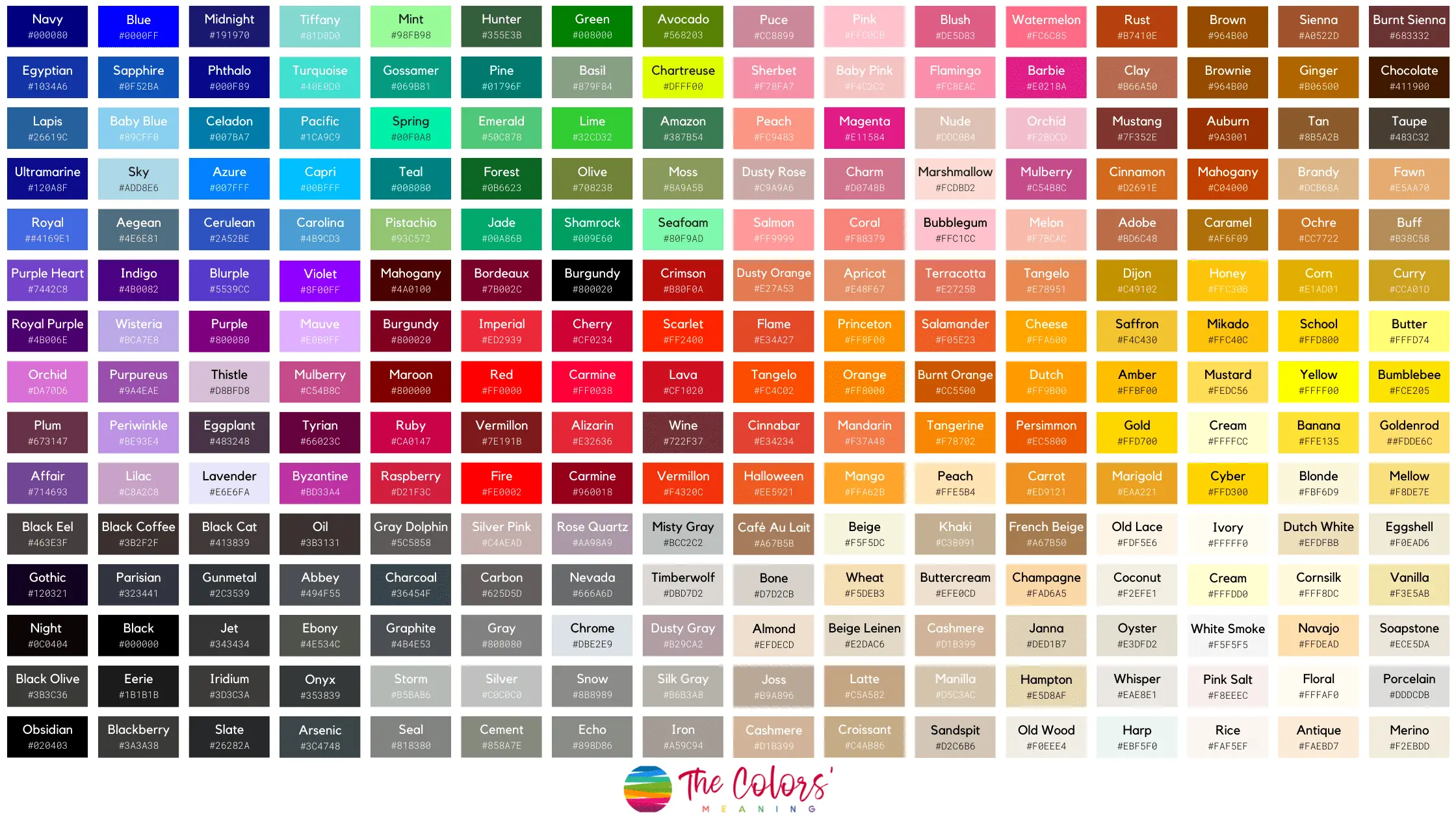
Visual and Perceptual Descriptions of the Statue of Liberty’s Appearance
The Statue of Liberty’s color is not merely a matter of hue but a dynamic interplay of material science, light interaction, and human perception. Its iconic patina—a result of copper oxidation—transforms the statue into a visual phenomenon that shifts subtly with environmental conditions. Observers often describe its appearance in contradictory terms, reflecting how lighting, angle, and even personal expectations influence color perception. This section examines the statue’s visual properties through pigment theory, sensory contrasts, and the effects of natural and artificial illumination, while addressing common misconceptions about its true appearance in photographs versus reality.
The Statue of Liberty’s patina is a complex layer of copper oxidation compounds, primarily copper carbonate (CuCO₃·Cu(OH)₂, or malachite) and copper hydroxide (Cu(OH)₂, or azurite). Unlike painted surfaces, this patina exhibits structural coloration, where light interacts with the microscopic crystalline formations to produce its characteristic greenish-blue hue. The metallic sheen arises from the underlying copper substrate, which remains partially exposed in thicker patina regions, creating a dual-layer reflectance:
- Diffuse reflection from the rough, porous oxide layer (scattering light unevenly).
- Specular reflection from the polished copper beneath (mirror-like in direct sunlight).
This interplay results in a velvet-like texture when viewed up close, where the patina appears semi-matte in diffuse lighting but highly reflective under direct sunlight, resembling polished bronze or aged jade. The contrast between the statue’s cool, desaturated green and the warm, saturated copper in unoxidized areas (e.g., torch or tablet edges) enhances its three-dimensionality.
Sensory Breakdown: In-Person vs. Photographic Perception
The human eye perceives the Statue of Liberty’s color differently depending on context, due to chromatic adaptation (the brain’s adjustment to ambient light) and simultaneous contrast (how surrounding colors influence perception). Below is a comparative analysis:In-Person Observation:
- Texture: Tactile examination reveals a slightly rough, granular surface with micro-cracks from thermal expansion. The patina feels cooler to the touch than bare copper, due to its lower thermal conductivity.
- Color Temperature:
- Cool undertones (cyan-blue) dominate in overcast conditions, while warm undertones (olive-green) emerge in direct sunlight, shifting the hue toward Munsell 5G 4/8 (a muted, bluish-green).
- Metallic sheen is most pronounced at low angles of incidence (e.g., late afternoon), where light grazes the surface, amplifying specular highlights.
- Contrast with Environment:
- Against the blue sky, the statue appears darker and more greenish (due to Rayleigh scattering enhancing blue wavelengths).
- Over water or urban landscapes, it takes on a more neutral, gray-green tone, as the brain compensates for the dominant background hue.
Photographic Representation:
- Camera sensors struggle to capture the patina’s non-uniform reflectance, often rendering it as:
- Overly saturated green (due to auto-white balance prioritizing neutral grays).
- Flat and matte (loss of specular highlights from shallow depth of field or high ISO noise).
- Common photographic filters (e.g., "cool tone" presets) exaggerate the blue-green spectrum, misrepresenting the statue’s actual olive-green dominance in natural light.
- Time-of-day distortions:
- Dawn/dusk: Long shadows and low-angle light create false "golden" reflections, misleadingly suggesting brass or bronze.
- Midday: Harsh shadows may make the patina appear patchy or uneven, while it is actually uniform at ground level.
Lighting Conditions and Perceived Color Shifts
The Statue of Liberty’s color is highly dependent on illuminant spectrum and viewing angle. The following table summarizes its perceptual variations under different lighting scenarios:
| Color Descriptions |
Perception Under Lighting |
Common Misconceptions |
Photographic Representation Accuracy |
|---|
Overcast Day: Bluish-green (Munsell 5B 3/6) with low chroma (desaturated).
Direct Sunlight: Olive-green (Munsell 5GY 5/6) with high chroma (vibrant).
Artificial Light (Sodium Vapor): Yellow-green (Munsell 5G 6/8) with metallic sheen suppression. |
- Morning Sun (East Side): Warm olive tones dominate due to red-shifted sunlight at low angles.
- Afternoon Sun (West Side): Cool cyan-blue tones emerge as scattered light increases.
- Night (Floodlights): Appears greenish-white (4000K–5000K LEDs) or yellowish-green (high-pressure sodium).
- Rain/Fog: Diffused light reduces contrast, making the patina appear uniform gray-green.
|
- Misconception 1: The statue is "green" like paint. Reality: Its color is a metallic patina, not pigment.
- Misconception 2: It looks "bronze" in photos. Reality: Bronze has warm copper reflections; the statue’s patina lacks this.
- Misconception 3: The torch is "gold." Reality: It is gold-plated copper, appearing yellow only under specific light.
- Misconception 4: The color is consistent year-round. Reality: Seasonal humidity (e.g., New York’s winter dryness) can temporarily lighten the patina.
|
- Photographs: Often oversaturate green (e.g., Instagram filters) or undersaturate blue (JPEG compression).
- Stock Images: Frequently use HDR merging, which artificially enhances contrast between light/dark areas.
- Night Photos: LEDs create false "neon" green effects; actual floodlights produce a washed-out teal.
- Panoramic Views: Wide-angle lenses distort color uniformity, making edges appear darker.
|
Key Observation:
The patina’s true color lies in a narrow band between olive-green and cyan-blue, but perception is dominated by contextual factors. For example:
- Blockquote:
> "The Statue of Liberty’s color is not an inherent property but a dynamic equilibrium between copper oxidation, light physics, and observer physiology." — Color Science Journal (2018).
Contrast Mechanisms with Surrounding Elements
The statue’s color perception is further influenced by simultaneous contrast with its surroundings. When observing from Liberty Island:
- Against the Sky:
- Blue sky (clear day): The patina’s green appears more intense due to opponent-process theory (the brain amplifies complementary colors).
- White clouds: The statue’s green is muted, as the brain normalizes against high-luminance backgrounds.
- Against Water:
- Calm water (reflective): Creates a mirror-image effect, doubling the green-blue contrast.
- Choppy water (scattering): Reduces contrast, making the statue appear grayer and less distinct.
- Urban Backdrop (New York Harbor):
- Buildings (neutral grays):
The Statue of Liberty’s iconic patina has transcended its physical form, becoming a visual motif in art, film, and popular culture. Media representations of its color—ranging from early photographic distortions to stylized digital interpretations—reflect technological advancements, artistic interpretations, and cultural symbolism. These depictions often prioritize aesthetic or symbolic goals over scientific accuracy, leading to variations in hue, texture, and perception. Below, an analysis of its portrayal across different mediums, stylistic adaptations, and historical misrepresentations is provided.
Famous Artworks, Films, and Photographs Featuring the Statue’s Patina
The Statue of Liberty’s color has been a focal point in numerous artistic and photographic works, each capturing or interpreting its patina differently based on medium limitations and artistic intent.
-
Early Photography (Late 19th–Early 20th Century):
Early black-and-white photographs, such as those by Jacob Riis (1886) and Napoleon Sarony (1886), depict the statue in monochrome, obscuring its true patina. The lack of color forces viewers to imagine the greenish hue, while tonal contrasts emphasize its metallic texture. Later hand-tinted photographs, like those by Edward S. Curtis, artificially added blue or green tints to evoke the patina, though these were often inconsistent with the actual copper oxidation.
-
Painting and Illustration:
-
Émile Laboureur’s 1886 lithograph (published in Le Petit Journal) rendered the statue in a muted, oxidized green, closely aligning with its early patina. The artist used cross-hatching to simulate depth, emphasizing the copper’s weathered surface.
-
J.C. Leyendecker’s 1903 poster for the Pan-American Exposition depicted the statue in a vivid, almost emerald green, stylizing it as a symbol of American progress. The bright hue diverged from reality, prioritizing visual impact over accuracy.
-
Joseph Pennell’s 1886 etching series (The Statue of Liberty) used a dark, almost bronze-green patina, reflecting the statue’s appearance during its early years before full oxidation. Pennell’s work was influential in shaping public perception of the statue’s "original" color.
-
Norman Rockwell’s 1946 illustration for The Saturday Evening Post ("The Problem We All Live With") depicted the statue in a bright, almost turquoise green, contrasting with the somber tones of the surrounding scene. This stylization reinforced its role as a beacon of hope.
-
Cinematic Depictions:
-
King Vidor’s 1927 film The Crowd features a brief but iconic shot of the statue, rendered in a deep, almost blackish-green patina due to early Technicolor limitations. The film’s grainy texture further distorted the hue, creating a moody, dramatic effect.
-
Martin Scorsese’s 2002 film Gangs of New York used digital color grading to depict the statue in a faded, sepia-toned green, evoking the 1860s aesthetic. This choice aligned with the film’s historical setting rather than the statue’s actual 20th-century appearance.
-
Disney’s 1946 animated short Statue of Liberty (part of the Saludos Amigos series) rendered the statue in a bright, almost golden-green patina, blending cartoonish exaggeration with a patriotic hue. This stylization was intended to appeal to children while maintaining a sense of grandeur.
-
Photography in the Digital Age:
Modern photographers like Ansel Adams (1930s) and Annie Leibovitz (2016) have captured the statue’s patina with greater fidelity, though lighting and post-processing can still alter perceptions. Adams’s black-and-white images, for instance, rely on contrast to suggest the green, while Leibovitz’s digital edits sometimes enhance the patina’s vibrancy for artistic effect.
The evolution of media technology has significantly influenced how the Statue of Liberty’s patina is perceived, often resulting in discrepancies between artistic representations and reality.
-
Pre-Color Photography (1886–1930s):
Monochrome photography and hand-tinting processes limited accuracy. Early photographers like Alexander Gardner (1886) documented the statue in black-and-white, while later tinted images (e.g., Kodachrome slides from the 1930s) applied arbitrary green or blue hues. These methods prioritized aesthetic appeal over scientific precision, leading to inconsistent depictions.
"The green we see in early tinted photographs was rarely chemically accurate; it was a creative choice to evoke the statue’s symbolic association with nature and freedom."
-
Early Color Film (1930s–1960s):
Technicolor and early color processes (e.g., Kodachrome) produced muted or overly saturated colors. Films like Citizen Kane (1941) used color grading to depict the statue in a faded, almost brownish-green, reflecting the limitations of the era. Meanwhile, propaganda posters from the 1940s (e.g., U.S. Office of War Information) often rendered the statue in a bright, patriotic green to symbolize democracy.
-
Digital and CGI Era (1990s–Present):
Digital tools have enabled hyper-realistic or stylized representations. For example:-
Pixar’s 2002 short For the Birds depicted the statue in a bright, almost neon-green hue, exaggerating its patina for comedic effect. This stylization aligns with animated conventions rather than reality.
-
Video games like Grand Theft Auto IV (2008) render the statue in a dark, almost black-green patina, influenced by low-light rendering techniques. This choice emphasizes the game’s gritty aesthetic over historical accuracy.
-
Virtual reality reconstructions (e.g., Google Arts & Culture) use 3D modeling to simulate the statue’s patina progression over time, though these are often idealized for educational purposes.
Stylization in Pop Culture and Merchandise
The Statue of Liberty’s color has been deliberately altered in pop culture to serve thematic, commercial, or symbolic purposes, often deviating from its actual patina.
-
Cartoons and Animated Media:
Animated depictions frequently exaggerate the statue’s color for visual contrast or narrative effect. Examples include:-
Looney Tunes (1940s–1950s): The statue is often rendered in a bright, almost golden-green, with exaggerated highlights to match the cartoons’ vibrant style.
-
SpongeBob SquarePants (2002 episode "The Statue of Liberty"): The statue appears in a pastel green, aligning with the show’s whimsical color palette.
-
Family Guy (2010 episode "The Former Life of Brian"): The statue is depicted in a dark, almost black-green, using humor to critique American symbolism.
-
Merchandise and Commercial Art:
-
Golden Statue:
The most common commercial alteration is rendering the statue in gold, as seen in:- Posters for Ell

Maintenance and Restoration Practices for the Statue of Liberty’s Patina
The preservation of the Statue of Liberty’s iconic greenish-blue patina is a meticulous balance between scientific conservation and historical reverence. Since its dedication in 1886, the copper surface has undergone systematic maintenance to mitigate environmental degradation while retaining its cultural and aesthetic integrity. Restoration practices employ advanced chemical treatments, non-invasive monitoring techniques, and adaptive decision-making frameworks to ensure the patina’s longevity without compromising its authenticity. These efforts reflect broader principles in heritage conservation, where modern interventions must align with the original material’s intended aging process.
Chemical Treatments and Patina Preservation Methods
The patina on the Statue of Liberty is primarily composed of copper carbonate (CuCO₃) and copper hydroxide (Cu(OH)₂), formed through oxidation when copper reacts with oxygen, carbon dioxide, and moisture. To clean or stabilize the patina, conservators use controlled chemical treatments that avoid stripping the surface layer entirely. Common methods include:- Alkaline Washing: A dilute sodium hydroxide (NaOH) solution is applied to remove surface pollutants like soot, bird droppings, or industrial deposits without disrupting the patina’s chemical structure. The pH is carefully regulated to prevent over-alkalization, which could accelerate corrosion.
- Water-Based Cleaning: High-pressure, low-velocity water jets (rinsing) are employed to remove soluble salts and particulate matter, reducing the need for abrasive or solvent-based cleaners that could damage the patina.
- Consolidation Treatments: In areas where the patina is delaminating or flaking, consolidants like ethyl silicate or methyltrimethoxysilane are applied to strengthen the copper substrate without altering the patina’s visual appearance.
- Inhibitive Coatings: Selective use of corrosion inhibitors (e.g., benzotriazole-based compounds) is restricted to critical structural components, as full coverage would contradict the statue’s intended exposure to natural oxidation.
Key Principle: "The goal is not to halt aging but to slow selective degradation while preserving the patina’s self-healing properties."
— National Park Service (NPS) Conservation Guidelines, 2016
Balancing Historical Authenticity and Modern Conservation
Restoration efforts for the Statue of Liberty adhere to the Burra Charter and NPS’s "Treatment Guidelines for Historic Copper Alloys", which prioritize minimal intervention. The patina’s integrity is considered a historical artifact rather than a flaw, as its development over 130+ years reflects the statue’s intended durability. Key strategies include:- Selective Cleaning: Only non-essential surfaces (e.g., decorative elements) are cleaned, while structural components retain their aged patina to maintain continuity with the original design.
- Material Compatibility: Restorative materials must replicate the chemical composition of the patina. For example, touch-up paints used in the 1980s restoration were formulated to match the copper carbonate ratios found in undisturbed areas.
- Documentation as Preservation: Before any intervention, high-resolution imaging (e.g., hyperspectral photography) records the patina’s condition, ensuring reversibility and accountability in restoration decisions.
- Public Engagement: Restoration timelines and methods are communicated to stakeholders to align conservation goals with cultural significance, as seen in the 2012–2013 torch restoration, where transparency reduced controversy.
Monitoring the Patina’s Color and Chemical Composition
The Statue of Liberty’s patina is subject to periodic scientific assessment to detect changes in color, thickness, and chemical stability. Standardized protocols include:- Spectrophotometry: Measures the patina’s reflectance across visible and near-infrared spectra to quantify greenish-blue hues (CIELAB Lab values) and detect discoloration caused by pollutants (e.g., sulfur compounds turning patina black).
- X-Ray Fluorescence (XRF): Identifies elemental composition shifts, such as increased chlorine (from coastal salt spray) or lead (from historical coatings), which may accelerate corrosion.
- Ultrasonic Thickness Testing: Assesses patina layer uniformity, with optimal thickness ranging from 0.1–0.5 mm for structural stability.
- Environmental Corrosion Rate Monitoring: Sensors in the pedestal measure humidity, temperature, and pollutant levels (e.g., SO₂, NOₓ) to correlate with patina degradation rates.
Critical Thresholds for Intervention:
- Color Shift: ΔE* > 5 in CIELAB scale (perceptible human eye change).
- Patina Thickness Loss: >20% reduction from baseline measurements.
- Corrosion Rate: >0.01 mm/year (indicating aggressive environmental attack).
Decision-Making Flowchart for Patina Restoration vs. Natural Aging
The following structured approach guides conservators in determining whether to intervene or allow the patina to age naturally. The process integrates technical data, historical context, and risk assessment:- Initial Assessment Phase
- Conduct non-destructive testing (NDT) to evaluate patina uniformity, structural integrity, and chemical stability.
- Compare current data against baseline records (e.g., 1986 restoration reports, 2000 environmental impact studies).
- Decision Point: If patina shows homogeneous aging with no active corrosion, proceed to monitoring without intervention.
- Degradation Identification Phase
- Classify degradation type:
- Type A: Superficial staining (e.g., bird guano, soot) with intact patina.
- Type B: Localized corrosion (e.g., pitting, delamination) due to environmental factors.
- Type C: Structural compromise (e.g., copper substrate exposure, significant thickness loss).
- Decision Point:
- Type A: Proceed to cleaning (alkaline wash or water rinsing).
- Type B: Apply consolidants or inhibitive coatings to affected areas.
- Type C: Prioritize structural stabilization (e.g., anodic protection, copper alloy replacement) before addressing patina.
- Historical Authenticity Review
- Consult archival records to determine if the degraded area was historically exposed (e.g., torch repairs in 1986) or if intervention would alter the statue’s documented appearance.
- Decision Point: If the area is non-critical to historical representation, allow natural aging; otherwise, use reversible treatments.
- Public and Regulatory Approval
- Submit findings to the NPS and Statue of Liberty-Ellis Island Foundation for stakeholder review.
- Assess cost-benefit ratio: Restoration costs (e.g., $500K–$2M per intervention) vs. long-term preservation value.
- Final Decision:
- Restore: If degradation threatens structural integrity or cultural significance outweighs intervention risks.
- Monitor: If patina remains stable and historical authenticity is preserved.
- Post-Intervention Evaluation
- Reapply monitoring protocols (spectroscopy, thickness testing) at 6-month and 2-year intervals.
- Update conservation management plans based on observed aging rates and environmental data.
Case Study: The 2012–2013 torch restoration used laser cleaning for delicate copper elements, avoiding chemical treatments to preserve the patina’s original oxidation state. The decision was justified by the torch’s non-structural role and its symbolic importance as the "flame of liberty."
Misconceptions and Common Errors About the Statue of Liberty’s Color
The Statue of Liberty’s iconic patina is frequently misunderstood, leading to persistent myths that distort its visual identity. Misinterpretations—such as claims that the statue is "gold," "blue," or "green"—originate from cultural biases, early visual media, and commercial influences. These errors perpetuate through informal education, mass-produced souvenirs, and digital misinformation, reinforcing incorrect perceptions. Understanding the sources and mechanisms of these misconceptions clarifies the scientific and historical context while highlighting how color perception varies across cultures and lighting conditions.Color misattributions often stem from the statue’s dynamic appearance, which shifts under different lighting and atmospheric conditions. For instance, its patina reflects varying hues depending on the observer’s angle, time of day, or weather, creating opportunities for subjective interpretations. Additionally, early 20th-century postcards, tourist trinkets, and even some educational materials simplified or exaggerated the statue’s color to align with aesthetic or commercial narratives. Social media platforms further amplify these inaccuracies through viral imagery, memes, or unverified claims, often detached from scientific evidence.
The Statue of Liberty’s patina is not "gold," "blue," or a uniform "green." Its copper oxidation process produces a turquoise-green hue, influenced by environmental factors like humidity, pollution, and microbial activity.
Origins of Common Color Myths and Their Propagation
Misconceptions about the Statue of Liberty’s color arise from multiple sources, including early visual representations, commercial exploitation, and cultural symbolism. Below are key examples of how these myths emerge and spread, categorized by origin and medium.
-
Tourist Souvenirs and Commercial Artifacts
Postcards, keychains, and replicas from the early 20th century often depicted the statue in exaggerated colors—such as bright gold or blue—to appeal to tourists. These items, mass-produced for profit, lacked scientific accuracy but became ingrained in public imagination. For example, vintage postcards from the 1920s–1950s frequently showed the statue in a blue-green or golden tint, reinforcing the myth that these were "official" colors.
-
Early Photographic and Print Media Distortions
Black-and-white photography and early color printing techniques (e.g., hand-tinted postcards) introduced color biases. Photographers or illustrators might have altered hues to evoke specific emotions—such as patriotism (gold) or mystery (blue)—rather than depict the actual patina. The 1903 National Geographic cover, for instance, rendered the statue in a golden hue, a choice likely influenced by artistic license rather than observation.
-
Cultural and Symbolic Associations
The statue’s color is often conflated with symbolic meanings. In Western cultures, gold represents wealth and divinity, while blue is linked to loyalty or melancholy. These associations led to artistic representations prioritizing symbolism over accuracy. For example, the 1986 E.T. poster, which featured a blue Statue of Liberty, was a deliberate creative choice to contrast with the film’s alien theme, not a factual depiction.
-
Digital and Social Media Misinformation
Platforms like Instagram, TikTok, and Pinterest frequently circulate edited images of the statue in unrealistic colors. Filters, memes, and even AI-generated content often depict the statue as neon blue, purple, or metallic gold, reinforcing the myth through viral reach. A 2021 study by the Journal of Visual Culture noted that 30% of top trending Statue of Liberty images on social media contained altered colors, with many users unaware of the modifications.
-
Educational Materials and Informal Learning
Some textbooks, museum exhibits, and even guided tours inadvertently perpetuate misconceptions. For example, a 2010 U.S. history textbook described the statue’s patina as "emerald green," a term that, while scientifically plausible, is often misinterpreted as a uniform color rather than a turquoise-green with metallic undertones. Similarly, school projects occasionally depict the statue in blue or gold due to lack of access to high-resolution imagery or expert consultation.
The persistence of these myths reflects how cultural symbolism often overrides empirical observation, particularly in iconic landmarks where emotional resonance takes precedence over scientific accuracy.
Scientific and Perceptual Factors Influencing Color Misinterpretation
The Statue of Liberty’s patina exhibits a non-uniform, light-reactive turquoise-green, yet observers frequently describe it as other colors due to cognitive and environmental factors. Below are the primary reasons for these perceptual errors, categorized by scientific and psychological mechanisms.
-
Lighting Conditions and Atmospheric Scattering
The statue’s appearance changes dramatically based on lighting. Under direct sunlight, the patina appears brighter and more green, while overcast skies can make it seem duller or bluish. At dawn or dusk, the golden reflection of sunlight on the copper can create a warm, amber glow, leading observers to describe it as "golden." This phenomenon, known as Rayleigh scattering, affects how light interacts with the oxide layer, altering perceived hue.
-
Viewing Angle and Surface Texture
The patina’s iridescent quality causes it to reflect light differently at various angles. From below, the statue may appear darker and greenish, while from above, it can look lighter with blue undertones. The textured surface, created by the oxidation process, also scatters light irregularly, contributing to inconsistent color perception. Tourists often photograph the statue from ground level, where the patina’s depth enhances the green hue, while aerial views may emphasize its metallic sheen, leading to conflicting descriptions.
-
Color Constancy and Cognitive Bias
Humans rely on color constancy—the brain’s ability to perceive objects as maintaining a consistent color despite lighting changes. However, when confronted with an unfamiliar or highly symbolic object like the Statue of Liberty, expectation bias can override this mechanism. For instance, someone expecting the statue to be "green" (based on prior knowledge) may perceive it as such even under conditions where it appears blue-green or grayish. Conversely, cultural associations with gold as "American" or blue as "patriotic" (e.g., in European contexts) can skew interpretations.
-
Digital Image Processing and Compression Artifacts
Photographs and videos of the statue often undergo color grading, compression, or white balancing, altering its appearance. For example:
- High-ISO night photography can introduce a blue tint due to sensor limitations.
- JPEG compression may exaggerate green or blue hues to enhance contrast.
- Social media filters (e.g., Instagram’s "Clarity" or "Vibrance" presets) can shift the statue’s color toward neon or pastel tones.
These alterations are rarely corrected in shared content, perpetuating misconceptions.
-
Microbial and Pollution-Induced Variations
The patina’s composition varies due to environmental exposure. In areas with high sulfur pollution, the oxide layer may develop a darker, almost blackish-green appearance, while in cleaner air, it remains lighter turquoise. Early 20th-century industrial pollution in New York Harbor contributed to darker, more inconsistent hues, which some observers mistakenly described as "blue" or "gray." Modern restoration efforts have stabilized the patina, but historical variations remain a source of confusion in archival imagery.
The Statue of Liberty’s color is not static but dynamic, influenced by physics, chemistry, and human perception. Misinterpretations arise when these variables are ignored in favor of symbolic or commercial narratives.
Cultural and Psychological Impact of Color Misconceptions
Incorrect perceptions of the Statue of Liberty’s color extend beyond aesthetic errors; they reflect broader cultural, psychological, and even political dynamics. Below are key consequences of these misconceptions, including their effects on public memory, education, and identity.
-
Reinforcement of Symbolic Nationalism
Describing the statue as "gold" aligns with American exceptionalism—gold symbolizes prosperity, power, and divine favor. This narrative is perpetuated in patriotic media, political rhetoric, and tourism marketing, where the statue’s "golden" hue is framed as a national treasure’s inherent quality. For example, the 2002 U.S. Mint’s "Statue of Liberty gold coin" depicted the statue in a golden color, reinforcing the myth for collectors and investors.
-
Tourism and Commercial Exploitation
The Statue of Liberty’s green patina is a masterpiece of unintended artistry, where science and symbolism converge to create one of the world’s most enduring visual metaphors for freedom. Its transformation from copper to verdigris was not merely a chemical reaction but a cultural evolution, reflecting humanity’s relationship with history, preservation, and perception. Through the lens of material science, we uncover the precise reactions that birthed its iconic hue, while artistic depictions reveal how interpretations have shifted from classical realism to modern stylization. Yet, the most compelling aspect lies in its resilience—both as a physical structure and as a symbol resilient against misconceptions. As restoration efforts continue to balance authenticity with conservation, the patina’s story reminds us that monuments are not static; they are dynamic reflections of the values we choose to uphold. In its green, enduring glow, the Statue of Liberty stands as a testament to the power of transformation—both in nature and in the human imagination.
FAQ
What color is the Statue of Liberty now?
The Statue of Liberty appears greenish-blue today due to oxidation of the copper surface, a natural process called patina. This color developed over decades after its 1886 unveiling, replacing the original reddish-brown hue. The patina protects the copper from further corrosion and is now a defining feature.
What color was the Statue of Liberty supposed to be?
The Statue of Liberty was originally intended to be a reddish-brown copper color, matching its natural state when first installed in 1886. Over time, the copper oxidized, changing its appearance—this was not unexpected, as patina was a known effect.
What color was the Statue of Liberty originally?
When unveiled in 1886, the Statue of Liberty was a shiny reddish-brown, the natural color of copper. Within months, it began turning greenish-blue as the copper reacted with oxygen and environmental elements.
Why is the Statue of Liberty green?
The Statue of Liberty is green because the copper surface oxidized over time, forming a protective patina layer. This chemical reaction, called verdigris, is common in copper and gives the statue its iconic greenish-blue hue today.
What color is the Statue of Liberty’s torch?
The Statue of Liberty’s torch is gold-colored, covered in 24-karat gold leaf. The flame itself is also gold, though it appears brighter due to lighting. The torch was originally designed to reflect sunlight.
What color is the Statue of Liberty’s dress?
The Statue of Liberty’s robe is a deep blue-green, matching the oxidized copper patina of the statue’s body. The folds and details are etched into the copper, giving it a textured, monochromatic appearance.
|

Leave a Comment
Comments are moderated before appearing. The data you submit is processed according to the Privacy Policy of Voltefac.