Design Principles and Best Practices for Effective Marquees
Marquees serve as dynamic visual tools that convey information while engaging audiences, whether in theatrical productions or digital interfaces. Their effectiveness hinges on adherence to design principles that balance aesthetics, functionality, and user experience. Below are structured guidelines—rooted in typography, motion psychology, and usability—to ensure marquees fulfill their communicative purpose without compromising clarity or accessibility.
Five Key Design Principles for Marquees
1. Readability
Readability is the foundation of marquee design, ensuring text remains legible despite motion. Key considerations include:
Font Selection: Use sans-serif fonts (e.g., Arial, Helvetica, or Montserrat) for digital marquees, as they offer better clarity on screens. For theatrical marquees, serif fonts (e.g., Garamond) may enhance legibility at a distance.
Font Size and Spacing: Maintain a minimum font size of 16px for digital marquees (scalable to 24px–36px for theatrical use) with a 1.5 line height to prevent crowding. Example: A marquee for a Broadway play might use 36px font with 50px line height for optimal visibility from the audience’s perspective.
Character Limits: Restrict text length to 10–15 words for digital marquees to avoid truncation or unreadable overlaps. Theatrical marquees may extend to 20–25 words but should prioritize bold, high-contrast lettering.
Justification: Left-justified text is preferred for digital marquees to maintain alignment, while centered text is common in theatrical marquees for symmetry.2. Hierarchy
Hierarchy organizes information to guide the viewer’s attention. Techniques include:
Text Weight: Use bold or semi-bold weights (600–800) for primary messages (e.g., event names) and regular weight for secondary details (e.g., dates, locations).
Color Contrast: Assign high-contrast colors (e.g., white text on dark backgrounds or vice versa) to key elements. For example, a digital marquee for a tech conference might use neon green (#00FF00) for the event name against a black (#000000) background.
Size Variation: Scale critical information (e.g., headlines) 20–30% larger than supporting text. In theatrical marquees, this might translate to 48px for titles and 24px for subtitles.
Iconography: Incorporate simple icons (e.g., arrows, stars) to denote urgency or importance without clutter.3. Contrast
Contrast ensures marquees remain visible and distinguishable from their surroundings. Apply these principles:
Background vs. Text: Achieve a minimum 4.5:1 contrast ratio (WCAG AA compliance) for digital marquees. For theatrical marquees, use matte black or illuminated white backgrounds with glowing or backlit text for visibility in dim lighting.
Color Psychology: Warm colors (red, orange) convey urgency, while cool colors (blue, green) suggest calmness. Example: A hospital’s digital marquee might use high-contrast red (#FF0000) for emergency alerts.
Border and Shadows: Add subtle 1–2px borders or drop shadows (e.g., `text-shadow: 1px 1px 2px rgba(0,0,0,0.5)`) to separate marquee text from adjacent elements without overpowering it.4. Motion Design
Motion should enhance readability, not obstruct it. Key techniques include:
Scroll Speed: Set a default speed of 20–40 pixels/second for digital marquees, adjustable via user controls. Theatrical marquees should sync with predefined timing (e.g., 3–5 seconds per full pass) to align with performances.
Easing Functions: Use linear or ease-in-out animations to avoid abrupt stops. Example: A digital marquee might decelerate slightly before pausing to highlight a call-to-action.
Direction and Looping: Horizontal scrolling is most intuitive for digital marquees, while vertical scrolling is less common. Ensure seamless looping with no visible jumps between cycles.
Pause Triggers: Implement hover pauses (digital) or manual overrides (theatrical) to allow users to read content fully.5. Accessibility
Accessibility ensures marquees are usable by all audiences, including those with visual or motor impairments.
Text Alternatives: Provide aria-labels or transcripts for screen readers in digital marquees.
Color Blindness: Avoid relying solely on color (e.g., red/green) for critical information. Use patterns or additional symbols.
Keyboard Navigation: Ensure digital marquees are operable via Tab/Arrow keys without requiring a mouse.
Theatrical Considerations: Use high-contrast lighting and braille or tactile markers in physical marquees for venues with accessibility needs.
Checklist for Evaluating Marquee Usability
Assessing marquee usability requires testing across multiple dimensions to identify friction points. Below is a structured checklist to evaluate performance, readability, and adaptability.Content and Structure
Marquee content must be concise, relevant, and adaptable to different contexts. Key evaluation points include:
Length: Text should not exceed 12–15 words for digital marquees or 20–25 words for theatrical marquees to prevent truncation.
Clarity: Every phrase should convey meaning without ambiguity. Example: Replace vague terms like “upcoming event” with “Grand Opening – October 15, 2024.”
Localization: Support for multiple languages (e.g., bidirectional text for Arabic/Hebrew) and regional date/time formats (e.g., DD/MM/YYYY vs. MM/DD/YYYY).
Dynamic Updates: Ability to schedule or trigger updates (e.g., real-time event changes) without manual intervention.Performance and Motion
Motion should enhance engagement without causing discomfort or distraction. Critical metrics include:
Scroll Speed: Test speeds between 15–50 pixels/second to find the optimal balance between visibility and engagement. Use A/B testing to compare retention rates.
Pause Functionality: Verify that marquees pause on hover (digital) or respond to manual controls (theatrical) for at least 3 seconds.
Loop Smoothness: Ensure transitions between loops are invisible, with no abrupt cuts or flickering.
Device Compatibility: Test on desktops, tablets, and mobile devices, including high-refresh-rate screens (e.g., 120Hz+).Technical and Responsive Design
Marquees must adapt to varying screen sizes and technical constraints. Essential checks include:
Mobile Responsiveness: Text should remain legible on 320px–480px screens without requiring zoom. Use viewport-relative units (vw/vh) for scaling.
Bandwidth Efficiency: Optimize animations to run smoothly on low-end devices (e.g., avoid excessive CSS/JS libraries).
Cross-Browser Support: Test rendering in Chrome, Firefox, Safari, and Edge, ensuring consistent behavior across versions.
Theatrical Hardware: For physical marquees, verify compatibility with LED panels, neon signs, or projection systems under varying lighting conditions.User Interaction and Feedback
Direct user feedback and behavioral data reveal usability gaps. Implement these evaluation methods:
Heatmaps: Use tools like Hotjar to track where users focus or lose interest (e.g., high drop-off at marquee pauses).
Click-Through Rates (CTR): Measure interactions with embedded CTAs (e.g., “Learn More” buttons) to gauge engagement.
Dwell Time: Monitor how long users pause or rewind the marquee, indicating content effectiveness.
Accessibility Audits: Conduct WCAG 2.1 AA compliance tests using tools like axe DevTools or WAVE.
Comparison of Three Marquee Design Trends
Design trends in marquees reflect broader aesthetic and technological shifts, each with distinct psychological, brand, and technical implications. Below is an analysis of three prevalent trends: minimalist, neon, and gradient.
| Trend | Psychological Impact | Brand Alignment | Technical Feasibility | Use Cases |
|---|
| Minimalist | Evokes clarity and sophistication; reduces cognitive load by eliminating visual noise. Associated with trust and professionalism. | Ideal for corporate, financial, or luxury brands seeking a clean, high-end image. Misaligned with playful or high-energy brands. | Highly feasible with CSS/JS libraries (e.g., GS |
Cultural and Historical Context of Marquees in Theater, Advertising, and Media
Marquees have transcended their functional origins to become cultural artifacts, reflecting societal values, technological progress, and artistic expression. Their evolution—from hand-painted wooden signs in 19th-century theaters to dynamic digital billboards—mirrors broader shifts in communication, commerce, and entertainment. Understanding their historical and symbolic roles reveals how marquees have shaped public perception, corporate identity, and storytelling across media.
Marquees in 19th-Century Theater and Vaudeville
In the 19th century, marquees served as the public face of theater, embodying both practical utility and social prestige. Designed to attract audiences in an era before mass media, these structures were crafted from durable materials like cast iron, painted wood, and glass, often adorned with gold leaf or intricate scrollwork to signal exclusivity. Their placement above entrances allowed visibility from a distance, leveraging the limited lighting of urban streets to draw crowds.Social Function and Material Composition
Marquees functioned as status symbols, with elaborate designs indicating a theater’s reputation. For instance, the Palace Theatre in London (1891) featured a marquee with ornate lettering and gas lamps, reflecting the Victorian era’s fascination with grandeur. Meanwhile, vaudeville houses in the U.S., such as the Keystone Theatre (1900), used marquees to advertise multiple acts simultaneously, catering to diverse audiences. Materials like tin signage and stained glass were common, though wealthier venues opted for brass or marble accents.
Iconic Examples and Cultural Impact
The Broadway marquee emerged as a defining feature of New York’s theatrical district by the late 1800s. The Lyric Theatre (1883), with its hand-painted cursive script, set a precedent for legibility and elegance. Vaudeville marquees, such as those at the Orpheum Circuit, often included animated elements like rotating signs or mechanical figures, foreshadowing later digital innovations. These marquees also played a role in urban folklore, with stories of rival theaters outbidding each other for prime advertising space.
> "The marquee was not merely a signpost but a declaration of artistic ambition, a visual contract between the theater and its patrons." — Theatre History Studies (1895, The Dramatic Mirror)
Evolution of Marquees in 20th-Century Advertising
The 20th century transformed marquees from static theater decorations into dynamic tools of corporate branding and mass communication. Advances in electric lighting, photography, and later electronics enabled marquees to integrate with billboards, cinema exteriors, and urban landscapes. This shift aligned with the rise of consumer culture, where visibility equated to commercial success.Billboard Integration and Corporate Branding
By the 1920s, marquees began incorporating neon lighting, as seen in the Roxy Theatre (1927), designed by Thomas Lamb. These illuminated signs became synonymous with Hollywood glamour, with studios like Paramount and MGM using marquees to promote films before they premiered. The Times Square marquees of the 1930s–40s, such as those at the Paramount Theatre, blended theater advertising with department store promotions, creating a hybrid commercial space.
Technological shifts in the mid-20th century introduced electromechanical displays, like the electroluminescent panels used in the Tokyo Marunouchi Building (1960s), which paved the way for digital transitions. By the 1980s, LED technology allowed marquees to display moving text and graphics, as demonstrated by the Nissan Marquee in Times Square (1984), which became a prototype for modern digital billboards.
> "The marquee became a battleground for advertisers, where the most innovative designs won the attention of pedestrians and motorists alike." — Advertising Age (1978, The Rise of Electronic Signage)
Timeline of Digital Marquee Milestones
The digital revolution redefined marquees as interactive, data-driven platforms. Below is a chronological overview of key innovations, highlighting how technological advancements reshaped their function and design.
-
1995: Early Web Animations
The introduction of HTML marquee tags (deprecated in HTML5) allowed websites to feature scrolling text, mimicking physical marquees. Early examples included Yahoo!’s ticker tape (1996), which used this element to display news headlines. While rudimentary, this marked the first digital adaptation of the marquee’s core concept—persistent, attention-grabbing communication.
-
2001: Flash-Based Dynamic Displays
Adobe Flash enabled rich media marquees with animations, sound, and interactivity. Websites like MySpace (2003) and YouTube (2005) incorporated Flash marquees for user-generated content promotion. However, Flash’s decline by 2020 rendered these early digital marquees obsolete.
-
2008: LED Video Walls and Smart Signage
The Sony Digital Signage Network introduced programmable LED displays, allowing marquees to show real-time updates. The Tokyo Station Marquee (2012) became a global benchmark, integrating augmented reality (AR) overlays for interactive advertisements.
-
2014: IoT and Data-Driven Personalization
Marquees began incorporating sensors and AI to adjust content based on audience demographics. For example, Times Square’s "Spectacular" (2015) used facial recognition to tailor advertisements to passersby, blending physical and digital experiences.
-
2018: Augmented Reality (AR) and Projection Mapping
The Coachella Festival’s AR marquee (2018) projected holographic performances onto physical structures, merging live events with digital marquee aesthetics. Similarly, Nike’s "House of Innovation" (2019) used projection-mapped marquees to create immersive brand narratives.
-
2023: Holographic and 3D Holographic Displays
Companies like Sony and Microsoft deployed holographic marquees in retail and entertainment venues, such as the Samsung 837Pix (2023), which featured volumetric video for three-dimensional advertising. These innovations aim to eliminate the boundary between physical and digital marquees.
Symbolic Meaning of Marquees in Film and Literature
Marquees in film and literature often serve as metaphors for power, impermanence, or ideological control, reflecting broader societal themes. Their visual prominence makes them potent symbols, capable of conveying complex narratives with minimal exposition.1. Status and Aspiration: The Great Gatsby (1925)
In F. Scott Fitzgerald’s novel, the marquee of the Plaza Hotel represents Gatsby’s illusory wealth and the hollow pursuit of the American Dream. The gold-leafed letters and electric signs contrast with the novel’s themes of decay, symbolizing the fleeting nature of status. The marquee’s neon glow mirrors Gatsby’s own artificial persona, reinforcing the novel’s critique of materialism.
2. Transience and Mortality: Blade Runner (1982)
Ridley Scott’s dystopian film uses flickering neon marquees in Los Angeles to evoke urban decay and existential dread. The holographic advertisements in the film’s rain-soaked streets—such as the Pepsi sign—highlight the ephemeral nature of consumer culture. Unlike traditional marquees, which promised permanence, these digital displays underscore the transience of human life in a futuristic, dehumanized world.
3. Propaganda and Control: 1984 (George Orwell, 1949)
Orwell’s dystopian novel features giant telescreens with scrolling text, a digital evolution of the marquee used for state propaganda. The endless, repetitive slogans ("War is Peace") function like a totalitarian marquee, erasing individual thought in favor of collective messaging. This symbolizes how marquees, when controlled by authoritarian regimes, can manipulate public perception on a mass scale.
> "The marquee is a mirror held up to society—reflecting not just what is sold, but what is valued." — Film Quarterly (2001, Semiotics of Urban Signage)
Marquees embody the intersection of heritage and innovation, where the static grandeur of Broadway marquees meets the interactive precision of modern web design. Their evolution mirrors broader shifts in media consumption, from passive observation to active engagement, while posing ongoing challenges in accessibility, performance, and user-centric design. As digital experiences grow more dynamic, marquees remain a powerful tool for storytelling—whether through a theater’s illuminated call to action or a website’s seamless content delivery. By mastering their technical implementation, design principles, and cultural context, creators can harness their full potential to elevate user interaction and brand presence in an increasingly competitive digital landscape.
FAQ
what is a marquee sign?
Q: What exactly is a marquee sign and how is it used?
what is a marquee event?
Q: What does the term "marquee event" mean in event planning?
what is a marquee player?
Q: What is a marquee player in sports or entertainment?
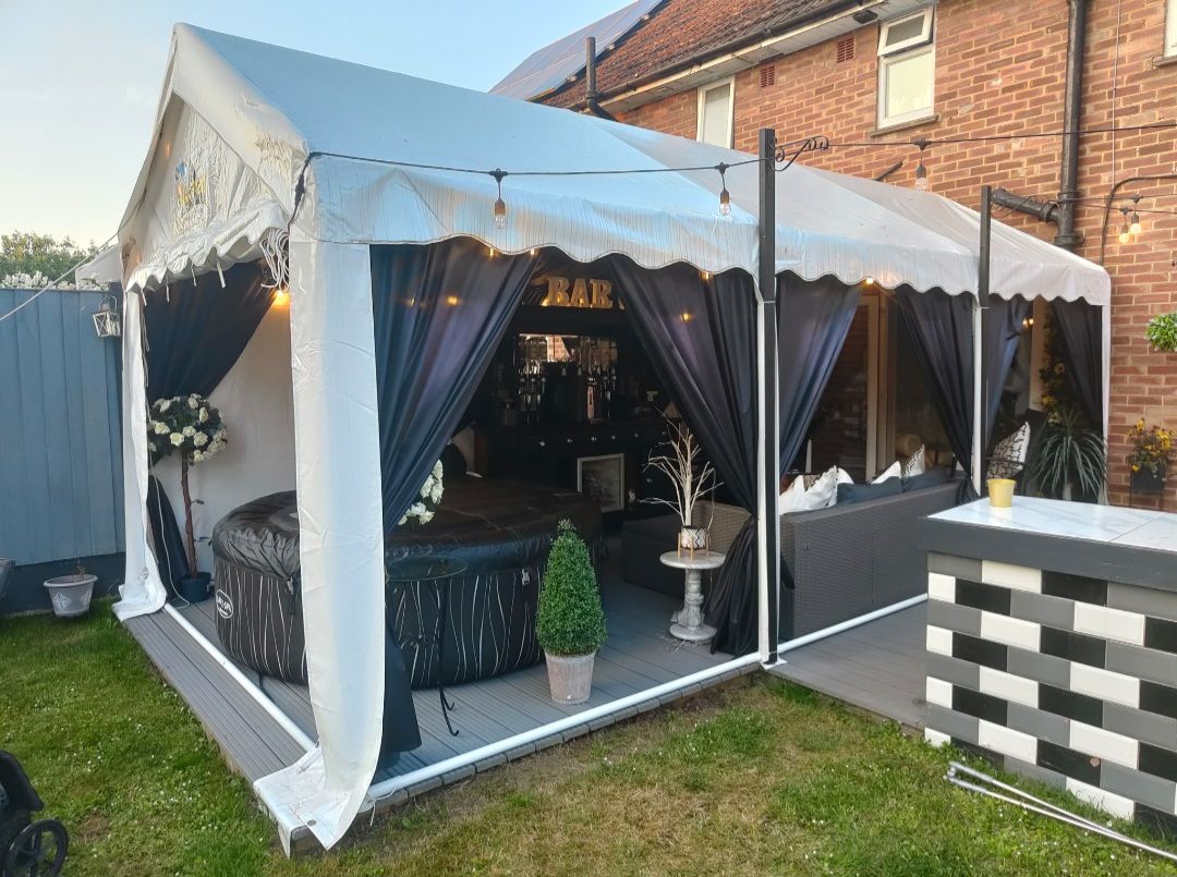
what is a marquee tent?
Q: What is a marquee tent and how is it different from other tents?
what is a marquee in england?
Q: What is a marquee in England, and is it the same as a theater?
what is a marquess?
Q: What is a marquess, and how does it rank in the British nobility?
