| Neutral Navy (balanced gray-blue) |
- Charcoal gray
- Deep teal
- Burgundy
- Dusty rose
|
Yields a polished, versatile aesthetic. Neutral navy allows ties to either stand out (burgundy) or blend subtly (charcoal), making it ideal for formal and business-casual settings.
|
- Legal/corporate environments
- Interviews
- Semi-formal events
Classic Tie Colors for Professional Settings with Navy Suits
Navy suits are a cornerstone of professional wardrobes, known for their versatility and ability to convey sophistication across corporate, formal, and business-casual environments. The selection of tie colors plays a critical role in enhancing visual harmony, projecting confidence, and aligning with cultural and psychological expectations. This section explores the most universally flattering tie colors for navy suits, their historical and symbolic associations, and structured recommendations for optimal pairing. The analysis distinguishes between solid hues and subtle patterns, emphasizing how fabric texture and design influence perceived formality and professionalism.The psychological and cultural weight of tie colors extends beyond aesthetics, often subtly influencing perceptions of authority, approachability, and competence. For instance, red ties evoke energy and ambition, while blue ties project calmness and reliability. Understanding these nuances allows professionals to tailor their attire to specific contexts—whether negotiating a high-stakes deal, attending a client presentation, or participating in a board meeting. Below, recommendations are categorized by frequency of use, ensuring clarity for both seasoned executives and emerging professionals.
Psychological and Cultural Associations of Traditional Tie Colors with Navy Suits
The interplay between navy suits and tie colors is deeply rooted in historical sartorial traditions, particularly in Western business attire. Navy, a color derived from the dye used in 18th-century British naval uniforms, symbolizes authority, stability, and trustworthiness. When paired with specific tie colors, these associations are amplified or tempered, creating distinct visual narratives.- Red Ties: Historically linked to power and passion, red ties with navy suits project confidence and assertiveness. In corporate settings, they are often associated with leadership and boldness, though excessive use may risk appearing overly aggressive. Studies in color psychology suggest red can increase perceived dominance, making it suitable for high-stakes negotiations or presentations where authority is desired.
Blue Ties: Blue, particularly shades like royal blue or navy-blue ties, reinforces the suit’s professionalism by creating a monochromatic or complementary color scheme. Light blues evoke trust and calmness, ideal for client meetings or collaborative environments, while darker blues enhance formality, aligning with legal or financial sectors.
Gray Ties: Gray ties, especially in charcoal or silver tones, offer a neutral yet sophisticated alternative. They convey professionalism and restraint, making them ideal for conservative industries or when subtlety is prioritized. Silver-gray ties add a modern touch, bridging traditional and contemporary aesthetics.
Green Ties: Emerald or forest green ties introduce a touch of elegance and exclusivity. Historically, green has been associated with wealth and prosperity, though its use in professional settings remains occasional due to its boldness. Olive green, a muted variant, provides a more approachable option for creative or environmentally conscious industries.
Brown Ties: Earthy brown ties, such as burgundy or chocolate, add warmth and approachability. They are less common in corporate settings but excel in business-casual environments or industries with a relaxed culture, such as media or startups.
The choice of tie color with a navy suit is not merely aesthetic but a deliberate communication tool. A red tie may signal ambition, while a blue tie reinforces reliability—both critical in shaping first impressions.
Tiered Recommendations for Tie Colors with Navy Suits
The following hierarchy categorizes tie colors based on their suitability for professional settings, balancing timelessness, versatility, and contextual appropriateness. Visual descriptors include shade intensity, fabric sheen, and pattern subtlety to guide selection.Must-Have (Universal and Timeless)
These colors are essential for any professional wardrobe, offering seamless integration across corporate, formal, and business-casual environments.
Navy Blue: A monochromatic pairing that exudes authority and cohesion. Opt for a slightly lighter or darker shade than the suit to create depth. Fabric: Silk or high-quality wool for a polished finish.
Dark Gray/Charcoal: A neutral alternative that enhances professionalism without overpowering the suit. Ideal for conservative industries. Fabric: Matte wool or fine herringbone weave for texture.
Royal Blue: A rich, complementary hue that balances navy’s formality with approachability. Best for client-facing roles. Fabric: Silk with a slight sheen for sophistication.Versatile (Frequent but Context-Dependent)
These colors adapt to various professional scenarios but require consideration of the setting’s tone.
Burgundy: A sophisticated red variant that conveys warmth and experience. Suitable for legal, finance, or creative fields. Fabric: Wool-blend with a subtle texture.
Olive Green: A muted green that projects stability and innovation. Ideal for tech or consulting sectors. Fabric: Linen or lightweight wool for breathability.
Dusty Pink: A modern twist that adds personality while maintaining professionalism. Best for progressive industries. Fabric: Silk or satin for a refined look.Occasional (Specialized or Bold Statements)
Reserved for specific contexts where individuality or industry-specific signaling is desired.
Emerald Green: A high-impact choice for creative or luxury sectors, signaling exclusivity. Fabric: Silk with a metallic thread for drama.
Mustard Yellow: A retro-inspired hue that projects confidence and creativity. Suitable for startups or design-related roles. Fabric: Wool with a textured weave.
Black: A bold, high-contrast option that demands confidence. Best for formal events or when making a deliberate statement. Fabric: Satin or fine wool for a sleek appearance.
Comparison: Solid-Colored Ties vs. Subtle Patterns with Navy Suits
The decision between solid-colored ties and patterned alternatives significantly influences the perceived formality and visual weight of an ensemble. Below is a comparative analysis, including fabric texture considerations to optimize professional impact.
| Feature | Solid-Colored Ties | Subtle Patterns (Stripes, Micro-Checks) |
|---|
| Formality | Highest for solid shades like navy, gray, or blue. | Moderate; stripes add dynamism, checks introduce texture. |
| Visual Weight | Light to medium; depends on shade intensity. | Medium; patterns create movement and draw the eye. |
| Fabric Texture | Silk or satin for sheen; wool for matte finish. | Wool or linen for texture; silk for refined patterns. |
| Contextual Suitability | Corporate, formal, and conservative settings. | Business-casual, creative industries, or relaxed corporate cultures. |
| Psychological Impact | Direct and authoritative (e.g., red, blue). | Subtle sophistication (stripes) or approachability (micro-checks). |
| Pattern Examples | N/A | - Pinstripes: Narrow, parallel lines for elegance.
- Micro-Checks: Small, dense checks for texture without busyness.
- Diagonal Stripes: Dynamic yet professional for creative fields. |
A solid navy tie with a navy suit creates a monochromatic effect, amplifying authority, while a subtle diagonal stripe introduces movement without sacrificing professionalism. The choice hinges on the desired balance between tradition and modernity.
Fabric Texture Considerations:
Silk/Satin: Ideal for solid ties, offering a luxurious sheen that elevates formal occasions. Best paired with wool suits for contrast.
Wool: Provides structure and matte finish, suitable for both solid and patterned ties. Opt for worsted wool for a crisp appearance.
Linen: Lightweight and breathable, ideal for business-casual settings with patterned ties. Adds a relaxed yet polished texture.
Cotton: Rare in professional ties but may appear in casual business settings. Limited to subtle patterns for a refined look.For patterned ties, ensure the scale of the design complements the suit’s formality. Micro-checks or thin stripes are universally acceptable, while bold patterns should be reserved for creative or informal settings.
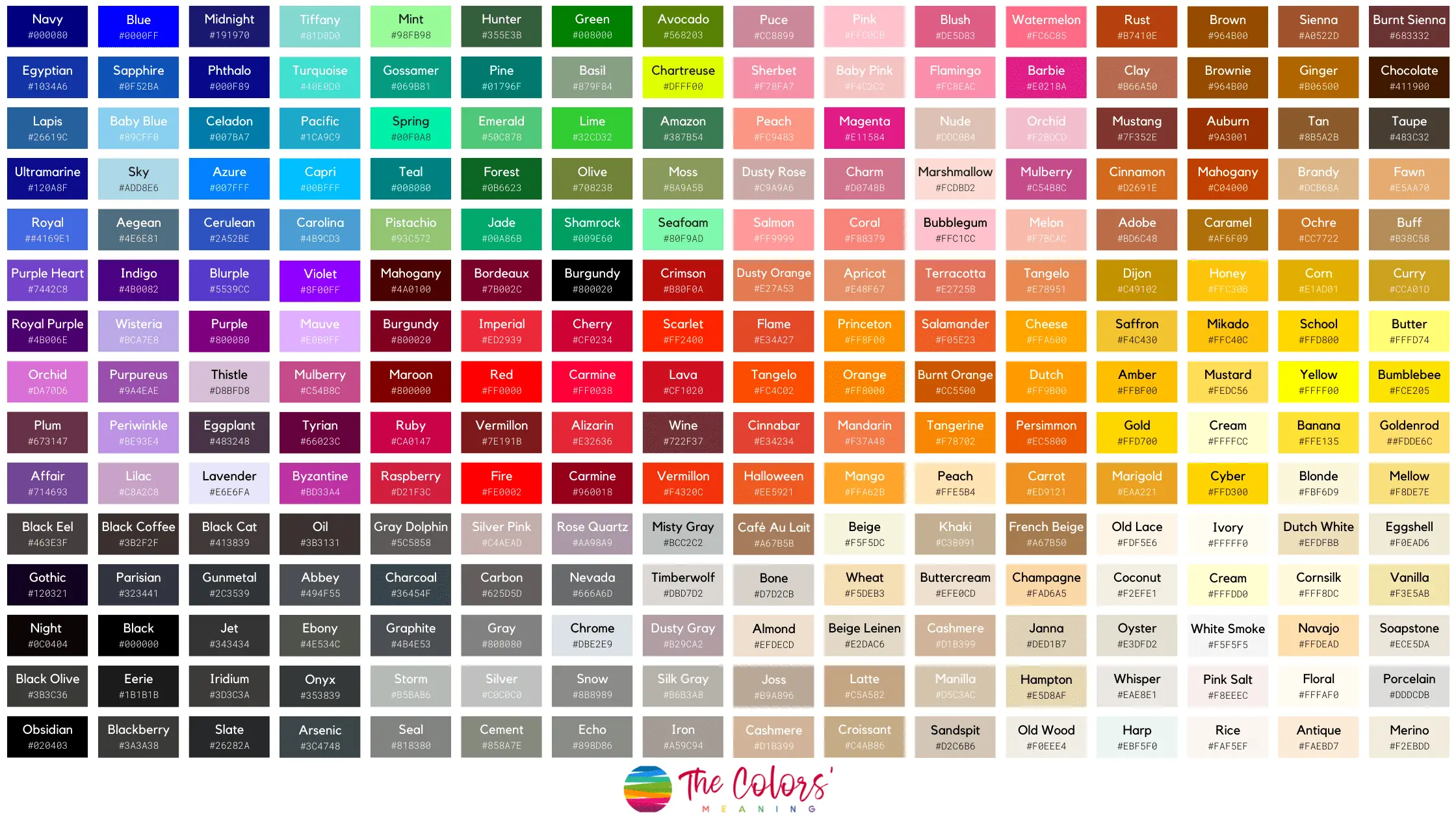
Bold and Statement Tie Colors for Impact with Navy Suits
Navy suits serve as a versatile foundation for professional attire, capable of seamlessly transitioning from conservative boardrooms to dynamic creative environments. When paired with high-contrast, bold tie colors, they elevate the wearer’s presence, conveying confidence and individuality without compromising sophistication. This approach is particularly effective in high-energy settings—such as creative agencies, startup pitches, or cultural events—where visual impact reinforces personal branding. However, achieving this balance requires deliberate coordination of fabric weight, sheen, and accessory harmonization to ensure the ensemble remains polished and intentional.The key to mastering bold tie pairings lies in understanding how color psychology, texture, and lighting interact with navy’s inherent depth. Emerald green, royal purple, and mustard yellow, for instance, introduce vibrant undertones that contrast sharply with navy’s cool, authoritative base, while metallic and iridescent ties introduce dimensionality that shifts with movement and ambient light. Below, structured guidelines address fabric selection, accessory cohesion, and environmental considerations to refine these pairings for maximum professional impact.
Fabric Weight and Sheen Effects in Bold Tie-Navy Suit Combinations
The tactile and visual properties of a tie’s fabric directly influence its compatibility with a navy suit. Heavyweight fabrics (e.g., silk, wool, or linen blends) lend structure and gravitas to bold colors, making them ideal for high-stakes environments where authority is paramount. Conversely, lighter fabrics (e.g., chiffon or satin) introduce fluidity, suitable for creative or casual-professional settings where movement and texture play a role in expression.Sheen further refines the perception of boldness:
Matte finishes (e.g., wool or textured silk) mute intensity, making electric hues (e.g., neon) appear more subdued and sophisticated.
Satin or glossy finishes amplify color saturation, ideal for metallic or iridescent ties where reflectivity enhances visual drama.
Textured weaves (e.g., herringbone or tweed) add depth, allowing bold stripes or patterns to stand out without overwhelming the suit.Example Pairings by Fabric and Sheen:
Emerald green tie: Opt for a wool satin for a refined, slightly retro aesthetic (e.g., 1970s-inspired corporate events) or a silk matte for a modern, understated edge.
Mustard yellow tie: A linen-blend matte softens the hue for daytime settings, while a chiffon sheen intensifies it for evening wear.
Metallic gold tie: Requires a smooth silk or microfiber to prevent clashing with the suit’s texture; avoid heavy brocade unless the suit features complementary embossing.
Balancing Bold Tie Colors with Neutral or Muted Accessories
The principle of controlled contrast governs the integration of statement ties into professional ensembles. Neutral or muted accessories act as anchors, preventing the tie from dominating the silhouette. Below is a step-by-step framework for harmonization:1. Shoes: Monochromatic or Earth-Toned
Bold ties demand low-contrast footwear to avoid visual competition. For navy suits:
Oxfords or derbies in black, dark brown, or burgundy maintain formality.
Two-tone shoes (e.g., black with burgundy soles) introduce subtle warmth without clashing.
Avoid white or light-colored shoes, which can create a disjointed "top-heavy" effect.2. Belts: Match the Shoes or Adopt a Subdued Metallic
Leather belts should mirror the shoe color or adopt a dark brown/black to unify the lower half.
Metallic belts (e.g., gunmetal or bronze) may complement iridescent ties but should not compete in sheen; opt for matte or brushed finishes.3. Pocket Squares: Scale and Texture
Size: Keep pocket squares small (3–4 inches) to avoid overwhelming the tie’s presence.
Color: Use navy, charcoal, or cream for a cohesive look; introduce one accent color (e.g., a single emerald green thread) to subtly echo the tie.
Fabric: Linen or silk with a textured pattern (e.g., micro-check) adds depth without competing with the tie’s boldness.4. Cufflinks and Tie Bars: Minimalist Metallics
Gold or silver cufflinks should be small and understated (e.g., geometric or monogrammed).
Tie bars should align with the belt’s metallic tone if present, avoiding clashing hues.Visual Harmony Formula:
"The sum of accessory contrast should not exceed 30% of the tie’s visual weight. For example, a royal purple tie paired with black shoes, a dark brown belt, and a navy pocket square adheres to this rule, while adding a single silver cufflink introduces a controlled metallic accent."
Metallic and iridescent ties leverage light refraction to create dynamic visual effects, but their success hinges on lighting conditions, room ambiance, and the wearer’s movement. Below is a breakdown of optimal scenarios:1. Gold Ties
Best Environments: Indoor settings with warm lighting (e.g., incandescent or dimmed LED) or natural sunlight during golden hour (early morning/late afternoon).
Avoid: Fluorescent lighting, which can make gold appear yellowish or dull.
Movement Effect: Gold ties catch light with every step, ideal for presentations or networking events where mobility is key.2. Silver/Gunmetal Ties
Best Environments: Cool-toned spaces (e.g., modern offices, art galleries) or evening events with blue/white lighting.
Avoid: Overly warm lighting (e.g., candlelit dinners), which can mute the metallic sheen.
Movement Effect: Silver ties reflect light more diffusely, making them versatile for both static and active settings.3. Holographic/Iridescent Ties
Best Environments: Low-light or stage-lit settings (e.g., keynote speeches, fashion shows) where the tie’s color-shifting properties create a focal point.
Avoid: Direct sunlight or harsh overhead lights, which can wash out the iridescence.
Fabric Note: Iridescent ties require smooth, non-absorbent fabrics (e.g., silk or synthetic blends) to maximize light play.Lighting Adjustment Tips:
Indoor: Use dimmable LED bulbs (2700K–3000K for gold, 4000K–5000K for silver) to enhance metallic ties.
Outdoor: Schedule events during overcast days or evening hours to minimize glare on iridescent ties.
Movement: Encourage natural posture shifts (e.g., gesturing, walking) to activate the tie’s reflective qualities.
Dos and Don’ts of Pairing Navy Suits with Neon or Electric Tie Colors
Neon and electric hues (e.g., electric blue, hot pink, lime green) introduce high-energy contrast to navy suits, but their application requires precision to avoid appearing unprofessional. Below is a structured table outlining visual cues and contextual guidelines:
| Scenario |
DO: Acceptable Pairings |
DON’T: Avoid Pairings |
Visual Cue |
|---|
| Creative Industries (e.g., Design, Marketing) |
Neon green tie with a matte wool navy suit, black oxfords, and a cream pocket square. |
Neon tie with a glossy silk suit or white shoes. |
Neon should appear intentional, not garish; matte fabrics diffuse brightness. |
| Electric blue tie with a textured tweed navy suit, dark brown loafers, and a navy pocket square with a subtle geometric pattern. |
Electric blue tie with polished shoes or a solid-colored
Seasonal and Occasion-Specific Tie Pairings for Navy Suits
The versatility of navy suits extends beyond color theory fundamentals, as seasonal trends and occasion-specific protocols dictate tie selections that enhance professionalism while reflecting cultural and aesthetic sensibilities. Navy’s deep, adaptable undertones—ranging from cool blues to warm teals—serve as a neutral canvas for seasonal palettes, allowing ties to either harmonize subtly or create deliberate contrast. Occasional appropriateness further refines choices, where fabric weight, pattern density, and cultural norms influence perceived formality. This section explores how to align tie colors with seasonal aesthetics, adapt pairings for distinct occasions, and evaluate the visual impact of patterns versus solids, while accounting for lighting conditions and cultural considerations.
Seasonal Tie Color Palettes for Navy Suits
Navy suits pair with seasonal tie colors that complement their undertones while adhering to fashion cycles. The choice of fabric—such as linen for breathability in summer or silk for texture in winter—further refines the seasonal transition. Below is a structured palette guide, organized by season, with descriptions of how each palette interacts with navy’s undertones under natural and artificial lighting.Spring Palette: Soft Pastels and Delicate Neutrals
Spring ties leverage pastel hues that evoke renewal, with colors that soften navy’s depth without clashing. Lighter blues, mint greens, and blush pinks create a harmonious contrast, while cream and pale gray ties introduce subtle warmth. Under overcast lighting, pastels may appear muted, so brighter accents (e.g., a single stripe or dot) can maintain visibility. Linen ties with textured weaves enhance breathability, ideal for transitional spring weather.
- Color Choices:
- Powder Blue (#AFD9E6) – Cool undertone that mirrors navy’s depth while appearing airy.
- Mint Green (#98FF98) – Brightens the ensemble without overwhelming, especially in lighter navy shades.
- Lavender (#E6E6FA) – Adds a modern, understated contrast; best paired with medium-toned navy.
- Dusty Rose (#D4A5A5) – Introduces warmth; pairs well with navy suits with brown or gray undertones.
- Fabric Recommendations:
- Linen – Breathable and slightly textured, ideal for spring’s variable temperatures.
- Silk (lightweight) – Offers sheen and drape, enhancing formal occasions.
- Avoid heavy wool unless layered with a lightweight jacket.
- Lighting Considerations:
Pastel ties may appear washed out under fluorescent lighting. Opt for slightly deeper shades (e.g., "spring green" over "mint") or ties with subtle geometric patterns to maintain definition.
Summer Palette: Vibrant Accents and Coastal Tones
Summer ties embrace boldness while maintaining polish, with colors inspired by oceans, skies, and tropical landscapes. Coral, teal, and golden yellow ties create striking contrasts, while seafoam green and white ties offer a relaxed, nautical aesthetic. Linen and cotton blends dominate summer fabrics, prioritizing comfort. Under direct sunlight, vibrant ties retain intensity, but in shaded or indoor settings, slightly muted tones (e.g., "sage" over "lime") prevent visual fatigue.
- Color Choices:
- Coral (#FF7F50) – Energizing contrast; pairs best with cool-toned navy.
- Teal (#008080) – Complements navy’s blue undertones, creating a monochromatic depth.
- Golden Yellow (#FFD700) – Bold and professional; balances navy’s seriousness with optimism.
- Seafoam Green (#98FB98) – Light and refreshing; ideal for casual summer events.
- Fabric Recommendations:
- Linen-Cotton Blends – Balances breathability and structure.
- Rayon – Lightweight with subtle sheen, suitable for semi-formal settings.
- Avoid heavy fabrics; opt for loose weaves to prevent overheating.
- Lighting Considerations:
High-contrast ties (e.g., white-on-navy) may appear stark under artificial lighting. For indoor events, choose ties with textured patterns (e.g., micro-checks) to soften the effect.
Autumn Palette: Earthy Tones and Rich Neutrals
Autumn ties draw from natural hues—burnt orange, olive green, and deep burgundy—while incorporating warm neutrals like camel and taupe. These colors enhance navy’s versatility, bridging formal and casual aesthetics. Wool and tweed ties introduce texture, ideal for cooler weather, while silk ties add sophistication for evening events. Under artificial lighting, warm-toned ties (e.g., mustard) may appear more vibrant, while cool autumn tones (e.g., slate gray) retain subtlety.
- Color Choices:
- Burnt Orange (#CC5500) – Evokes warmth; pairs with navy’s depth for a balanced contrast.
- Olive Green (#6B8E23) – Earthy and professional; complements navy’s green undertones.
- Burgundy (#800020) – Rich and formal; best for evening or winter occasions.
- Camel (#C19A6B) – Neutral warmth; ideal for layered autumn outfits.
- Fabric Recommendations:
- Wool – Durable and warm; suitable for daywear.
- Tweed – Textured and seasonal; adds rustic charm.
- Silk (heavier weave) – For formal autumn events like galas.
- Lighting Considerations:
Cool-toned autumn ties (e.g., charcoal gray) may appear flat under warm indoor lighting. Pair with metallic accents (e.g., silver embroidery) to restore visual interest.
Winter Palette: Deep Jewel Tones and Classic Neutrals
Winter ties emphasize sophistication, with jewel tones like emerald, sapphire, and ruby creating luxurious contrasts against navy. Charcoal, slate gray, and black ties offer timeless neutrality, while metallic threads (silver, gold) add festive flair. Wool and cashmere ties dominate winter wardrobes, prioritizing warmth and texture. Under dim or colored lighting (e.g., holiday decor), jewel tones retain vibrancy, while neutrals may require reflective finishes to avoid appearing dull.
- Color Choices:
- Emerald Green (#50C878) – Rich and elegant; pairs with navy’s blue undertones.
- Sapphire (#0F52BA) – Monochromatic depth; ideal for formal settings.
- Ruby (#9B111E) – Bold and striking; best for evening events.
- Charcoal (#36454F) – Neutral and versatile; suitable for all-day wear.
- Fabric Recommendations:
- Wool (heavy weave) – Insulating and structured.
- Cashmere – Luxurious and soft; ideal for high-collar ties.
- Silk (with metallic threading) – For formal winter occasions.
- Lighting Considerations:
Metallic ties may appear overly bright under fluorescent lighting. Opt for matte finishes or ties with subtle embossing to maintain elegance.
Occasion-Specific Tie Adaptations for Navy Suits
Navy suits serve as a foundation for occasion-specific tie selections, where cultural norms, industry standards, and event formality dictate color and pattern choices. Below are guidelines for adapting ties to weddings, funerals, creative industries, and corporate settings, with cultural sensitivity considerations to avoid missteps.Weddings and Celebratory Events
Weddings require ties that align
Fabric and Texture Considerations for Tie Selection with Navy Suits
The interplay between tie fabric textures and navy suit materials significantly influences both the visual cohesion and functional comfort of an ensemble. Fabric weight, breathability, and sheen levels create distinct tonal contrasts or harmonies, while structural differences—such as knit elasticity or woven rigidity—affect movement and formality. Understanding these technical interactions ensures professional attire aligns with occasion, climate, and personal silhouette, balancing aesthetics with practicality.
"Texture in menswear acts as a silent communicator of intent: a matte silk tie on a pinstripe suit signals understated sophistication, while a glossy polyester blend on a herringbone suit may convey modernity with a bold edge."
Sheen Levels and Their Interaction with Navy Suit Finishes
Sheen in ties—ranging from matte to high-gloss—modulates perceived formality and visual weight, particularly when paired with navy suits, whose own finishes (e.g., pinstripes, herringbone, or solid weaves) dictate contrast or harmony. A matte tie (e.g., worsted wool or microfiber) absorbs light, creating a subdued, versatile pairing ideal for structured wool suits or linen blends in warmer climates. Conversely, satin or glossy ties (e.g., silk or polyester-satin) reflect light, amplifying the suit’s texture—pinstripes appear sharper, while herringbone weaves gain dimensionality. For solid navy suits, a satin tie introduces a refined sheen, whereas a matte tie ensures a seamless, understated look.
-
Matte Ties (Low Sheen)
- Best paired with: Wool worsted suits, linen-blend suits, or textured weaves (e.g., herringbone).
- Effect: Reduces visual noise; ideal for conservative settings (corporate, legal, or academic).
- Fabric examples: Wool flannel, microfiber, or unglazed silk.
-
Satin Ties (Moderate Sheen)
- Best paired with: Solid wool suits, subtle pinstripes, or lightweight tropical wool.
- Effect: Adds subtle elegance; bridges formal and semi-formal occasions (e.g., weddings, galas).
- Fabric examples: Charmeuse silk, polyester-satin blends.
-
Glossy Ties (High Sheen)
- Best paired with: High-contrast suits (e.g., navy with wide pinstripes or brocade), or for evening wear.
- Effect: Projects confidence; suitable for creative industries (design, entertainment) or black-tie events.
- Fabric examples: Dupioni silk, glossy polyester, or metallic-thread ties.
"A glossy tie on a matte navy suit creates a focal point, while a matte tie on a glossy suit (e.g., linen with a slight sheen) achieves balance through contrast."
Breathability and Climate Adaptability in Tie-Suit Combinations
Navy suits, particularly in wool or wool-blend fabrics, require tie materials that mitigate heat retention or cold stiffness. Summer wear demands lightweight, breathable ties—such as linen, silk dupioni, or cotton-blend ties—paired with linen or tropical wool suits to prevent overheating. In contrast, winter ensembles benefit from wool or cashmere ties, which complement thick wool suits while maintaining insulation. Polyester blends, though durable, trap heat and are best reserved for transitional seasons or indoor environments.
-
Summer-Friendly Tie Fabrics
- Linen: Highly breathable; pairs with linen or lightweight wool suits (avoid stiff weaves).
- Silk Dupioni: Breathable with a slight sheen; ideal for tropical wool or seersucker suits.
- Cotton or Rayon Blends: Affordable and airy; suitable for casual professional settings.
-
Winter-Appropriate Tie Fabrics
- Wool Flannel or Worsted: Insulating; pairs with heavy wool suits or overcoat layers.
- Cashmere: Luxurious and warm; best for high-end formal wear (e.g., evening suits).
- Polyester-Wool Blends: Durable and slightly breathable; suitable for office wear in cool climates.
-
Transitional/Indoor Adaptations
- Microfiber: Lightweight and moisture-wicking; pairs with lightweight wool or suit separates.
- Silk Charmeuse: Breathable with a touch of sheen; versatile for spring/autumn.
Knit vs. Woven Ties for Navy Suits: Aesthetic and Functional Comparison
The structural differences between knit ties and woven ties influence comfort, silhouette enhancement, and occasion suitability when paired with navy suits. Woven ties (e.g., silk, wool, or polyester) offer crisp lines and formal structure, ideal for tailored suits, while knit ties (e.g., cashmere, wool, or cotton) provide elasticity and a relaxed fit, better suited for casual or layered looks. For broad-shouldered individuals, woven ties elongate the torso, whereas knit ties soften angularity. Conversely, slender frames benefit from knit ties to add bulk without sacrificing comfort.
-
Woven Ties: Formality and Structure
- Aesthetic Suitability:
- Best for: Pinstripe, herringbone, or solid wool navy suits.
- Effect: Enhances suit lines; projects authority in corporate or judicial settings.
- Functional Benefits:
- Durability: Resists stretching; maintains shape over time.
- Silhouette Control: Ideal for suits with structured shoulders (e.g., Italian or British tailoring).
- Limitations:
- Less breathable; may stiffen in humidity.
- Requires precise knot-tying to avoid bulkiness.
-
Knit Ties: Comfort and Versatility
- Aesthetic Suitability:
- Best for: Linen suits, lightweight wool blends, or layered outfits (e.g., suit + knit tie + blazer).
- Effect: Adds texture; suitable for creative or casual professional environments.
- Functional Benefits:
- Breathability: Ideal for summer or indoor wear.
- Adaptability: Stretches with movement; comfortable for long wear.
- Limitations:
- Less formal; may appear sloppy if not styled intentionally.
- Prone to stretching or losing shape over time.
Technical Fabric Mapping: Tie Textures and Navy Suit Compatibility
The following table outlines optimal tie fabric-texture pairings with navy suit materials, including climate adaptability and aesthetic outcomes. Bold entries indicate the most harmonious combinations, while italicized notes highlight exceptions or transitional adaptations.
| Tie Fabric |
Navy Suit Fabric |
Aesthetic Outcome |
Climate Adaptability |
Notes |
|---|
| Wool Worsted |
Wool Worsted |
Classic, authoritative |
Cool to cold |
Mastering the art of pairing ties with navy suits distills to balancing science with intuition—where color theory meets contextual adaptability. The optimal choice hinges on aligning tie hues with the suit’s undertones, the event’s formality, and the wearer’s personal brand, all while navigating fabric interactions that influence perceived weight and sheen. From the timeless reliability of burgundy or charcoal to the high-impact drama of emerald or metallic finishes, each selection tells a story. By adhering to structured guidelines—whether adhering to the 60-30-10 rule for harmony or leveraging bold contrasts for creativity—professionals can command attention without compromise. Ultimately, the navy suit becomes a canvas: the tie, the brushstroke.
FAQ
What color tie should I wear with a navy suit and a white dress shirt?
Classic choices include navy, burgundy, or charcoal gray ties, as they complement the white shirt without overpowering the navy suit. For a formal look, a navy or deep blue tie works best, while burgundy adds warmth. Avoid overly bright colors like neon or pastels, which can clash.
What color tie looks best with a navy suit and brown leather shoes?
Burgundy, olive green, or deep brown ties pair well with brown shoes and a navy suit for a cohesive, sophisticated look. Charcoal gray also works if you want a more neutral contrast. Avoid black or very dark ties, as they can compete with the brown shoes.
What color tie goes well with a navy suit and a light blue dress shirt?
Navy, light blue, or soft gray ties create a harmonious monochromatic effect. For contrast, burgundy or mustard yellow ties add warmth. Avoid clashing shades like bright teal or orange, which can look too busy.
What color tie is appropriate to wear with a navy suit for an interview?
Stick to conservative colors like navy, charcoal gray, or deep burgundy to convey professionalism. Avoid patterns, bright colors, or overly bold hues. A solid dark blue or gray tie is the safest choice for a corporate interview.
What color tie should I wear with a navy suit to a wedding?
Opt for navy, burgundy, or deep green ties for a formal wedding, as they complement the suit without competing with the groom’s attire. Avoid white, black, or overly bright colors. For a daytime wedding, light blue or soft gray can work.
What color tie is best for a navy suit at a funeral?
Black, dark gray, or charcoal ties are traditional and respectful choices for funerals. Avoid loud patterns, bright colors, or anything too casual. A simple solid black tie is the most universally appropriate option.
|
|
|

Leave a Comment
Comments are moderated before appearing. The data you submit is processed according to the Privacy Policy of Voltefac.