| Cognitive and Physiological Effects |
Research: A 2016 study in Color Design found that bright colors increased heart rate by 8–10 bpm in test subjects, correlating with heightened alertness.
|
Research: The Journal of Environmental Psychology (2020) reported that muted

Seasonal Color Trends in Fashion and Design
Summer 2024 fashion and design trends reflect a dynamic interplay between cultural influences, sustainability demands, and technological advancements in textile innovation. The season’s palettes prioritize vibrancy, fluidity, and adaptability, with designers leveraging color theory to evoke emotional resonance while addressing ecological concerns. Sustainable dyeing techniques—such as plant-based pigments, upcycled fibers, and waterless production—now underpin trend forecasts, aligning aesthetic boldness with ethical responsibility. Below, the top five global summer color trends are analyzed, alongside their application in men’s and women’s fashion, fabric innovations, and color theory principles.
Top 5 Summer 2024 Color Trends in Global Fashion Runways
The Pantone Color Institute, WGSN, and industry reports identify five dominant summer 2024 trends, each driven by cultural narratives, climate consciousness, and cross-disciplinary collaborations. These trends emphasize luminosity, depth, and texture, with designers like Marine Serre, Coperni, and Bottega Veneta leading experimentation in hue saturation and fabric manipulation.
"Color in 2024 is not just about visibility—it’s about storytelling through materiality and sustainability."
— Leatrice Eiseman, Executive Director of Pantone Color Institute
The following trends incorporate biophilic hues (nature-inspired tones), neon minimalism (subtle electric accents), and chromatic layering (transparent overlays for dimensionality). Fabric innovations include:
Algae-based dyes (e.g., Stella McCartney’s collaboration with Notpla for biodegradable pigments).
Photochromic textiles (e.g., Balenciaga’s solar-reactive fabrics that shift between pastel and bold shades).
Upcycled metallic threads (e.g., Gucci’s use of recycled polyester with iridescent finishes).
-
Electric Coral Revisited
A revival of the 2023 Pantone "Viva Magenta" but refined with lower saturation and matte finishes to avoid visual fatigue. Brands like Prada and The Row employ this hue in structured silhouettes paired with semi-sheer linen, creating a contrast between rigidity and fluidity. Color theory application: Complementary pairing with deep teal (e.g., Prada’s SS24 collection) to enhance vibrancy without clashing.
-
Sage Green with Golden Undertones
Rooted in Scandinavian biophilic design, this muted green dominates minimalist knitwear (e.g., Agnès b.) and tailored suits (e.g., Max Mara’s SS24 "Oasis" line). Fabric innovations include hemp-blend fabrics with golden thread embroidery (e.g., Rick Owens’ use of 24K metallic accents). Color theory: Analogous scheme with olive and mustard to evoke warmth and organic sophistication.
-
Neon Lavender
A high-contrast trend led by Coperni and Miu Miu, where lavender is paired with black or white to create optical illusions. Sustainable techniques involve UV-reactive dyes that fade in sunlight, encouraging seasonal wear. Color theory: Split-complementary (lavender + chartreuse or burnt orange) for modernist edge.
-
Dusty Rose with Terracotta Accents
Inspired by Mediterranean earth tones, this palette appears in flowy cottons (e.g., Rejina Pyo’s SS24 "Desert Bloom") and structured wool blends (e.g., Loro Piana’s "Terra Rossa" collection). Fabric innovations include pièce-dyed techniques (e.g., Bottega Veneta’s hand-painted rose motifs). Color theory: Triadic harmony (rose + terracotta + slate) for balanced warmth.
-
Deep Indigo with Silver Foil
A luxury-metallic hybrid trend, popularized by Valentino and Saint Laurent, where indigo is laminated with silver leaf for a futuristic sheen. Sustainable alternatives include recycled aluminum foil laminates (e.g., Loewe’s "Silver Cloud" collection). Color theory: Monochromatic depth with high-contrast silver to amplify richness.
Summer 2024 Color Palettes: Men’s vs. Women’s Fashion
Gendered color trends in summer 2024 reflect silhouette-driven palettes, where men’s fashion leans toward structured, monochromatic layering, while women’s collections emphasize fluidity and chromatic play. Below is a comparative table of high-street and luxury brand applications, categorized by dominant hues and fabric innovations.
| Category |
Color Palette (Primary + Accents) |
Men’s Fashion Examples |
Women’s Fashion Examples |
Fabric/Fabric Innovation |
Color Theory Application |
|---|
| Vibrant Neutrals |
Off-White + Electric Coral |
Luxury: Bottega Veneta (linen suits with coral pocket squares) |
High-Street: COS (sheer blouses with coral embroidery) |
Linen-cotton blends with algae-dyed coral accents (biodegradable) |
Complementary contrast (off-white + coral) for high visibility. |
| — |
Luxury: Prada (tailored trousers with coral lining) |
High-Street: Uniqlo (oversized shirts in "Coral Dust" wash) |
— |
— |
| Earthy Modernism |
Sage Green + Gold |
Luxury: Max Mara (wool-blend blazers with gold button details) |
High-Street: & Other Stories (knit dresses with gold thread appliqués) |
Hemp-cashmere blends with gold leaf embroidery (upcycled) |
Analogous warmth (sage + gold + camel) for organic luxury. |
| — |
Luxury: Rick Owens (structured coats in "Olive Drift") |
High-Street: Zara (flowy skirts with gold-stitched hems) |
— |
— |
| Neon Minimalism |
Neon Lavender + Black |
Luxury: Coperni (techwear jackets with lavender panels) |
High-Street: Mango Man (lavender denim jackets) |
Recycled polyester with photochromic lavender dye (reacts to light) |
Split-complementary (lavender + chartreuse) for futuristic contrast. |
| — |
Luxury: Miu Miu (lavender leather bags with black hardware) |
High-Street: H&M (lavender sneakers with black laces) |
— |
— |
| Mediterranean Revival |
Dusty Rose + Terracotta |
Luxury: Loro Piana (linen shirts with terracotta embroidery) |
High-Street: Mango (rose-toned midi dresses with terracotta belts) |
Pièce-dyed silk-cot
Natural and Synthetic Sources of Summer Colors
The vibrant hues associated with summer—ranging from golden yellows and electric blues to deep crimsons—originate from both natural botanical sources and chemically synthesized pigments. Historically, natural dyes derived from plants, minerals, and insects dominated textile and cosmetic industries, while modern advancements in chemistry enabled the mass production of synthetic alternatives. This section explores the botanical origins of traditional summer pigments, their historical applications, and the chemical processes behind synthetic dyes, alongside their environmental implications in contemporary fashion and design.Natural pigments have shaped cultural aesthetics for millennia, with botanical sources like saffron, turmeric, and indigo providing enduring colorfastness and symbolic significance. Conversely, synthetic dyes, such as neon pinks and electric blues, emerged in the 19th and 20th centuries to meet industrial demand for consistency and affordability. The following analysis distinguishes between these two categories, examining their extraction methods, chemical synthesis, and modern industry applications.
Botanical Origins and Historical Uses of Natural Summer Pigments
Natural summer colors are primarily derived from plants, fungi, and minerals, each offering unique chromatic properties and cultural applications. These pigments were historically essential in textiles, cosmetics, and ritualistic practices due to their accessibility, biodegradability, and symbolic meanings. Below are key botanical sources of summer hues, their extraction processes, and historical roles in artisanal industries.Extraction and Processing Techniques
The extraction of natural pigments often involves complex methods to isolate colorants while preserving their vibrancy. Common techniques include:
Solvent Extraction: Using water, alcohol, or oil to dissolve soluble pigments (e.g., turmeric’s curcumin in water).
Fermentation: Microbial action enhances color intensity (e.g., indigo fermentation for blue dyes).
Mordanting: Chemical treatments (e.g., alum or tannin) bind dyes to fibers, improving fastness (e.g., madder root for reds).
Mechanical Separation: Crushing or grinding plant materials to release pigments (e.g., saffron’s stigmas for golden hues).Case Studies of Summer Pigments
The following table summarizes notable natural summer pigments, their botanical sources, and historical applications:
| Pigment |
Botanical Source |
Color Produced |
Historical Uses |
|---|
| Saffron |
Crocus sativus stigmas |
Golden yellow to orange |
Textiles (Persian rugs), food coloring (e.g., Indian cuisine), medieval illuminated manuscripts. |
| Turmeric |
Curcuma longa rhizomes |
Yellow to orange |
Ayurvedic cosmetics, Hindu ceremonial dyes, Egyptian mummy wrappings. |
| Indigo |
Indigofera tinctoria leaves |
Deep blue (oxidized to blue-green) |
Denim textiles (Levi’s 501 jeans), African kente cloth, Japanese aizu dyeing. |
| Madder |
Rubia tinctorum roots |
Red to pink |
European Renaissance garments, Ottoman silk production, medieval tapestries. |
| Annatto |
Bixa orellana seeds |
Orange-red |
Mesoamerican body paint, cheese coloring (e.g., Parmesan), Caribbean textiles. |
Cultural and Symbolic Significance
Natural summer colors often carried cultural meanings tied to seasons, deities, or social status. For example:
Saffron symbolized wealth in ancient Persia and was reserved for royal garments.
Indigo represented protection in African traditions and was used in Hindu wedding ceremonies.
Turmeric held medicinal and spiritual significance in Ayurveda and Buddhist rituals.The decline of natural dyes in the 19th century coincided with the rise of synthetic alternatives, though modern eco-conscious movements have revived interest in sustainable pigmentation.
Chemical Synthesis of Synthetic Summer Dyes
Synthetic dyes revolutionized the textile and cosmetic industries by offering consistent, vibrant hues at lower costs. Their production relies on petroleum-based chemicals and complex reactions, often involving aromatic compounds, azo groups, or metal complexes. Below is a step-by-step breakdown of the synthesis of two iconic summer colors—neon pink and electric blue—alongside their environmental and health implications.General Synthesis Process
Synthetic dyes are typically produced through:
1. Raw Material Preparation: Derived from coal tar or petroleum byproducts (e.g., benzene, aniline).
2. Intermediate Compounds: Creation of reactive intermediates (e.g., diazonium salts for azo dyes).
3. Coupling Reactions: Combining intermediates to form chromophores (color-bearing structures).
4. Purification and Formulation: Removing impurities and adjusting pH for stability. Case Study: Neon Pink (Azo Dye)
Neon pink dyes, such as C.I. Reactive Red 198, are synthesized via:
Diazotization: Aniline reacts with nitrous acid (HNO₂) to form a diazonium salt.
Coupling: The diazonium salt reacts with a naphthol derivative to produce an azo compound.
Reactive Group Addition: A chlorotriazine group is attached to enable covalent bonding with fabrics.Chemical Formula Example: C₁₆H₁₀N₄O₄Cl (Simplified azo dye structure) Environmental Concerns:
Toxicity: Azo dyes release aromatic amines (carcinogenic) when metabolized.
Water Pollution: Heavy metal catalysts (e.g., chromium) contaminate wastewater.
Non-Biodegradability: Persistent organic pollutants accumulate in ecosystems.Case Study: Electric Blue (Phthalocyanine Dye)
Electric blue dyes, like C.I. Pigment Blue 15, are based on copper phthalocyanine (CuPc):
Cyclization: Phthalic anhydride reacts with urea to form phthalimide.
Metal Complexation: Copper ions are introduced to stabilize the blue hue.
Polymerization: The complex forms a crystalline structure for opacity.Chemical Formula Example: C₃₂H₁₆CuN₈ (Copper phthalocyanine) Environmental Concerns:
Heavy Metal Release: Copper leaching from dyes affects aquatic life.
Energy-Intensive Production: High temperatures and pressures increase carbon footprints.
Microplastic Contamination: Synthetic fibers shed microplastics during washing.
Natural vs. Synthetic Summer Colors in Modern Industries
The choice between natural and synthetic summer colors in contemporary fashion and design reflects broader ethical and environmental priorities. Eco-friendly industries prioritize biodegradable, non-toxic pigments, while fast-fashion relies on synthetic dyes for cost efficiency and scalability. Below is a comparative analysis of their roles in modern production, supported by industry practices and consumer trends.Eco-Friendly Industry Applications
Natural dyes are favored in:
Slow Fashion: Brands like Patagonia and Eileen Fisher use plant-based dyes for organic cotton textiles.
Upcycled Materials: Artists and designers (e.g., Marina Texeira) extract indigo from denim waste.
Cosmetics: Companies like Lush use turmeric and beetroot for sustainable makeup.
Blockchain Traceability: Platforms such as Provenance track natural dye sourcing to ensure transparency.Fast-Fashion Industry Applications
Synthetic dyes dominate due to:
Cost Efficiency: Mass production reduces prices (e.g., Shein’s neon collections).
Colorfastness: Resistance to fading in high-volume washing.
Versatility: Ability to create fluorescent hues (e.g., UV-reactive dyes in clubwear).
Supply Chain Speed: Quick turnaround for seasonal trends (e.g., Zara’s bi-annual collections).Environmental Trade-offs
"Natural dyes offer biodegradability and reduced toxicity but face challenges in scalability and color consistency. Synthetic dyes provide unmatched vibrancy and durability but contribute to microplastic pollution, water contamination, and carbon emissions. The shift toward circular economy models—such as dye recycling or lab-grown pigments—represents a potential middle ground, though adoption remains limited by infrastructure and cost barriers."
— Textile Exchange, 2023 Sustainability Report
Innovations Bridging the Gap
Emerging technologies aim to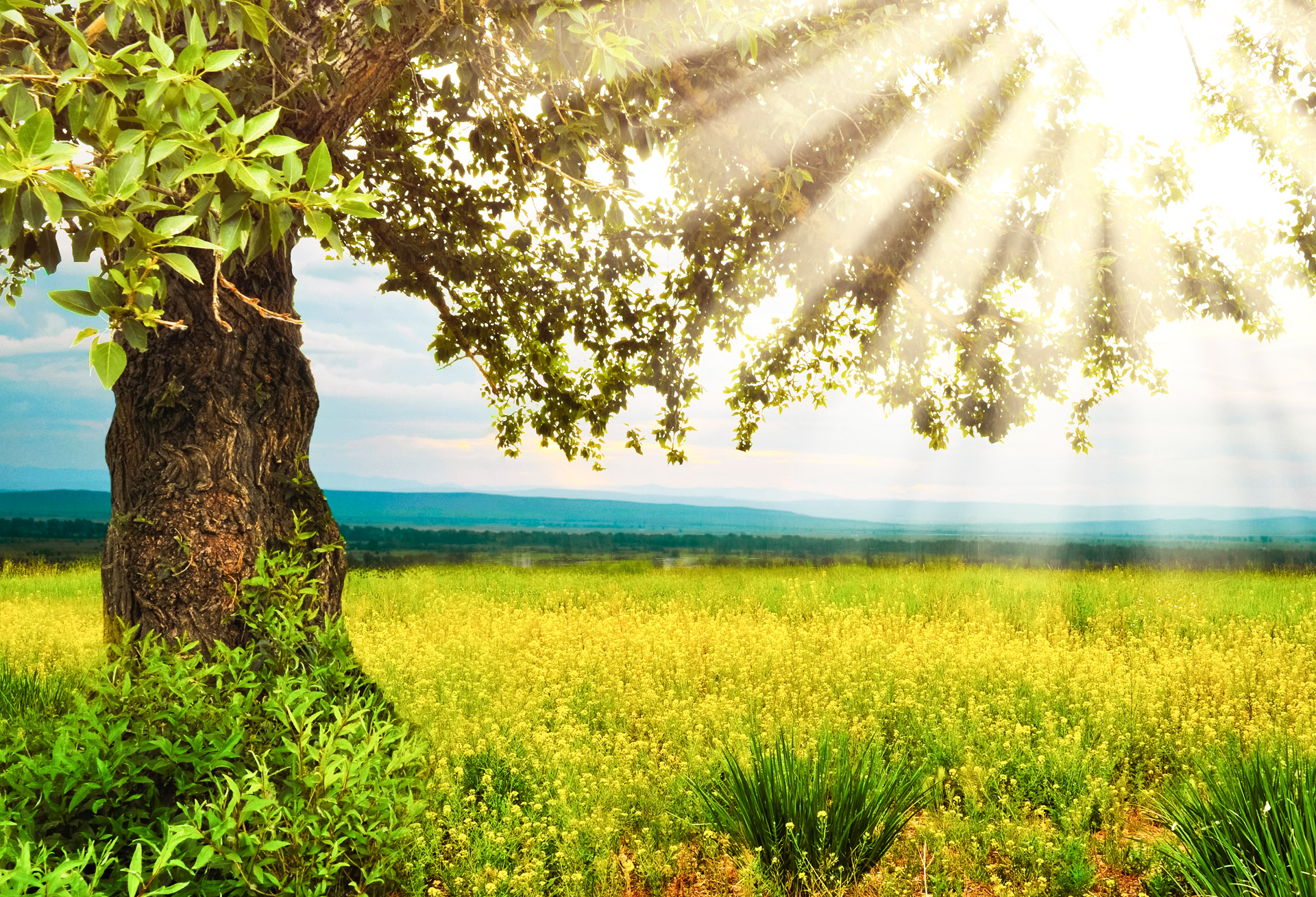
Digital media and technology leverage summer color gradients to enhance user engagement, evoke seasonal emotions, and align with brand aesthetics. In user interface (UI) and user experience (UX) design, summer-inspired palettes—ranging from vibrant corals and sunny yellows to soft pastels—are strategically applied to create visual harmony and drive conversions. These colors are not merely decorative but are optimized for psychological impact, accessibility, and technical implementation, ensuring they function effectively across devices and platforms.The technical generation of summer-themed color palettes involves a combination of color theory, design tools, and accessibility best practices. Designers use software like Adobe Color, Figma, or Coolors to create cohesive gradients while adhering to hexadecimal (hex) codes for consistency. Additionally, digital art—such as NFTs and animations—expands the representation of summer colors through dynamic effects, blending traditional media techniques with cutting-edge digital tools like Procreate and Photoshop filters.
Application of Summer Color Gradients in UI/UX Design
Summer color gradients in UI/UX design serve functional and emotional purposes, particularly in industries like travel, e-commerce, and entertainment. For example, travel platforms often use warm gradients (e.g., #FFD700 to #FF8C00) to evoke feelings of adventure and relaxation, while summer sales pages may employ high-contrast combinations (e.g., #FF6B6B to #4ECDC4) to draw attention to call-to-action (CTA) buttons. The psychological impact of these colors includes:
Increased energy and excitement through bright hues like fuchsia (#FF00FF) or lime green (#32CD32).
Trust and approachability via softer tones such as mint (#98FF98) or peach (#FFDAB9).
Urgency and action with bold gradients transitioning from orange (#FFA500) to red (#FF0000).Designers often pair these gradients with typography and icons to reinforce messaging. For instance, a travel app might use a gradient background (#FF6B6B to #FF8E53) with white or light text to ensure readability while maintaining visual appeal. Accessibility considerations, such as sufficient color contrast (minimum 4.5:1 for text), are critical to ensure inclusivity.
Technical Process of Generating Summer-Themed Color Palettes
The creation of summer color palettes in design tools follows a structured workflow to ensure consistency, scalability, and adherence to accessibility standards. Key steps include:- Color Selection and Theory:
Designers begin by identifying a primary summer color palette (e.g., coral, turquoise, or golden yellow) and use tools like Adobe Color’s "Color Wheel" to generate complementary or analogous shades. For example, a palette based on #FF6B6B (coral) might extend to #FF8E53 (peach) and #FFD700 (gold) for a cohesive summer theme. - Hex Code Standardization:
Each selected color is converted to a hex code (e.g., #FF6B6B for coral) to ensure precision across digital platforms. Tools like Figma’s "Color Variables" feature allow designers to define reusable palettes, reducing inconsistencies in branding. - Gradient Generation:
Gradients are created using linear or radial transitions between hex codes. For instance, a summer gradient might transition from #4ECDC4 (turquoise) to #44A08D (teal). Designers use CSS or SVG for web implementations, ensuring smooth transitions and responsiveness. - Accessibility Validation:
Tools like WebAIM Contrast Checker or Stark (a Figma plugin) assess color combinations for contrast ratios. For example, a CTA button with #FFD700 (gold) text on a #FF6B6B (coral) background must meet WCAG AA standards (minimum 4.5:1 contrast). - Dynamic Adaptation:
Some platforms use JavaScript to adjust gradients based on user preferences (e.g., dark mode) or device capabilities. For instance, a summer-themed app might shift from bright gradients to muted tones in low-light conditions. Example Palette Generation in Adobe Color:
Primary Color: #FF6B6B (Coral)
Secondary Colors: #FF8E53 (Peach), #FFD700 (Gold)
Gradient: Linear from #FF6B6B to #FFD700
Accessibility Note: Ensure text on gradients maintains ≥4.5:1 contrast (e.g., white or dark gray text).
Summer Colors in Digital Art: NFTs and Animations
Digital art, particularly in NFTs and animations, expands the representation of summer colors through dynamic effects, interactive elements, and non-traditional mediums. Unlike static traditional media, digital summer art often incorporates:
Dynamic Gradients and Shaders:
Tools like Photoshop’s "Gradient Map" or Procreate’s "Blend Modes" create fluid transitions between summer hues (e.g., #FFB6C1 (pink) to #ADD8E6 (light blue)). NFT artists use shaders in platforms like Unity or Blender to simulate real-time color shifts based on user interaction.- Glossy and Reflective Effects:
Summer-themed digital art frequently employs metallic or water-like reflections to mimic natural light. For example, an NFT depicting a sunset might use #FF6347 (tomato) with a glossy overlay to simulate heat haze, achieved via Photoshop’s "Outer Glow" or Procreate’s "Warp Tool." - Animated Color Transitions:
In animations (e.g., social media ads or game assets), summer colors evolve over time. A character’s outfit might transition from #FFFACD (lemon chiffon) to #FFD700 (gold) as the scene shifts from day to sunset, using keyframe animations in After Effects or Adobe Animate. - Tool-Specific Techniques:
Procreate: Uses "Color Dynamics" to create summer-inspired brush strokes with varying opacity (e.g., #FF7F50 (coral) with a watercolor texture).
Photoshop: Employs "Smart Objects" to layer summer gradients (e.g., #20B2AA (light sea green)) with texture overlays for depth.
NFT Platforms (e.g., OpenSea): Artists use Solidity smart contracts to encode color palettes dynamically, allowing NFTs to alter hues based on blockchain events.Comparison with Traditional Media:
Traditional summer art (e.g., watercolors or oil paintings) relies on physical pigments and brushwork, while digital art leverages algorithms and layer effects. For example, a digital sunset might use #FF4500 (orange-red) with a "turbulence" filter in Photoshop to mimic atmospheric dispersion, whereas a traditional painting would achieve this through glazing techniques.
Summer Colors in Nature and Their Symbolism
The vibrant palette of summer is not merely a visual spectacle but a result of complex biological, chemical, and environmental interactions. Natural summer colors—ranging from the golden hues of sunlight to the deep blues of oceans and the vivid florals of wildflowers—emerge from evolutionary adaptations, pigment chemistry, and atmospheric phenomena. These colors carry profound symbolic meanings across cultures, often representing vitality, warmth, renewal, and transcendence. Understanding their scientific origins and cultural interpretations reveals how nature’s chromatic language influences human perception, art, and even spiritual traditions.The dominance of summer colors in the natural world stems from three primary factors: pigment synthesis in organisms, light scattering in the atmosphere, and selective reflection of wavelengths. For instance, chlorophyll’s green dominance in foliage persists into summer, while secondary pigments like carotenoids (yellows and oranges) become more visible as chlorophyll degrades. Meanwhile, the sky’s azure tones result from Rayleigh scattering, where shorter blue wavelengths are dispersed by air molecules, while the ocean’s blues and greens arise from light absorption by water and dissolved organic compounds. These processes, combined with human cultural associations, imbue summer colors with layered meanings—from fertility and abundance to divine favor and fleeting beauty.
Scientific Foundations of Summer’s Dominant Colors
The spectrum of summer colors in nature is governed by biological pigmentation, optical physics, and ecological adaptations. Chlorophyll, the primary pigment in plants, absorbs blue and red light while reflecting green, which remains prevalent in summer due to sustained photosynthesis. However, as temperatures rise and daylight lengthens, plants often produce accessory pigments such as:
Carotenoids (β-carotene, lutein): Responsible for yellows, oranges, and reds in flowers (e.g., marigolds) and fruits (e.g., peaches), these pigments also act as photoprotectants, shielding chlorophyll from excessive light.
Anthocyanins: Water-soluble flavonoids that produce red, purple, and blue hues in berries, grapes, and some leaves (e.g., Japanese maples). Their synthesis is triggered by high light intensity and temperature fluctuations, common in summer.
Melanins: Found in animal fur, feathers, and insect exoskeletons, these pigments create blacks and browns (e.g., dragonflies’ metallic sheens) and play roles in thermoregulation and UV protection.Atmospheric and aquatic colors, meanwhile, are products of light interaction with mediums:
Sky blues: Caused by Rayleigh scattering, where shorter wavelengths (400–500 nm) are scattered more than longer ones, creating the characteristic summer sky.
Ocean hues: Vary from turquoise (shallow waters reflecting seabed) to deep blue (absorption of red light in open ocean). The presence of phytoplankton can introduce greenish tints due to chlorophyll.
Sunlight’s golden tones: Result from Mie scattering by airborne particles (e.g., pollen, dust) and the redshift of sunlight during summer solstice, when the sun’s higher angle in the sky enhances yellow and orange wavelengths.
"The perception of color in nature is not arbitrary but a product of evolutionary pressure—pigments that enhance survival (e.g., camouflage, pollinator attraction) or optimize energy capture (e.g., photosynthesis) dominate the summer palette."
— Optical Society of America, Journal of Photonics
Symbolism of Summer Colors Across Cultures
Summer colors transcend their scientific origins to carry universal and culture-specific symbolic weight, often tied to agricultural cycles, deities, and life stages. Below is a comparative analysis of their meanings:
| Color | Scientific Basis | Cultural Symbolism | Mythological/Folklore Associations |
|---|
| Gold/Yellow | Carotenoid pigments, sunlight scattering | Prosperity, harvest, enlightenment (e.g., golden age myths) | Egypt: Sun god Ra; Greece: Apollo’s radiance; India: Lord Vishnu’s skin hue (tilak). |
| Blue | Rayleigh scattering, water absorption | Tranquility, spirituality, divine connection (e.g., Mary’s blue robes in Christianity) | Egypt: Sky goddess Nut; Greece: Athena’s aegis; Native American: Water spirits (e.g., Manitou). |
| Red | Anthocyanins, high-energy light absorption | Passion, danger, vitality (e.g., Chinese New Year’s red envelopes) | Aztec: Huitzilopochtli’s war feathers; Norse: Fenrir’s blood; Japanese: Cherry blossom’s fleeting life. |
| Green | Chlorophyll dominance | Renewal, fertility, luck (e.g., St. Patrick’s Day) | Celtic: Druidic sacred groves; Islam: Paradise’s description; Greek: Dionysus’ ivy crown. |
| White | Light reflection (e.g., sand, clouds) | Purity, beginnings (e.g., weddings), but also heat and sterility in desert cultures | Greek: Hestia’s hearth; Hindu: Shiva’s asceticism; Eskimo: Summer solstice festivals. |
In agricultural societies, summer colors often symbolize abundance and preparation for harvest. For example, the golden fields of wheat in Mesopotamia were linked to the goddess Ishtar, while the blue of the Mediterranean inspired Greek myths of Poseidon’s dominion. Conversely, in Indigenous traditions, colors like the red of sunset (e.g., Navajo Diné ceremonies) represent transitions between life stages or spiritual realms.
Summer-Colored Flora and Fauna in Mythology and Folklore
Plants and animals exhibiting summer hues frequently feature in global mythologies, where their colors are imbued with sacred, prophetic, or transformative qualities. Below is a curated list of iconic examples, categorized by their symbolic roles:#### Flora: Messengers of Growth and Transformation
Summer’s floral palette—dominated by whites, yellows, reds, and blues—reflects themes of fecundity, fleeting beauty, and divine favor. Key examples include:
Sunflowers (Helianthus annuus)
Color: Golden-yellow petals, dark brown centers.
Mythology: Associated with Helios (Greek sun god) and Incan worship of Intisuyu (sun cult). In Aztec lore, sunflowers were sacred to Tlaloc, the rain and fertility deity.
Folklore: European tales link sunflowers to protection against evil spirits; in China, they symbolize longevity and loyalty (e.g., The Legend of the White Snake).
Scientific Note: Their heliotropism (sun-tracking) aligns with summer’s solar abundance, reinforcing their symbolic connection to vitality.- Peonies (Paeonia)
Color: Pink, red, white, or yellow (anthocyanin/carotenoid-based).
Mythology: In Chinese culture, peonies (mudan) are the "king of flowers," linked to wealth and honor (Imperial symbol). The Greek god Paeon was said to have created the flower from his tears after healing a wounded Zeus.
Folklore: Victorian-era language of flowers assigned peonies to "I hope" or "disdain"; in Persian poetry, they represent shame and modesty.- Lavender (Lavandula)
Color: Purple-blue (anthocyanin-rich).
Mythology: Dedicated to Chiron, the wise centaur in Greek myth, who used lavender to heal wounds. Roman brides wore lavender crowns for fertility.
Folklore: In Provençal traditions, lavender bundles were hung to ward off witches; in Hinduism, the shringar (bridal adornment) includes lavender for auspiciousness.#### Fauna: Symbols of Adaptation and Divine Presence
Animals with summer hues often embody agility, danger, or celestial connections, reflecting their ecological roles:
Dragonflies (Odonata)
Color: Iridescent blue, green, or gold (structural color from light interference in exoskeleton).
Mythology: In Native American lore, dragonflies are messengers between worlds (e.g., Ojibwe bdoonh). Japanese folklore (tonbo) associates them with courage and rebirth.
Folklore: European tales claim dragonflies predict rain or steal souls; in Southeast Asia, their presence signals Summer colors are more than fleeting seasonal trends—they are a synthesis of nature’s brilliance, human creativity, and technological advancement. From the botanical roots of indigo to the algorithmic precision of digital gradients, these hues tell stories of cultural heritage, psychological resonance, and environmental consciousness. As designers, marketers, and artists continue to reinterpret summer palettes, their enduring relevance lies in their ability to inspire, connect, and adapt across disciplines. Understanding their depth ensures that summer’s vibrant legacy remains both visually striking and meaningfully impactful.
FAQ
what are summer colors for nails?
Q: What are the best summer nail polish colors for 2024?
what are summer colors for clothing?
Q: What are the most popular summer colors for clothing this season?
what are summer colors for a wedding?
Q: What are the best summer colors for a wedding?
what are summer colors for women?
Q: What are the summer colors for women’s fashion?
what are summer colors for men?
Q: What are the summer colors for men’s clothing?
what are summer colors for nail polish?
Q: What are the summer colors for nail polish in 2024?
|
|

Leave a Comment
Comments are moderated before appearing. The data you submit is processed according to the Privacy Policy of Voltefac.